Lecture
Content
After determining the grouping attribute, the number of groups and grouping intervals, these reports and groups are presented in the form of distribution series and arranged in the form of statistical tables.
A number of distribution is one of the types of groupings.
Distribution series - is an ordered distribution of the units of the studied population into groups according to a certain varying characteristic.
Depending on the characteristic underlying the formation of a series of distribution, attributive and variational distribution series are distinguished:
The variation variation series consists of two columns:
The first column lists the quantitative values of the varying attribute, which are called variants and are indicated by  . Discrete option - expressed as an integer. Interval option is between and to. Depending on the type of options, you can build a discrete or interval variation series.
The second column contains the number of specific options , expressed in terms of frequency or frequency:
Frequencies are absolute numbers that show so many times in the aggregate this characteristic value, which denote
. The sum of all frequencies must be equal to the number of units of the entire population.
Frequently (
) - These are frequencies expressed as a percentage of the total. The sum of all frequencies expressed as a percentage should be equal to 100% in fractions to a unit.
Graphic representation of distribution rows
Clearly the distribution series are represented using graphic images.
Distribution rows are depicted as:
When constructing a polygon on the horizontal axis (abscissa axis), the values of the varying attribute are laid, and on the vertical axis (ordinate axis), frequencies or frequencies.
Polygon in Fig. 6.1 built according to the microcensus of the Russian population in 1994
| Households consisting of: | one man | two people | three people | 5 or more | Total |
| Number of households in% | 19.2 | 26.2 | 22.6 | 20.5 | 100.0 |
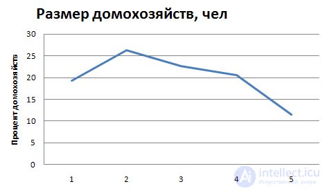
6.1. Household size distribution
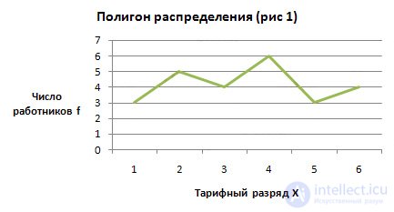
Condition : The data on the distribution of 25 employees of one of the enterprises by tariff categories are given:
four; 2; four; 6; five; 6; four; one; 3; one; 2; five; 2; 6; 3; one; 2; 3; four; five; four; 6; 2; 3; four
Task : Build a discrete variation series and depict it graphically as a distribution polygon.
Solution :
In this example, the options are the wage rate of the employee. To determine the frequencies, it is necessary to calculate the number of workers with the corresponding tariff category.
| Tariff bit xi |
Number workers fi |
| one | 3 |
| 2 | five |
| 3 | four |
| four | 6 |
| five | 3 |
| 6 | four |
| Total: | 25 |
The polygon is used for discrete variation series.
To build a distribution polygon (Fig. 1), we plot the abscissa (X) along the quantitative values of the varying attribute — the variants, and along the ordinate — the frequencies or frequencies.
If the attribute values are expressed as intervals, then such a series is called an interval.
Interval rows of distribution are represented graphically in the form of a histogram, cumulates or ogives.
Statistical table
Condition : Data on the size of deposits of 20 individuals in one bank (thousand rubles) 60; 25; 12; ten; 68; 35; 2; 17; 51; 9; 3; 130; 24; 85; 100; 152; 6; 18; 7; 42
Task : Construct an interval variational series with equal intervals.
Solution :
| Deposit amount thousand rubles Xi |
Number of deposits fi |
The number of contributions in% of the total Wi |
| 2 - 32 | eleven | 55 |
| 32 - 62 | four | 20 |
| 62 - 92 | 2 | ten |
| 92 - 122 | one | five |
| 122 - 152 | 2 | ten |
| Total: | 20 | 100 |
With such a record of a continuous feature, when the same value occurs twice (as the upper limit of one interval and the lower limit of another interval), then this value belongs to the group where this value acts as an upper limit.
To construct a histogram on the abscissa axis, indicate the values of the boundaries of the intervals and on their basis build rectangles, the height of which is proportional to the frequencies (or frequencies).
In fig. 6.2. depicts a histogram of the distribution of the population of Russia in 1997 by age groups.
| Whole population | Including age | ||||||||
| to 10 | 10-20 | 20-30 | 30-40 | 40-50 | 50-60 | 60-70 | 70 and older | Total | |
| Population | 12.1 | 15.7 | 13.6 | 16,1 | 15.3 | 10.1 | 9.8 | 7.3 | 100.0 |
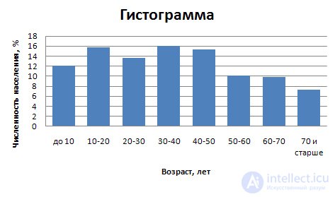
Fig. 6.2. The distribution of the population of Russia by age groups
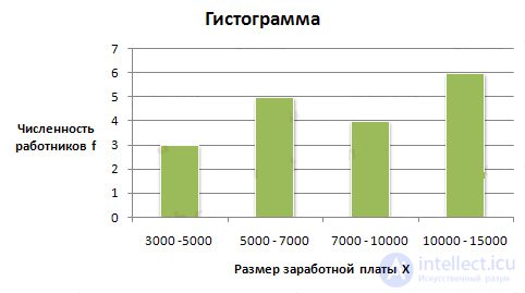
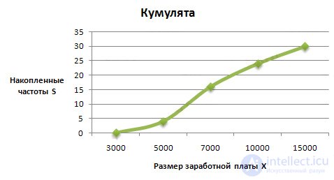
Condition : The distribution of 30 employees of the company by the size of the monthly wage is given
| Salary rub. per month |
Number of employees people |
| up to 5000 | four |
| 5000 - 7000 | 12 |
| 7,000 - 10,000 | eight |
| 10,000 - 15,000 | 6 |
| Total: | thirty |
Task : Display the interval variation series graphically in the form of a histogram and cumulates.
Solution :
To build cumulates, it is necessary to calculate the accumulated frequencies (frequencies). They are determined by successively summing the frequencies (frequencies) of previous intervals and are denoted by S. The accumulated frequencies show how many units of the aggregate have a characteristic value not larger than the considered one.
The distribution of the trait in the variation series by the accumulated frequencies (frequencies) is depicted using cumulates.
Cumulative or cumulative curve in contrast to the landfill is based on the accumulated frequencies or frequencies. In this case, the characteristic values are placed on the abscissa axis, and the accumulated frequencies or frequencies are placed on the ordinate axis (Fig. 6.3).
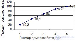
Fig. 6.3. Cumulative distribution of households by size
4. Calculate the accumulated frequency:
Knocked frequency of the first interval is calculated as follows: 0 + 4 = 4, for the second: 4 + 12 = 16; for the third: 4 + 12 + 8 = 24, etc.
| Salary rubles per month Xi |
Number of employees people fi |
Accumulated frequencies S |
| up to 5000 | four | four |
| 5000 - 7000 | 12 | sixteen |
| 7,000 - 10,000 | eight | 24 |
| 10,000 - 15,000 | 6 | thirty |
| Total: | thirty | - |
When building cumulates, the cumulative frequency (frequency) of the corresponding interval is assigned to its upper boundary:
Ogiva is constructed in the same way as cumulative, with the only difference being that the accumulated frequencies are placed on the abscissa axis, and the characteristic values are on the ordinate axis.
A variety of cumulates is a concentration curve or a Lorenz graph. To construct a concentration curve, a scale scale is plotted on both axes of the rectangular system in percent from 0 to 100. At the same time, the accumulated frequencies are indicated on the abscissa and the accumulated fraction (in percent) by volume of the feature are indicated on the vertical axis.
The uniform distribution of the sign corresponds to the diagonal of the square on the graph (Fig. 6.4). In case of uneven distribution, the graph is a concave curve depending on the concentration level of the trait.
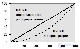
6.4. Concentration curve

Comments
To leave a comment
Probability theory. Mathematical Statistics and Stochastic Analysis
Terms: Probability theory. Mathematical Statistics and Stochastic Analysis