Lecture
The location of the cart is a major headache for online merchants, and one of the first things to optimize for higher conversions.
What is this optimization process for different forms? Each field of the form represents for a person the possibility of an error: technical, simple confusion, frustration.
Users do not always leave the buying process halfway for technical reasons (some buyers compare prices, change their mind to buy at the last stage, doubt the security of the site, etc.), the development of forms is completely up to you. Forms can be improved through testing .
Some web forms submit an order immediately after clicking the "continue" or "make an order" button. In this case, the page is updated and if there are errors in the order, tips with errors appear . Some sites tend to show the error and its possible solutions as clearly as possible for the buyer.
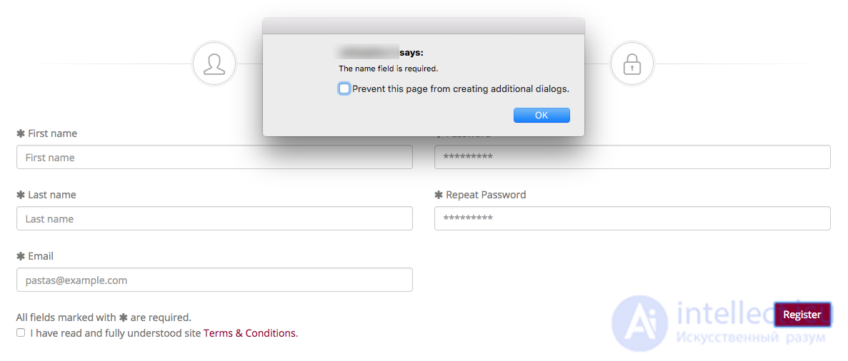
The worst option to show on the page with an error are pop-ups . After closing such a window with a warning, the buyer can easily forget what was said there:
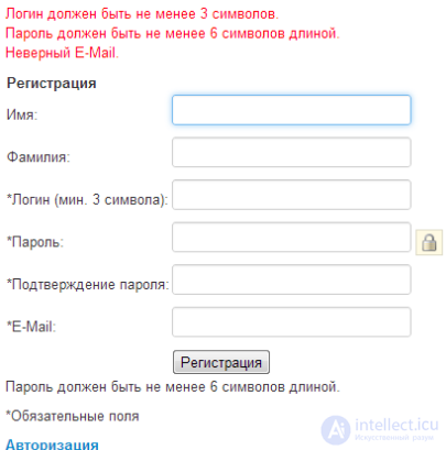
A little better, but still not the best option, when the list of errors is displayed at the top of the form :
Remember the main rule around which all the usability of the Internet is built - "Do not make me think." Both of the above ways of presenting errors make users think.
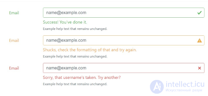
The best way to report an error is to select the form field where it was made .
The best way is to display an error immediately after entering data in the form field (or skipping a required field).
A study of the impact of user behavior on this error-finding method, the following:
21% increase in the number of successful orders means a 21% decrease in the number of users who left the form. Definitely, for each site you need separate testing methods.
Also, on my own, I want to add another factor that can affect the decrease in conversions. This is common and if the product is not exclusive, then the potential client may leave your site in an irritated state and will not return.

The proximity of the "send" and "clear" buttons can have a very negative effect on the conversion. When you click "Clear form", you should definitely ask if the user is sure of this, because Often mistakenly clicking not send. Do additional validation of this action , then you will not have such problems.
The same can be attributed to the captcha , sometimes I met an unreadable captcha and after entering I logically gave an error, but the data with the back button could not be restored, either re-entered, or leave the site.
I believe that it is better to receive several letters from spammers, due to the absence of a captcha, than to lose a client. Therefore, on important "sites" there is no captcha.

Comments
To leave a comment
seo, smo, monetization, basics of internet marketing
Terms: seo, smo, monetization, basics of internet marketing