Lecture
In this lesson we:
- we understand the characteristics of the screen
- we consider layout parameters (height, width, indent, gravity, weight)
First, a little theory on the screens. The screen has such physical characteristics as diagonal and resolution. Diagonal is the distance between opposite corners of the screen, usually measured in inches. Resolution - the number of horizontal and vertical dots that the screen is capable of displaying is measured in pixels.
Take the screen of the smartphone HTC Desire as an example. Diagonal = 3.7 inches, resolution = 800x480 pixels.
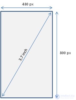
The number of pixels in one inch is called dpi (dot per inch). We find out what is equal to dpi in this case, remembering the classics: c 2 = a 2 + b 2 , where c is the number of pixels diagonally, i.e. fit in 3.7 inches. a and b are sides of the screen.
c = 3.7 * dpi
(3.7 * dpi) 2 = 480 2 + 800 2
dpi 2 = 870400 / 13,69 = 63579
dpi = 252. That is, One inch of the screen fits a row of 252 pixels.
Returning to the topic of the lesson. Consider in detail the following parameters View elements
We have already talked a little about the width (layout_width) and height (layout_height) in the last lesson. We can specify absolute values for them, but we can use constants. Let us consider these features in more detail.
The following units of measurement are used:
dp or dip - Density-independent Pixels. An abstract UE that allows applications to look the same on different screens and resolutions.
sp - Scale-independent Pixels. Same as dp, only used for font sizes in View elements.
pt - 1/72 inch, determined by the physical size of the screen. This EI is from the typography.
px - pixel, not recommended because on different screens the application will look different.
mm - millimeter, determined by the physical size of the screen
in - inch, determined by the physical size of the screen
You can read more about the differences and ratios between these EU in this site material.
match_parent (fill_parent) - means that the element will occupy all the width / height available to it in the parent element.
wrap_content - width / height of the element will be determined by its content
Create a project:
Project name : P0072_LayoutProp
Build Target : Android 2.3.3
Application name : LayoutProp
Package name : ru.startandroid.develop.layoutprop
Create Activity : MainActivity
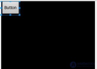
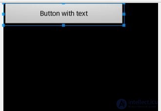
Open main.xml . Set the root LinearLayout to horizontal orientation, remove the TextView , and add a Button with a width and height equal to wrap_content . It is displayed on the screen and its width corresponds to the text on it.
Change the text from “Button” to “Button with text”, save and look at the screen.
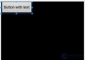
The button has become wider, because width is determined by the content. If we now explicitly indicate a width of 250 dp to it, the button will stretch regardless of the content.
Now let's make the width equal to match_parent . The button stretched the entire width of the parent , i.e. LinearLayout. And LinearLayout, in turn, will occupy the entire width of the screen.
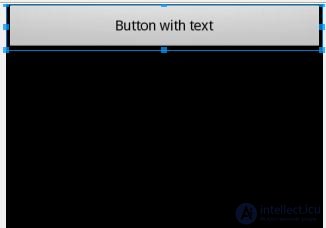
If our parent contains several elements and we want them to occupy all the space, you must use the parameter Layout weight - weight . Free space is distributed between elements in proportion to their weight values.
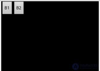
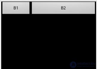
Change the text of our button on B1 and add a LinearLayout neighbor to it - the second button with the text B2 . Wrap for both wrap_content
Make a divide. If we want the buttons to divide the parent's space equally - then for both we specify weight = 1. In this case, the buttons are equal in width.
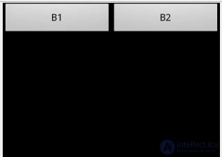
Please note that units are not used, just numbers are indicated.
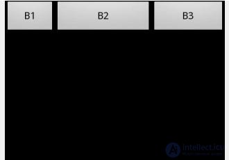
If it is necessary that B1 occupies a quarter, and B2 three quarters of free space, then we put down weight = 1 for B1 and weight = 3 for B2 .
The number of elements can be any. Add another button with the text B3 , weight = 2 and width = wrap_content.
xml-code of the resulting screen:
<? xml version = "1.0" encoding = "utf-8"?>
<LinearLayout
xmlns: android = "http://schemas.android.com/apk/res/android"
android: layout_width = "fill_parent"
android: layout_height = "fill_parent"
android: orientation = "horizontal">
<Button
android: id = "@ + id / button1"
android: layout_height = "wrap_content"
android: layout_width = "wrap_content"
android: text = "B1"
android: layout_weight = "1">
</ Button>
<Button
android: id = "@ + id / button2"
android: layout_width = "wrap_content"
android: layout_height = "wrap_content"
android: text = "B2"
android: layout_weight = "3">
</ Button>
<Button
android: layout_height = "wrap_content"
android: layout_width = "wrap_content"
android: id = "@ + id / button3"
android: text = "B3"
android: layout_weight = "2">
</ Button>
</ LinearLayout>
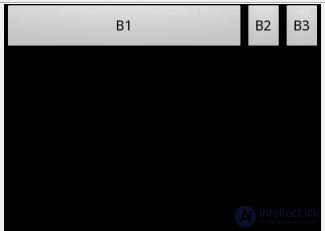
Now for B2 and B3, specify weight = 0. They no longer claim to free space and occupy the width of the content, and B1 takes everything for itself.
Of course, all of the above is applicable for the parameter height - height .
When using weigth, you can specify a height or width = 0dp . In this case, the contents of the elements will not be taken into account and the result will be more appropriate to the coefficients of weight.
The layout_gravity parameter is similar to the alignment of Word or Excel. The most convenient way is to demonstrate it using FrameLayout . I did not describe this layout in the last lesson, because he is quite simple. He places all elements placed in it by default in the upper left corner and does not line them up at all. This is very suitable for demonstrating alignment settings.
Create grlayout.xml :
<? xml version = "1.0" encoding = "utf-8"?>
<LinearLayout
xmlns: android = "http://schemas.android.com/apk/res/android"
android: orientation = "vertical"
android: layout_width = "match_parent"
android: layout_height = "match_parent">
<Framelayout
android: id = "@ + id / frameLayout1"
android: layout_width = "match_parent"
android: layout_height = "match_parent">
<Button
android: id = "@ + id / button1"
android: layout_width = "wrap_content"
android: layout_height = "wrap_content"
android: layout_gravity = "top | left"
android: text = "gravity = top left">
</ Button>
<Button
android: id = "@ + id / button2"
android: layout_width = "wrap_content"
android: layout_height = "wrap_content"
android: layout_gravity = "top | right"
android: text = "gravity = top right">
</ Button>
<Button
android: id = "@ + id / button3"
android: layout_width = "wrap_content"
android: layout_height = "wrap_content"
android: layout_gravity = "bottom | left"
android: text = "gravity = bottom left">
</ Button>
<Button
android: id = "@ + id / button4"
android: layout_width = "wrap_content"
android: layout_height = "wrap_content"
android: layout_gravity = "bottom | right"
android: text = "gravity = bottom right">
</ Button>
<Button
android: id = "@ + id / button5"
android: layout_width = "wrap_content"
android: layout_height = "wrap_content"
android: layout_gravity = "center"
android: text = "gravity = center">
</ Button>
</ FrameLayout>
</ LinearLayout>
On the screen we see:
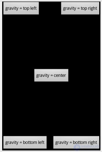
For clarity, the text of the button displays its properties. Everything is obvious and simple.
I honestly tried to understand why the gravity fill_ * and clip_ * values are needed, but I did not understand. What is written about them in the help does not work for me. If you have information about this - write to kamenty.
The margin parameters are completely similar to the margin from html . This is indented. It can be on all sides at once, or only from the necessary sides. Let's demonstrate it on the example of TableLayout. Create a marginlayout.xml and draw a three by three table with buttons.
<? xml version = "1.0" encoding = "utf-8"?>
<LinearLayout
xmlns: android = "http://schemas.android.com/apk/res/android"
android: orientation = "vertical"
android: layout_width = "match_parent"
android: layout_height = "match_parent">
<TableLayout
android: layout_height = "wrap_content"
android: layout_width = "match_parent"
android: id = "@ + id / tableLayout1">
<TableRow
android: id = "@ + id / tableRow1"
android: layout_width = "wrap_content"
android: layout_height = "wrap_content">
<Button
android: text = "Button"
android: id = "@ + id / button1"
android: layout_width = "wrap_content"
android: layout_height = "wrap_content">
</ Button>
<Button
android: text = "Button"
android: id = "@ + id / button2"
android: layout_width = "wrap_content"
android: layout_height = "wrap_content">
</ Button>
<Button
android: text = "Button"
android: id = "@ + id / button3"
android: layout_width = "wrap_content"
android: layout_height = "wrap_content">
</ Button>
</ TableRow>
<TableRow
android: id = "@ + id / tableRow2"
android: layout_width = "wrap_content"
android: layout_height = "wrap_content">
<Button
android: text = "Button"
android: id = "@ + id / button4"
android: layout_width = "wrap_content"
android: layout_height = "wrap_content">
</ Button>
<Button
android: text = "Margin"
android: id = "@ + id / button5"
android: layout_width = "wrap_content"
android: layout_height = "wrap_content">
</ Button>
<Button
android: text = "Button"
android: id = "@ + id / button6"
android: layout_width = "wrap_content"
android: layout_height = "wrap_content">
</ Button>
</ TableRow>
<TableRow
android: id = "@ + id / tableRow3"
android: layout_width = "wrap_content"
android: layout_height = "wrap_content">
<Button
android: text = "Button"
android: id = "@ + id / button7"
android: layout_width = "wrap_content"
android: layout_height = "wrap_content">
</ Button>
<Button
android: text = "Button"
android: id = "@ + id / button8"
android: layout_width = "wrap_content"
android: layout_height = "wrap_content">
</ Button>
<Button
android: text = "Button"
android: id = "@ + id / button9"
android: layout_width = "wrap_content"
android: layout_height = "wrap_content">
</ Button>
</ TableRow>
</ TableLayout>
</ LinearLayout>
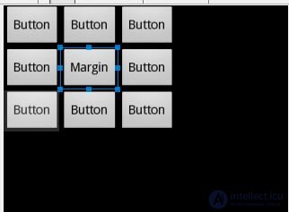
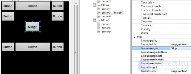
And on the button in the center we will experiment.
margin = 50 dp
Around the button on all sides formed indentation = 50 dp.
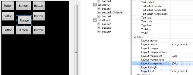
margin left = 10 dp
margin top = 20 dp
Indent left and top.
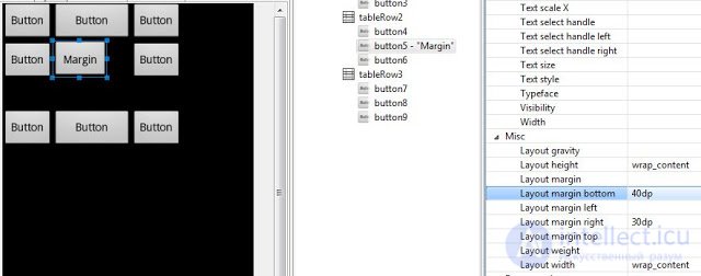
margin right = 30 dp
margin bottom = 40 dp
Indent right and bottom.
The lesson was great, but useful. I think this was the last lesson of design, modeling and layout, and then we will start coding.
If someone used HTML, they probably heard about cascading styles - CSS. Styles allow you to group attributes of elements (buttons, tables, paragraphs, etc.). Then you simply apply styles to the elements, and the element is drawn with all the attributes of the style. And there is no need to repeat the same code several times for elements that should look the same. This is especially useful in case of changes in attributes. You just change the style once and all the elements with this style change.
Android also has styles and they have the exact same purpose. If you have several elements and you want them to look the same, then you simply create one style and apply it to the desired elements. In principle, you can still not bother with this and start using styles when you have gained experience. But for those who are interested in it right now - I ask you in this thread of our forum. The user icamys with an example explains in detail how to use styles.
In the next lesson:
- learn how to access the View-elements from the code and change their properties

Comments
To leave a comment
Mobile Programming (Android IOs)
Terms: Mobile Programming (Android IOs)