Lecture
Typography is an important element in the process of creating a web site design, but most often, it closes its eyes. This is partly due to lack of time, urgency of work, and clients almost never always pay attention to this aspect of design. As a rule, the fonts and design of the text of the site uses a standard, without any frills, the maximum that is done is the selection of headers in the text and some other elements of the site. Those who pay enough attention to web typography can only get the masterpiece design of the site through the same fonts, make it unusual, bright and creative.
In this section of the blog will be published articles about the basics of typography, lessons and tips for novice designers when creating web typography, etc. You can also find the best examples of using typography, bright website designs, programs and services for web typography and everything you need to master this area of web design.
Greetings to all, today, in Design Mania, a guest post about Typography is presented by Dmitry Lezhnev (aka meekman), who is also the CEO of Cifronet.
There are many books and articles on typography, but only some of them reveal the choice and combination of fonts. Due to the emerging opportunities and prospects for the free use of many fonts on the Internet, designers will have to master another important skill - the ability to choose the appropriate fonts that complement their website designs.
Until now, the use of fonts other than those installed with the operating system has meant using images, flash or other workarounds. However, the creators of browsers gave map designers a hand by introducing the @ font-face CSS property, which allows you to register a link to any font file, as a result of which it will be used on the site’s pages.
Immediately there was a problem with companies, developers and distributors of fonts: most of them refused to issue licenses to use their raw-fonts on web pages, for fear of piracy. The introduction of the @ font-face feature has heightened such concerns, forcing both sides to look for solutions that are satisfactory to everyone. Some of them are already available, some are still under development. These include extended end-user license agreements for fonts, as well as third-party services that provide embedded fonts, such as Typekit, Typotheque, and Kernest. Web designers are more free to choose fonts, and font companies and developers get paid for their work. Problem solved? I guess, yes.
Brand new world
We are spoiled. Until now, the use of any font on a web page has been legal. Moreover, all the subtleties of the fonts that had to be used were known. Many of the fonts that will soon be available for use, are not intended for the screen because of their difficult perception or obvious unreadable.
The technical difficulties of using fonts on the Internet are also aggravated. These may include unequal display in different browsers and platforms, as well as problems in processing a font file or even a font family. Page sizes can easily go up to 100k and up. However, let's imagine for a moment that these problems will be solved soon and focus on what we are going to do.
There is a serious possibility that, by gaining access to world font libraries, we will open a Pandora’s box. Many people working in the Internet today have some knowledge of typography, however, most designers may be puzzled by new features.
Context and meaning
The webdesign profession will soon require a deeper understanding of typography and the use of fonts. As this trend develops, opportunities may first be limited, but further the choice will steadily increase. And, as you know, great opportunities lead to great responsibility. If you can use a font that looks like a battered leg, this does not mean that it should be done.
Widely used system fonts, for example, Georgia, Verdana and Arial, are so omnipresent that they are no longer associated with anything other than the “web”. Being unable to achieve the desired aesthetic effect due to the meager selection of fonts, we had time to focus on readability. Largely because of this, the work for the web was based on the principle of “make and forget”, partly due to the rapid development of printing, and also due to the fact that web design does not have such precise typography rules as in the design of printed products.
Flour choice
Of course, sometimes using a font just because it looks interesting can produce acceptable results, but the real art of typography requires an understanding of the fonts and their meanings. Choosing a good enough font is not difficult, but choosing the right font, taking into account societal and technical aspects, can be a difficult task.
The famous type designer Zuzana Licko once said: “Everyone reads better what they read more often.” These are acquired skills. This explains why choosing the font is the typograper's most difficult task: reading is a subjective relative action. To read a long paragraph written in a gothic font that was considered “readable” a century ago, it will take much longer than if a simple font from the Serif or Sans Serif family were used, regardless of whether we read from the page or from the monitor.
In addition to readability, typography significantly affects the issues of contrast and form. Font features are capable of filling a design with meaning: smoothness and saturation of lines, for example, can convey the fragility of a material or the atmosphere of elegance and nobility. The same elements, combined with unexpected textual content, are capable of conveying irony.
The following is a list of features and methods that should be kept in mind when dealing with the growing world of web fonts.
A great guide to choosing and combining fonts
When thinking about buying new fonts, it should be remembered that famous fonts will be a profitable acquisition. Choose those that fit the general concept of readability - those that we use and see daily. Let it be fonts lying in the “readability range” (perhaps you should use a rectangular coordinate system). The further away, the harder it will be to read the design. By the way, do not forget that many fonts are intermediate between readable and unreadable.
CONTRAST
Contrast is probably the most important thing to remember. When combining it is important to make it clear that two different fonts are used, however this is not the only use of contrast. Very different fonts can both complement each other, and shade, creating a kind of tension. Very similar in appearance fonts can weaken the message and change its visual component.
WORK WITH MAJOR TEXT
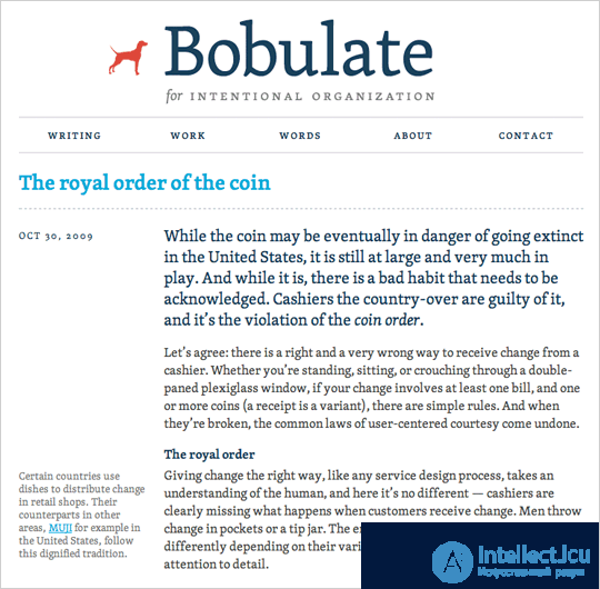
Bobulate uses TypeTogether's Skolar through Typekit
When choosing fonts, I usually start with the main text, because the reader will be looking at it for the longest time. For the main text one should choose intensive and readable with small sizes fonts with reasonable contrast between characters.
The best fonts usually have a certain personality, but it does not distract the reader from the content or the reading process. Fonts that are different too bright personality, it is better to save for selections, as in long paragraphs they are difficult to read.
READ ME!
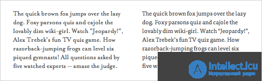
When you reduce the text, slightly increased x-height and contrast can be of great importance.
Standard rules for the selection of fonts are also used for the screen, but because of the qualitative differences between the text on the screen and when printing these rules, it should be adhered to even more strictly when developing websites, and maybe even slightly toughen them. Increased x-height and saturation of the body of the letter will make the text readable even with small font sizes. For example, Verdana and Georgia, proven screen fonts, I have an increased x-height and a slightly increased inter-character spacing, so the text remains clear even with small sizes.
THE ESSENCE OF A MESSAGE
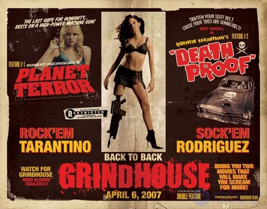
In this poster of the double session of the film “Grindhouse”, many different fonts and styles are used, but this is done in order to imitate the posters of the so-called “operational cinema” of the late 1970s.
To understand what the design is done for, you can write down the general characteristics of the message features that you are trying to convey, and then choose the fonts that embody these features. If you create a design for something serious, a playful handwritten font is likely to be out of place. But rich fonts, such as Franklin Gothic, can convey stability and power, as well as make the text more meaningful in the eyes of the reader.
One font may be enough to convey the essence, the second is usually superfluous. To use more, there must be a good reason - the desire to achieve a certain aesthetic effect, for example, to imitate an old boxing poster, film, or a music poster.
WITH CUTTERS AND NO CUTTINGS

In the Bodoni and Futura fonts, the letters look very different, but their structure is based on the same geometric principles.
One of the easiest ways to achieve balance and contrast in typography is to combine the Serif and Sans Serif family fonts. This simple and easy-to-match combination, with the right choice of fonts, is able to make the text look harmonious.
This is not a strict rule, but the fonts of the same designer are sometimes well combined together. As in two paintings of the same artist, his hand is traced in two fonts of one designer. For example, the fonts of Eric Grill (Eric Gill) Perpetua and Gill Sans are well combined, since they have several identical strokes and lines. It also combines fonts specially designed for combination, such as Meta Sans and Meta Serif.
Combining more than one marking or handwriting font is usually a bad idea. There are exceptions to each rule, but these fonts are so individual that one is enough, and two can distort the message of the text.
Attention should be paid to fonts that have been developed according to similar principles. For example, although Futura and Bodoni look very different, they can make an excellent combination, since they are based on the same geometric shapes.

Baskerville and Futura, “old” contrasted with “new.”
Conversely, two very different fonts can create a new meaning or an interesting contrast. The combination of a transitional font, for example, Baskerville, with a more modern one, for example, Futura, can very interestingly express the idea of contrasting the old with the new.
EXPERIMENT WITH STYLES
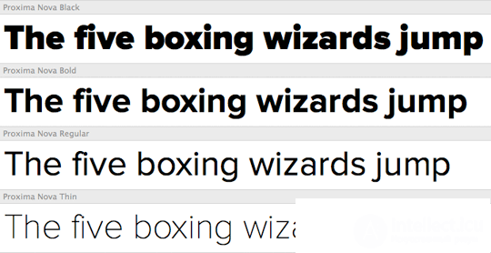
In families like Proxima Nova by Mark Simonson (Mark Simonson), fonts have several types of intensity, which provides various flexible typographic possibilities when creating a design.
Using font families in which you can choose different intensities and styles provides greater flexibility without the need for additional fonts. For contrast, you can make a bold thin or italic font, or try to use uppercase or small uppercase letters, slightly increasing the letter-to-face discharge for subtitles. With fonts with only one type of intensity at your disposal, it can be very difficult to create the contrast necessary for proper visual selection of sections.
TO THE LIBRARY!
Many fonts are associated with a cultural period or subculture. Depending on what the designer is working on, this can be an advantage or a disadvantage. It is best to find out where, when and for what purpose it was created when choosing a font. Sometimes the font can "look" right, but cause incorrect associations. For example, Trajan is used in epics, thrillers, romantic, comedy and other films, although this is a Roman font, which is about 1900 years old. Gothic fonts have long been an attribute of heavy metallers and everything that should look "frightening" and "dark." Understanding the cultural identity of fonts helps to avoid incorrect associations and use them wisely, making your choice clear to the reader.
CASH QUESTIONS
We are so used to using system fonts that many web developers are frightened by the need to pay. However, even using the fonts originally installed on the computer, we do it for free: the cost of the license is included in the cost of the operating system. There are many free fonts, but most of them are free for one reason: they often look great when used for highlighting, but kerning and hinting may not be great, and many of them are not sufficiently developed and functional to be used for serious purposes. . Solid fonts, like almost all quality, usually cost money.
TRUST INTUITIONS
Sometimes two fonts look good together, although there is no apparent reason for this. This is rather a recommendation, not a rule: fonts have many types and styles, and it happens that an amazing combination is formed by fonts that, logically, should not be combined.
ONLY FORWARD!
The number of available fonts is increasing every day. If your favorite font is not yet available, in all likelihood this will change soon enough, although the problem of licensing, receiving and selecting web fonts will not be solved in a day.
Gaining access to an increasing number of fonts, we must understand how they can improve our design and not be limited solely to the criterion of novelty when choosing. If the Internet for the most part consists of texts - and this is true - web typography can really become a very powerful tool.
Translation of the article: On Web Typography (Jason Santa Maria).
 From myself I want to thank and say thank you for the translation of Dmitry Lezhnev (aka meekman), who provided it specifically for Design Mania. It turned out, it seems to me, quite interesting - I personally have never thought much about the typography of the project, choosing standard fonts for the site, but here it turns out to be much more complicated. Designers and layout designers will be very useful to read. Dmitry, by the way, is also to some extent involved in web design, since his company Cifronet is developing websites — a smart investment for any business!
Text layout using CSS3 in practice
CSS3 gives you amazing text styling. Now in the arsenal of a webmaster (or web designer) such typographical techniques and levels of control appear that you could only dream of before. All this is the best demonstration of the guide from the EchoEnduring blog, which I propose to translate. The result is simply unrealistically interesting design of the text and I can’t even believe that all this is done through CSS styles, truly now the CSS3 and HTML5 Internet technologies bring layout to a new level.
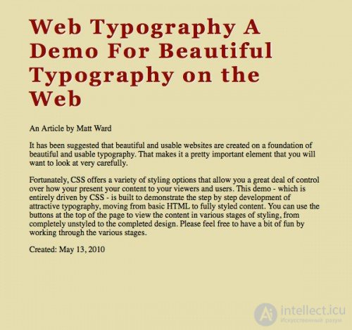
Let's define the starting point. We will start by creating a small web page for which we use this code:
  <h1> Web Typography <span> A Demo For Beautiful Typography on the Web </ span> </ h1>
 <div class = "meta"> An <span> Article </ span> by <span> Matt Ward </ span> </ div>
 <div class = "body"> typing.  It is very important.  Fortunately, CSS offers you a variety of options.  This is a demo - it is a concept that can be used to fully express it.  There is no need for more information.  Please May 3, 2010 </ div>
You can see the result in the screenshot:

In the picture, the usual text is as it should be for a given HTML, it is almost not stylized, although it looks quite decent. But whether still will be!
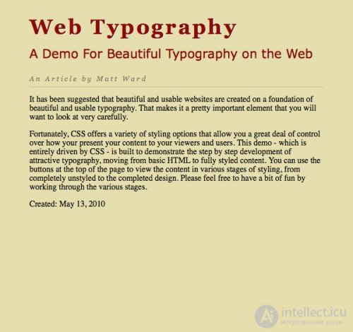
Let's start with the title. Define the font, size, color, add a shadow, change the spacing between characters:
  h1 {
   font-size: 2.5em;
   font-family: Georgia;
   letter-spacing: 0.1em;
   color: rgb (142,11,0);
   text-shadow: 1px 1px 1px rgba (255,255,255,0.6);
 }
That's what happened with us:
Pay attention to the original text. In the title we have a subtitle (with the help of span), so let's take a look at it:
  h1 span {
   display: block;
   margin-top: 0.5em;
   font-family: Verdana;
   font-size: 0.6em;
   font-weight: normal;
   letter-spacing: 0em;
   text-shadow: none;
 }
The heading received at the first stage looked heavy. Благодаря тому что мы выделили подзаголовок оформленный более «легким» шрифтом Verdana (кроме того мы отказались от тени, плюс интервал между символами стал снова равен Оem), наш текст преобразился:

На этом и следующем шаге мы займемся метаданными (в нашем случае данными об авторе):
 .meta{
  font-family: Georgia;
  color: rgba(69,54,37,0.6);
  font-size: 0.85em;
  font-style: italic;
  letter-spacing: 0.25em;
  border-bottom: 1px solid rgba(69,54,37,0.2);
  padding-bottom: 0.5em;
 }
Мы снова вернулись к шрифту Georgia, но на сей раз он невесомый, практически прозрачный (обратите так же внимание что мы добавили к rgb канал прозрачности «а»). Данные об авторе отделены от основного содержания серой линией:
Информация об авторе уже выглядит неплохо, но давайте немного усложним:
 .meta span{
  text-transform: capitalize;
   font-style: normal;
  color: rgba(69,54,37,0.8);
 }
Что мы сделали? Вычленили «Article» и «Matt Ward», сделали их начертание обычным, первую букву заглавной (с помощью свойства text-transform: capitalize;) и немного изменили прозрачность:

Ну вот мы и дошли непосредственно до основного контента. Исторически процесс создания колонок (столбцов) силами CSS был делом непростым. Создавать их с помощью таблиц – решение тоже не самое изящное. К счастью, в CSS3 появились элементы благодаря которым проблема решается без особого труда:
 .body p{
font-family: Verdana;
-moz-column-count: 2;
-moz-column-gap: 1em;
-webkit-column-count: 2;
-webkit-column-gap: 1em;
column-count: 2;
column-gap: 1em;
line-height: 1.5em;
color: rgb(69,54,37);
 }
Мы задали количество колонок, расстояние между колонками, стиль текста:
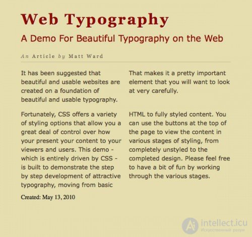
Сделаем над нашими колонками что-то вроде анонса:
 .body p:first-child{
font-size: 1.25em;
font-family: Georgia;
font-style: italic;
-moz-column-count: 1;
-webkit-column-count: 1;
column-count: 1;
letter-spacing: 0.1em;
 }

.body p:first-child:first-line{
 font-weight: bold;
 }
Here's what we got:

Обратите внимания на то, что еще одни стиль (тот что делает первую строку анонса жирным) добавлен умышленно, чтобы показать что вы можете пойти дальше. В большинстве случаев такой прием, конечно же, излишен.
Все что нам осталось – поработать над нижними метаданными (дата):
 date{
  font-family: Georgia;
  color: rgba(69,54,37,0.6);
  font-size: 0.75em;
  font-style: italic;
  letter-spacing: 0.25em;
  border-top: 1px solid rgba(69,54,37,0.2);
  display: block;
  padding-top: 0.5em;
  margin-top: 2em;
 }
Result:
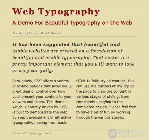
On this I think you can stop. “Live” result can be viewed on this demo site - in my opinion it looks great. Many thanks to the author of this lesson. This tutoril is possible and does not demonstrate all the features of CSS3, however, even those properties that we used make it possible to achieve on the screen of a typography level monitor a decent newspaper or magazine.

Comments
To leave a comment
design software UI and Web design
Terms: design software UI and Web design