Lecture
Terms such as responsive (responsive) and adaptive (adaptive) design, used recently quite often. As it turned out, for some people, these two concepts are almost identical. In this article we will talk about what is responsive and responsive design, and what is the difference between them.
Starting from the moment when tablet computers and smartphones became available to the general public, more and more sites are viewed using touchscreen devices with small screens. Many online resources have been sharply unsuitable for use by the owners of such devices.
There are two fundamentally different approaches to creating websites for mobile devices: Adaptive web design and Responsive web design. Let's consider each of them separately, and then compare their application and features.
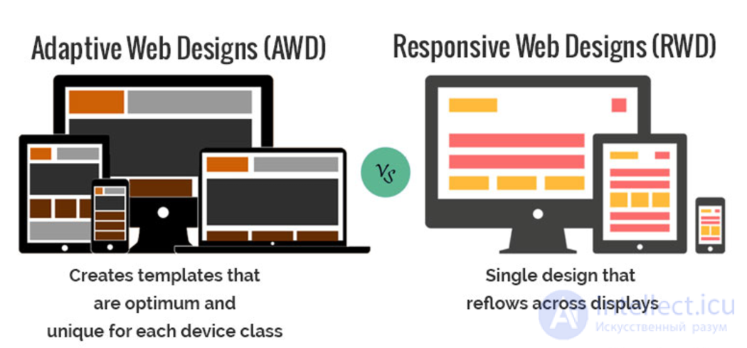
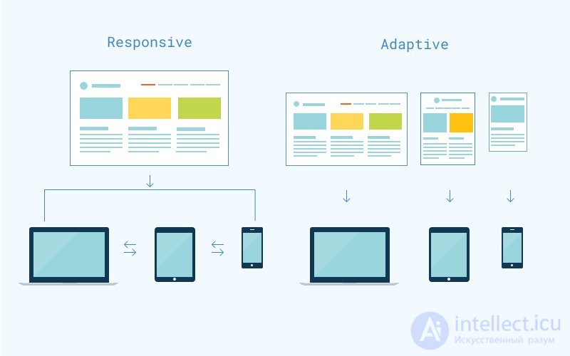
Responsive design (Responsive web design or RWD) is an approach to creating a design in which a website is designed with the intention of ensuring its most simple use: convenient viewing of a website with a minimum of resizing and unnecessary scrolling on the widest range of devices.

Responsive design has the following features:
Adaptive web design or AWD is a design based on operations with different layouts of the site or its markup to ensure its best use on certain predefined devices and screen resolutions.
In runet, the concepts of responsive and adaptive design are almost identified with each other. It should be understood that these approaches differ primarily in the tasks for which they are applied.
Adaptive layout and responsive design are radically different things. Adaptive website markup involves changing the styles of elements on different devices and is used in responsive design. Adaptive design is a separate approach to the design and creation of front-end websites.
Several important aspects in terms of which responsive and responsive designs are radically different:
The speed of the site. A website created according to the principles of adaptive design can load several times faster, since the user will need to download from the server only those parts of the design that are necessary for the website to work on his device. In the case of a responsive design, the user will have to wait for all styles and images to load, regardless of the device used by the visitor.
The complexity of the development. Creating a website with an adaptive design requires a higher professional level from the developer. In particular, a solid experience with javascript.
SEO aspect. According to rumors, Google is much more loyal to responsive sites than adaptive ones.
In practice, Responsive, responsive design, is quite common, as opposed to adaptive. Which is obvious: after all, the first is easier to implement and master. Most of the templates that are sold on marketplaces are responsive, not adaptive.
Adaptive design is often used in serious and multifunctional products. The most obvious examples: in the mobile version of the network Vkontakte, mail from Google.
The variety of devices for surfing the Internet is growing gradually. And therefore it is necessary to create solutions that can meet the requirements of all varieties of browsers and screen sizes. Designers and developers need to make these decisions almost every day. For example, what are they going to use to create another cutting-edge product to meet the needs of users who are becoming more and more demanding!
In this article, we delve into the definition of flexible and responsive mobile web design, what are their differences and how to choose which one should be followed. Both responsive and responsive design aim to accomplish the same task. A website should look great on any device, be it a mobile phone, tablet, or laptop that runs on any browser: Google Chrome, Internet Explorer, Mozilla, Safari, etc. Despite the same goal, in these approaches there are different methods.
Responsive versus responsive design: what's best for you?
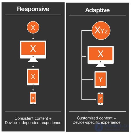
The world first heard about RWD (responsive web design) for the first time in 2010, when a designer named Ethan Marcott mentioned this term in an article, and later wrote a book called Responsive Web Design, which is still considered the most reliable source for This theme. The idea behind RWD is that you have one website for all devices and browsers, where the content is similar to water and is perfectly shaped depending on the size of the browser screen.
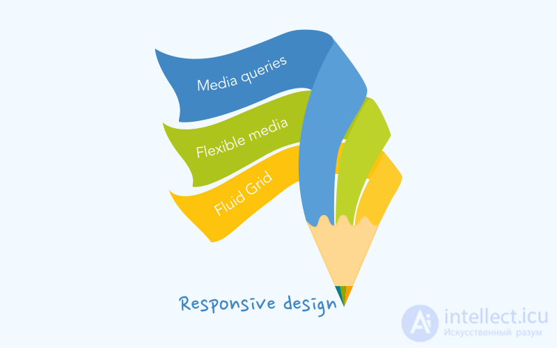
In accordance with responsive design, websites should have the following components:
Based on the grid (flexible layout), you can customize one layout to different devices and browsers, where the content changes in proportion to the screen size.
The trick is that instead of pixels you use percentages and em for fonts. The site page will change relative to the size of the browser window, and the elements will be adjusted proportionally, for example, if a certain column occupies about 60% of the page, it will remain so, whether it is the size of the desktop or the size of the mobile page. Of course, the changes must be reasonable. If there are 3 columns on the website, it makes sense to display only 2 or even 1 of them on a mobile device with relatively small dimensions. There is a point to set the maximum width, but not to make your responsive website look funny on huge TV screens or laptops.
Flexible images (media) images vary proportionally according to relative blocks, but never become wider than the block where it is located (the maximum width should be assigned to all images, video, etc.). This component is required for mobile sites.
Media queries are part of the CSS standard. They are used in flexible web development to optimize the image in accordance with the screen resolution of a specific device where the site can be opened.
Mobile design doesn't really care about devices. The main goal is to create a website that automatically matches browser resizing and has one set of codes. How do you know the site is responding? You simply drag the corners of your browser to emulate different screens. If the content starts to shrink smoothly and continues to look good as it gets smaller, you most likely have a mobile mobile web design.
Responsive design
Another approach to creating attractive web products that adapt their design to different screen sizes and browsers is to follow responsive design.
The world has received the term responsive web design (AWD) after the publication of Aaron Gustafson’s book Adaptive Web Design: Creating Rich Experience with Progressive Improvement. The basic philosophy of responsive design is to create a better user interface, where the site is accessible without any technical limitations. This approach also takes for granted that the website will be configured for different devices or browser width and uses the same technologies as the responsive design. But still, it is very different from RWD. The AWD webpage will change step by step, but not in a liquid way (although you can, of course, enter some liquid elements). Adaptive design is based on operations with different layouts and certain predefined devices and screen resolutions. This is a very smart idea, because,

Not sure that you really understand the difference between UX and UI? This article will help you: Breaking stereotypes about the identity of UI and UX design.
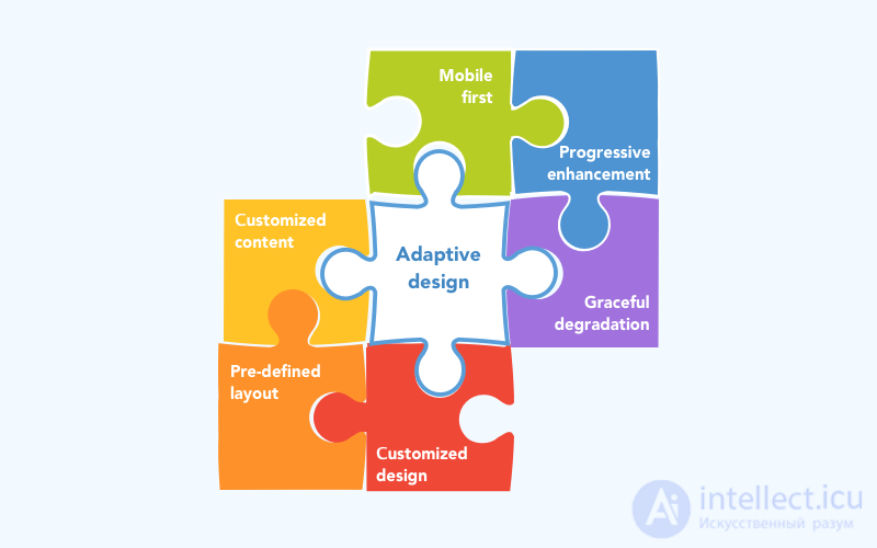
As part of an adaptive approach to design, you must decide who your primary audience is and what types of devices can be used on your website. This is important because, as mentioned above, it is impossible to create only one layout for different variants of this method.
AWD uses progressive improvements and graceful development degradation strategies as part of its approach.
According to the strategy of progressive improvement , you start creating your website that meets all the requirements of the oldest browsers, such as Internet Explorer 8. And then, step by step, you create a website that looks great in the most modern and powerful browsers. This strategy is considered the best choice if you strictly follow the principles of responsive design.
Graceful degradation is another strategy in the framework of an adaptive approach. The strategy achieves the same goal (as progressive), but vice versa. First, you create a website that is best suited for the most used and modern browsers, and then simplifies it to match the oldest browsers.
The strategy of progressive improvement is very convenient: at the end of each stage you get a site that works and looks good in the browser. At each step, you get a more attractive product, using HTML markup to show simple static content and CSS with Javascript for a more dynamic look. The priority of such a strategy is that you can quickly get a simple but complete product.
If your priority is to create a mobile site, in this case, the first principles of Mobile will be useful. The term comes from the book of Luke Wroblewski. The concept is very close to the principles of progressive enhancement, but only applies to mobile web development. The website was first designed in accordance with his view of the mobile phone. All content fits in one column normally and has a compact and compact design. And then the site is designed for other devices, getting more content and dynamics. By following the first principles of mobile development of your site, you can get a full-featured product that will also look on a laptop.
Basic components and principles of responsive web design
It is assumed that websites developed in accordance with adaptive design principles have the following features:
If the website on which you are looking at a mobile phone provides you with various functions, for example, you have a “call to order” button on the mobile version, while there is a “write us an email” button on your desktop This should be a responsive website.
Although it is important to mention that there are many discussions regarding the definition of adaptive and adaptive design. But according to its origin, responsive design has a flexible layout and HTML “one size” markup, while adaptive design seeks to provide customizable products to its users by using different layouts for certain device groups and auto-detection to determine the type of device.
Responsive website on different devices
Benefits
Negative points
Benefits
Negative points
Responsive design and responsive design
Responsive sites are a good idea if:
Responsive websites will be an excellent choice if:
The right choice for your business project.
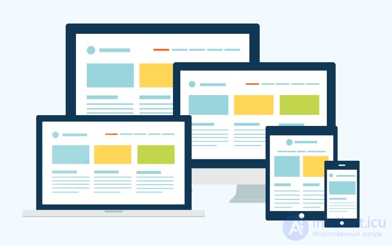
Both types of design focus on the features of displaying sites on various types of electronic devices. Both types of design tend to make the user experience as enjoyable as possible, regardless of the size of the device screen used to access the website or application.
Make sure you know exactly what are the advantages and disadvantages of each type of web design before deciding to invest in any of them. Choosing the wrong type of design for your needs can be a very expensive mistake. In this article you will learn about the basics of both types of web design, which will allow you to make the right choice for your business project.
Responsive web design
With responsive web design, you can create a flexible grid, where different elements of the page (for example, images and texts) will react to which device and browser is used to view the site. The key elements used to create a flexible grid are the CSS3 Media Queries. What happens with this? In essence, a template is created with different segments responsible for the screen size in which the template will be displayed. На рисунке ниже отображен этот эффект.
Отзывчивое изменение размеров страницы (Responsive Page Sizing)
Адаптивный Веб-дизайн
В противовес отзывчивому веб-дизайну адаптивный веб-дизайн не имеет одного гибкого шаблона. Вместо этого данный метод использует многочисленные конструкции, различные шаблоны, которые адаптируются к характеристикам заранее определенного набора возможных устройств. Например, дизайнер может создать три различных макета: шириной в 960 пикселей для настольных браузеров, 760 пикселей для планшетов и 320 пикселей для малых мобильных устройств. Независимо от того, какой бренд у электронного устройства, три шаблона будут единственными возможными для отображения для тысяч различных размеров экрана.
Принятие решения: RWD или AWD
В случае, если ваш бизнес хочет, чтобы создать веб-сайт или приложение, способное доставлять индивидуальные удобный опыт для любого типа устройства, независимо от размеров экрана или его разрешения, то стоит использовать отзывчивый веб-дизайн (RWD).
Тем не менее, если вы четко очерчиваете набор электронных устройств, с которых будут заходить на ваш сайт или в приложение, то адаптивный дизайн (AWD) станет лучшим решением, так как этот метод позволит наиболее оптимально и ярко отразить всю специфику макета.
Адаптивный и отзывчивый типы веб-дизайна
Почему отзывчивый веб-дизайн обычно лучше, чем адаптивный?
Хотя и у RWD, и у AWD есть свои преимущества, когда дело доходит до их сравнения в глобальном плане, перевешивает отзывчивый (RWD), ведь именно он обеспечит наиболее приемлемую подачу информации для любых типов устройств. Другими преимуществами отзывчивого веб-дизайна являются следующие:
Так или иначе каждый должен проанализировать свои потребности, цели, аудиторию и, исходя из этого, оценить преимущества обоих методов: RWD, AWD.
Last but not least, we would like to mention that neither of these approaches is better or worse than the other. Again, the choice is yours. Until you forget to start the development process first, you will flourish and also have happy customers!
We hope that after reading this article you now have a much better understanding of the topic, and it was helpful to make your choice.
If you need additional advice or you are ready to start working on your project, do not hesitate to write to the comments!

Comments
To leave a comment
design software UI and Web design
Terms: design software UI and Web design