Lecture
Color is a kind of "generator of emotions" of visitors to the site. The color design of the resource pages transmits emphasis on important information that may cause excitement or stimulate certain actions. This is a powerful factor in manipulating the user's emotions. For proper selection of colors, follow the main principles of color theory: unity and contrast of tint combinations.
Color combinations can be either complementary or contrasting. The principle of unity consists in the selection of similar tones for the design of components of a web page of similar functionality. So you set up a resource visitor for peace of mind and thoughtful information processing, easier navigation. However, the abuse of the implementation of the principle of color unity will lead to the fact that the site is quickly bored with its monotony. Contrasting elements will help to avoid this.
Color theory
For people with a developed taste, that is, an intuitive understanding of the correctness of combinations, the design of a web resource does not pose a problem, but even it would not hurt them to become familiar with the basics of color separation.
The coloristic theorists are based on the color wheel of Isaac Newton, the result of the work of a physicist on the division of white into seven components - the spectrum. Thanks to the circle, you can consciously select shades that are in perfect harmony with each other.
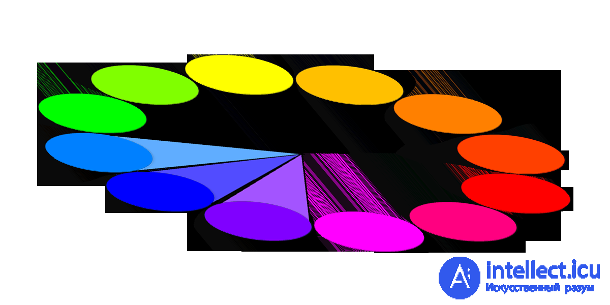
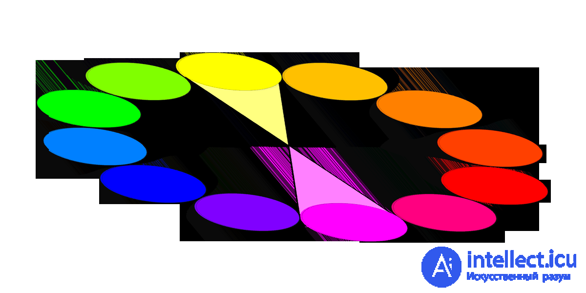
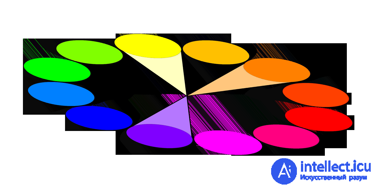
There are only six primary colors: red, orange, yellow, green, blue, purple. The right combinations: two colors opposite each other in the spectrum, three colors at equal distances, four pairs of two opposite each other (they form a rectangle). The theory of combinations applies to absolutely all colors in the spectrum circle, regardless of the angle of rotation.
Red, yellow and blue colors can not be obtained by mixing - they are basic. And their combination leads to the formation of additional: green (blue + yellow), orange (red + yellow) and purple (red + blue). Mixing the three color components gives tertiary colors. There are many combinations.
Contrasting colors are called opposite to each other in a circle: red and green, purple and yellow, blue and orange. To attract special attention to a particular element of the website, use these particular combinations. For a harmonious perception of the components of the resource, combine those located in a circle nearby. So you will achieve a feeling of comfort from the visitor.
Ethnocultural symbolism of color
Be sure to consider the ethno-cultural identity of the majority of visitors to your resource. Color associations in different cultures are very different. Consider the main ambiguous color-symbolic stereotypes.
Red symbolizes:
• in China - good luck, triumph;
• in India - cleanliness
• in South Africa - mourning;
• in the East - red + white - joy;
• in the West - passion;
• Holidays in the USA: red + white - Valentine's Day, red + green - Christmas;
• in Japan - life;
• feng shui means yan, fire, luck, respect, protection, vitality, money.
Blue symbolizes:
• in Europe - calm;
• in Iran, spirituality as well as mourning;
• in China - immortality;
• in the Middle East - protection;
• in the West - sadness, depression;
• feng shui means water, peace, love, healing, relaxation, trust, adventure;
• In many cultures, it is the color of security.
Yellow symbolizes:
• in Europe - happiness, hope, joy, but also weakness;
• in Asia - imperial color;
• in Egypt - mourning;
• in Japan - courage;
• in Buddhist countries - wisdom;
• Feng Shui means Yang, the Earth, the sun's rays, heat, movement;
• In India, it is the color of merchants.
Psychological features of color perception
The reactions of the user of the web resource can be foreseen and even formed. To do this, use the color as a lever to evoke feelings. Consider the most common emotional reviews on colors.
Red causes feelings of excitement, courage, desire, awakens leadership beginning. But do not abuse them, making out the site, because the color is so strong that it can cause a feeling of anxiety and danger.
Blue adjusts to calm, forms a sense of peace, reliability, love, stability. If you want to inspire confidence in the professionalism of specialists or the quality of products represented by a web resource, be sure to use the possibilities of blue. This is especially true of sites, most of whose visitors are men.
Yellow awakens energy, curiosity, associated with joy, entertainment, intelligence. But! Try not to overpower a resource with this color - to arouse a sense of caution.
Orange causes a feeling of cheerfulness, stimulates creativity, friendliness, playfulness, gives a feeling of confidence, even courage and perseverance.
Violet awakens ambitious thoughts, associated with power, wisdom, luxury, magic and mystery.
Green is not only the color of vital energy, but also evokes thoughts about money, while associating with harmony, nature, healing.
Brown is accompanied by a feeling of relaxation, confidence, stability. It means durability, earthiness, nature, comfort and reliability.
Gray is the color of conservatives. It contributes to a sense of trust, seriousness, honesty.
Causes feeling, conservatism and traditionalism. It excites the feeling of purity and innocence.
Pink is good for forming such feminine emotions as romance, education, weakness, passivity, affection. The website for men would be inappropriate and not conducive to the influx of users.
White is the color of purity, simplicity and kindness.
Black is associated with power, elegance and style. Excellent color to give perspective and depth to design. Use moderately so as not to cause a heavy feeling in the visitor.
A few little secrets of web designers
Professional web designers often follow the same scheme:
• They match the contrasting background color and text. It is easier to read and perceive articles.
• In addition, avoiding coarseness: the number of colors is limited, while at the same time trying not to use them too little so as not to make the design boring.
• Do not neglect intense colors to attract the visitor.
• Look for inspiration and new color combinations in natural color combinations.
Itten's color wheel. It looks something like this:

It consists of 12 colors. These colors are considered the most familiar and easy to human perception.
The primary colors are considered to be three primary colors: yellow (ffff00), blue (0000ff), and red (ff0000). Based on these colors, the entire color wheel is created. They are primitive, because if you have these three pure colors by mixing them, you can create a whole palette. Any colour.
Second order colors are obtained by mixing the primary colors: m *** arinic (ff8000), magenta (ff00ff), green (00ff00).
Colors of the third order are obtained by mixing the primary colors and the colors of the second order. There are six of them:
This circle can be said to be a panacea for all ills. With it you can select the most successful color combinations. For this there are six principles of color harmony. The so-called color models.
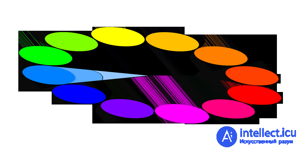
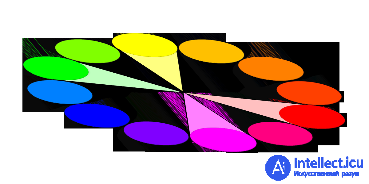
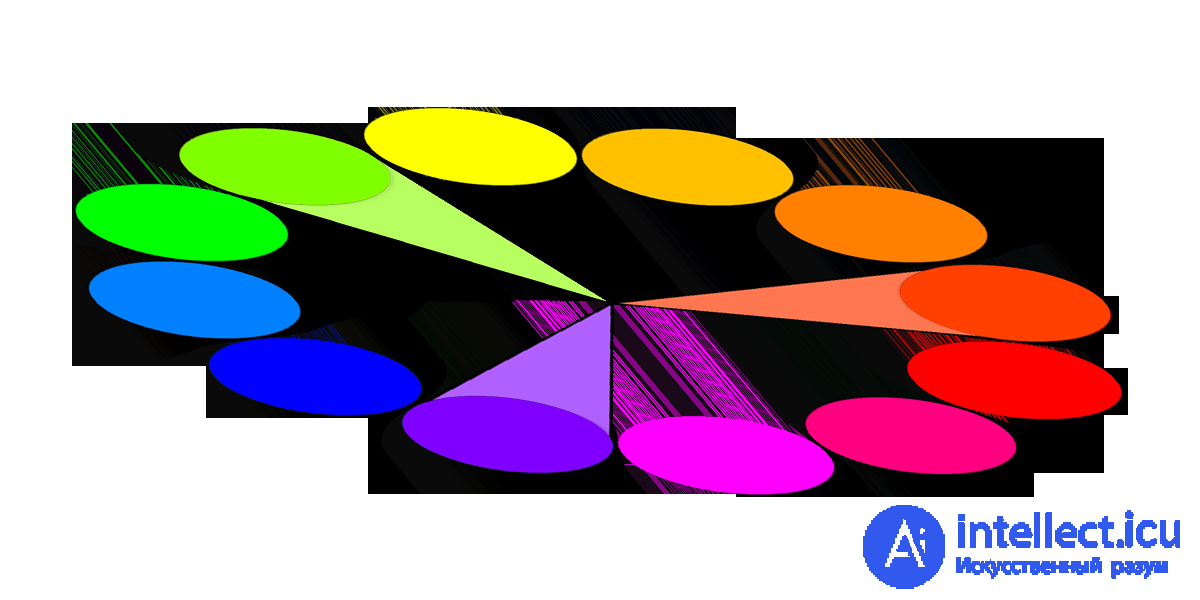
The principle of working with color in Itten's circle is simple: pick up 2-4 colors through the principles of color harmonies and experiment with brightness-contrast, fill area.
Well, in addition, it is worth mentioning the achromatic colors. No colors, no shades. Only gradation from black to white. Full range of dullness. Huge selection.
And, lastly, small nuances and subtleties:
The presence of pure white or pure black in the color scheme of the main six harmonies, enhances the contrast, respectively, the interface will be very “alive” if you do not overdo it with the color coverage area. Otherwise, excessive color activity will be annoying.
Want to draw attention to the color and make the site as bright and expressive as possible? Take contrasting colors. Add some pure white or velvet black. Make a large menu and volume font. It'll be enough.
We need a calm unobtrusive interface for a serious project — monochrome combinations to help you.
And, an important rule in the interface color matching: minimalism. Five colors is the maximum limit. Do not overload your site with all the colors of the rainbow. No need for a patchwork quilt here. Your task is to convey information, but not to frighten people with variegation.
Used materials:

Comments
To leave a comment
design software UI and Web design
Terms: design software UI and Web design