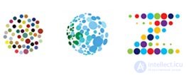
Drops and diverging points A drop shape is played up, where there may be several objects. Drops can be placed both separately and in symbolic fusion with each other. The effect can also be used to express a
technical or scientific association . Forms can be shown both flat and with a claim to three-dimensionality due to shadows or the introduction of additional tonal strokes.
With very few exceptions, divergent dot logos consist of a series of dots, increasing or decreasing in a clear mathematical sequence. Most of these signs seek to reflect the movement in order to better convey their meaning. You can call it a frozen animation. Each picture is a stopped motion, with elements of different caliber or color intensity depending on the time of their release to the viewer.


 Simple geometric primitives
 Over the past few years, there has been a return
to simplicity in corporate emblems . On the other hand, they use this style quite often. There are still many signs that are primitives, combined with simple slogans. Is this a respect for the 1970s and the emblem design classics? Or is it easier to do this on a computer where initially simple graphics prevail? Or maybe there are no more designers who can draw?


 Pop style "Hello Kitty" 60s
 This is a return to the past, which is repeated every 30 years. Companies that work for young people adhere to the language of pop culture of the late 1960s - early 1970s. This style arose at a surge in popularity, perhaps as a result of companies' willingness to be led by their modern style of youth culture.


 Spiral motifs
 These are associations to spreading circles on water or spiral forms in mixed paint. Or it is a picture of a circle of light created by a child. These are bionic natural similarities of a spiral, but not dry mathematical computer models. In particular, this is a combination of chaos and geometry with a claim to freedom.
Hollywood actively exploits DNA as a symbol of mysterious corporations in science fiction scenery. The design community so often uses a double helix that this symbol no longer has an unambiguous meaning: it is the germ of life, health and longevity, family tree, code, riddle, or unbreakable sequence — all possible options are involved.


 Images of animals. Flora and fauna
 They are used to quickly create an image of the company by creating an image that reflects their specific animal characteristics on the company and is associated with it. Although this tactic, I use more small and medium-sized companies, there are several large corporations of companies that use this method. Although illustration styles vary widely, all of these emblems are styled according to the rules for the design of the mark.
Flora - this may be the evolution of last year's curl trend, or part of a more global trend that unites them. That same trend, which borrows the remains of a patterned Victorian era, to give a little more thin warm humanity solid shell of wiser sterile logos. This attracts the consumer to visual participation in the non-confrontational fashion stream.




 Deformation principle, axis
 You can take a simple geometric solution and make it great. Tilt it or wrap it onto a sphere, a task easily accomplished. Thanks to this tactic, even very simple two-dimensional solutions of the emblem can be transformed into 3D.
Such signs can serve as a model of the communication structure of any online community. There is a central axis that serves as a source of information. Without this axis, satellites lose contact with each other. So, regardless of whether these logos are a communication tool or not, the divergence from the central point is their main concept. And one more meaning that can be invested in such a graphic solution is the interaction of individual elements of a single structure to achieve a common good.


 "Humanization" of the mark
 To make the image of the company more
friendly and likable to a person , many brands have been turned into a face or a small person. Parts of these are signified in the eyes, noses, ears, and mouths. Although these ideas have been used for generations, designers continue to find new and new solutions.


 Use of shadows
 Hard or soft, the
shadows continue to give a sense of space where the sign is located. Sometimes shadows are used below the mark to give it greater expressiveness: an emblem that defies seriousness must have unusual qualities. Other emblems used a shadow because, they had no basis, and the shadow binds them to a specific place.


 Illuminations. Overlay and transparency. Gradients and lights
 Designers continue to mercilessly crush the rules, according to which logos are being created for an entire era. There are no more printing restrictions, the borders of chromaticity are overcome. In addition, many designers and their clients agreed that they would definitely never print their logos in the Yellow Pages in their lives, so there is no need to develop at least one version of the flat and monochrome logo.
Fact: An old rule that dictates that any really well-designed logo:
1. applies only in one color
2. the form is painted in silhouette
But on the Internet (when the image looks in transmitted light) now there are rules. There are many emblems today such as MSN Butterfly, which use transparency, which show themselves through multiple layers.
Radiant signs carry a certain warmth and comfort; psychologically, the effect of radiance is comparable to the effect of light at the end of a tunnel. Such light begins to prevail when we try to convey optimism, purity, warmth, or deliverance from something negative.


 Ecology and living greens
 This is a literal and metaphorical trend. This is a trend that is the breath of fresh air in an industry overrun with red, white. This is an ecological hit of companies. This is an emphasis on natural pure elements.
The main thing that has to keep pace with the entire corporate world is compliance with regulations related to the maintenance of the environment.


 Punctuation marks
 A peculiar Internet hit associated with the symbolism of a computer keyboard and advanced and developed by the younger generation of Internet users.


 Label principle
 These are simple, even primitive in shape signs, which are simple silhouettes of certain objects. The word identifying it (name) is clearly written on such a silhouette. The image says what they do and the word says who they are. Everything is extremely simple and honest.



 Photographically accurate images and 3D
 Very natural or even exaggerated images. Images are placed on a local (for example white) background, and the company name is placed below. The style is much more advantageous when the visual is supported by the corresponding text, or when the text is unexpectedly original for the visual.
The problem with using 3D-logos is that the company must have sufficient media resources to transfer its identity in full. That is why many 3D-logos only imitate the volume, but do not fully possess it.


 Spirograph effect, rings
 This is the effect of artistic spirals. Such a mark is usually placed above the company name. The curvilinear form is very reminiscent of the Spirograph fun, and perhaps these precise, but smooth shapes convey a sense of satisfaction that two plastic gears (gears with teeth inside and out, who knows), four pins and a ballpoint pen can depict these wonderful beauty ( though completely meaningless) spiderwebs.
Ring-shaped structures are designed to reflect the concept of a common product or divisions working together as a whole. And the density of the rings and the difference in their shape may reflect the corresponding parameters of the connection of the parts of one whole in the company. Color reflects the individuality of the individual components and helps to understand the general idea that the whole being created is more than just the sum of the parts.


 Line, flap and ribbon
 A sign is an object formed by one continuous, precisely designed line. Picasso and Calder discovered this path before others realized the form as a means of logo design.
Many of the best ribbon logos were created at the very beginning of the trend. And now there is still space for other ideas with ribbons, they are just smaller and they are farther apart. It will be interesting to see how the environmental trend clashes with this, the tape. Then we will have to develop a global plan for the disposal of all these magnetic tape badges, which we have already filled up.



 Pseudogers
 At first glance, the logos of this category look like something from the book 101 heraldic sign, something like that. But only until you start looking at the compositional elements: there you will find crossed guitars, penguins, boots, cell phones and all these incredible things that are certainly not from the era of Camelot. This is the lot of youth; Designers have chosen this style for the fashion and music industry. In fact, this is a fashion trend that can be seen now almost everywhere, despite such intricate heraldic and Victorian roots.
 Toys Mascots
 Vinyl designer toys became popular for the first time in Hong Kong in the 90s thanks to Michael Lau. Now they have become a collectible, and they have their own stores, such as KidRobot, and magazines like Super 7, entirely dedicated to vinyl figurines. This can be anything from fire-breathing dragons to alien cyclops. Of course, among the logos of companies belonging to the Fortune 500, there are hardly any similar ones, but these funny vinyl pieces are already well established in pop culture and are increasingly appearing in a two-dimensional logo form.

 Halves
 Where is the second half and why? Was it cut off, crawls out of the limits of something, does it sink, or vice versa? A simple play on words, or in some cases images, allows the buyer to associate the product with an action. In some cases, the cut off part of the picture is something like a challenge to the viewer: a beautiful number or a letter is cut in half - this is akin to heresy! The letters for customers are holy: you can change them as you please, but completely removing a part is what makes people look.

 Overlap location
 The elements put together, which have nothing to hide at the same time - a symbol of a clearly built, diversified and at the same time transparent structure. Overlapping elements can tell a story about a company or explain its architecture. With the development of design software, creating images with transparencies has become simple and convenient - you can immediately see the result of various color overlays and easily adjust them.

 Optical illusions, op art
 The idea of the possibility of the impossible - this is how designers characterize the attractiveness of such logos for their customers. The visual essence of illusions in this case is something like the statement "We do things that others cannot, we know special workarounds." Often in this category of logos draw initials, capital letters of the company name. Due to the volume effect, such signs are not uncommon among architectural companies or those who offer a view of something from a new point of view.
 Other trends 2007-2009:
 1. Animated movement: these logos are made already in motion, unlike those that were originally drawn flat and later animated.


2. Wreaths: a set of elements, sometimes so thin that earlier they would not be considered part of the logo design, assembled into a patterned whole.
3. Rainbows and blurring: a trend, perhaps born out of the popular all-in-one concept, supported by customer loyalty to bright colors, but nurtured definitely by the permissiveness of RGB.


4. Figures: replacing letters with figures similar in appearance or phonetically replacing part of a word.
 5. Holes: Designers play with the surface of the paper, driving logos under the cuts or letting them look out of all sorts of holes.

 6. Dragons: set, set of dragons.
  7. Pixel, hex and mosaic. Large tangirye points: very close ups on the tangirka grid, the points blur and overlap.


 8. Cartouches: more and more logos are supported by ornamental frames.
  9. Hidden items.
  10. Flaps
  11. Inlay
  12. Dandelion motif
  13. Cubism
  14. Tentacles and roots
  15. Parts
  16. Dust
  17. Image in image
  18. Spots and blots
  19. Explosion
  20. Wallpaper
  21. Text in frame
 Other trends that have already emerged and are developing in 2010: 1. Rainbow - the use of the entire color range. 2. Curvature - a reflection in a curved mirror. 3. Stretching - as in zero gravity. 4. Patchwork - mosaic, clear geometry. 5. Pressed molds.


Comments
To leave a comment
design software UI and Web design
Terms: design software UI and Web design