It is worth noting that this is a report on trends, and not a treatise on recipe styles.
It is also not a final list and not a dogma: There are other good trends and new styles that are not mentioned here.
This is an excursion into what is new in logos.
The word “trends” may in itself have a very negative meaning, but in reality, these trends are not so bad.
They show our height (above ourselves :)). This is our landmark and our bar. And this allows us to learn, change, move on, and not stand still.
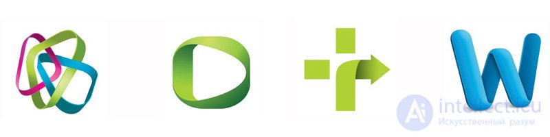
1. Gradients Not every trick in the designer's palette should be clearly noticeable: Subtlety, of course, can play an important role in the battle for the attention of the consumer. In a number of emblems, delicate linear gradations are achieved by minor discrepancies in color. Color gradations can be either no more than a 10% shift in the color value (in hue) or a more dramatic color deviation, for example, from purple to dark purple.
This direction allows developers to create dynamic solutions that visually move or change color, but not through vector shapes or images. This reception is a continuation of the trends revealed in the last two years.
 2. Juvi
 These logos are similar in style to the style of Hello Kitty, where everything is too cute, with the smell of cigarettes on the breath. We have seen this technique for some time, but last year the trend reached a turning point. Designers' passion for social symbols of culture led to an enchanting solution to yet another logo design style.
The society has become pleased to accept such a flow. Gaming symbols, Twitter birds, manga are all new generation visuals. These logos are simple geometric images.
 3. Vibration
 The style of this logo reminds us of a certain symbol of bad and unfair typographical printing. These small bundles, which caused visual vibrations that seem blurry and unclear, as for a half-witted reader, have now become another trend of logo presentation.
What was once considered a CMYK print issue is now perceived as a matter of focusing a 3D movie when the viewer removes special glasses to wipe them. Any of these images reminds the consumer about modern technologies. There is also a negative aspect of perception of this approach. This is perceived as an optical illusion and not everyone may like it. The question is difficult because you might think that the designer has coaxed and this is just a print marriage.
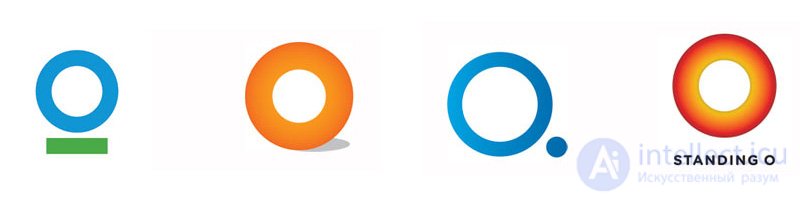
 4. O
4. O Yes, it is O! This 360-degree, not elliptical, but very round. But this is not just an empty circle. Here everyone sees his logo through the prism of his personal perception. And in my opinion too poorly).
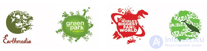
 5. Earth
 This is a solution for a client who wants to see his logo in the context of the Earth. The trend can be divided into two categories: worlds on the perimeter inhabited by current images or worlds built from actual images. Since both variations appeared simultaneously, we will consider them as a sustainable solution.
The logo is interesting dense placement of a large number of parts in a limited space. Small details that disappear when scaling should probably be avoided. This trend invites the viewer to enter the miniature world, which is located in the hands.
 6. Highly specialized
 There is a certain elegance in ultra-thin lines, the designers have always known this. This is a definite challenge to the viewer, since such logos do not scale well and are difficult to see for people with poor eyesight. But this trend can also have its fans.
 7. Series
 A customer having a series of logos is absolutely nothing new. It is a time-tested solution for maintaining integrity, consistent with visual identity, focusing on specific departments, products or services.
Remarkably, this is a trend of a family sign. In some cases, there are major and minor logos. However, in other cases, each logo is equally important, and there is no single flagship logo. This may be a set of icons for mobile devices or Internet applications, social. networks where one sign with slight variations means different services. The color coding of the series is not particularly effective, since The audience should remember all the nuances of such a system. There are also consumers who do not recognize and do not understand this approach, which is dangerous, since this audience is lost.
 8. Brown
 Every year we see color preferences appearing and disappearing. This year, designers have found that brown can be attractive. This was a bold step that guarantees the emergence of a new trend.
This approach is built on the nuances and is a consequence of new thinking. The tone varies from sepia, chocolate and even warmer. Auxiliary colors are also not bright in the tone of the main. Pink always works well with brown, but other colors apply here. As a rule, these are pure colors that are lightened by 50%.
 9. Dandruff
 Any of these logos can do without the dust of white disruptive plaque, but this is what helps to distinguish these signs in a particular genre and makes them more visible.
But this art of crumpling and acid breaking has been popular for many years. This subtle effect has several intrinsic differences that distinguish it from the usual methods of distribution (disruption of the structure). These splashes on the surface, by the way, are not always uniform. Most often it applies only to specific areas. Because only limited portions of the mark can use this effect, these logos can live with one foot in the future and the other in the past.
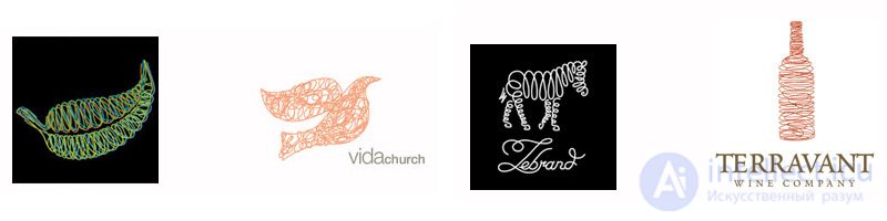
 10. Spirograph. Spirals
 Yes, such logos are pretty detailed. But this trend of logos has an almost hypnotic optical mystique of perception and quite often simply fascinates the consumer. The repetition of thin lines is concentrically adjusted, so that the proposed image could symbolically achieve the same effect as a section of a tree, which tells the story of his life. This could be a travel story or a process schedule. The scientific nature of the creation of these marks is closely related to the technology that helped translate them into action.
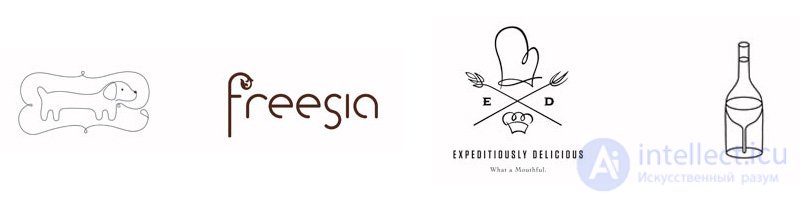
 11. Ariadne's thread
 A clear, lively, hand-made, tricky line is applied to the surface. It is chaotic and unremarkable, but it forms a recognizable shape with its silhouette. The logos of this trend this year were silhouettes filled with erratic scribbles.
 12. Records
 These marks often resemble colored plastic or other flexible materials. Signs are constructed as three-dimensional forms that are pseudo lighted and even cast a shadow on their planes, but we do not see the shadow of them on the page. What makes these signs unreal.
Flat and uninteresting graphic objects acquire a pleasant aspect, which is attractive to the eyes of the consumer. This method represents a graphic compromise between the flat shapes of vector objects and pseudo three-dimensional motifs of the last decade.
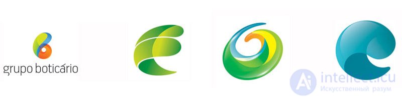
 13. Comma
 What is interesting exactly in this form? It will continue to be repeated in a wide range of different embodiments. We call such motifs a “comma” because they look like big commas. This logo is quite dynamic. Or maybe it is a seed unfolding when it is preparing to jump into life in a new form.
As a trend, it seems to be imbued with visual magic, which hints to the viewer not to look for explanations, but simply to observe the form that was seen. Do not try to understand.
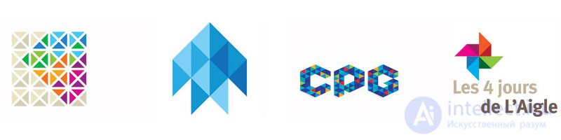
 14. Triangles
 Like those building blocks of the universe, designers learn how to use these modules to create space, size, and shape. Clustering many triangles to form a larger whole can create a mosaic of diversity.
The triangle itself is not interesting, although it is graphic. This is a primitive figure and can create a negative impression as an example of a logo. But connect triangles of two, three or a bunch, and they become an excellent rapport field that can be interestingly organized and you can build almost any shape or size from it. This is a stylish form, it is like building a dna or a universe of molecules. The possibilities are endless.
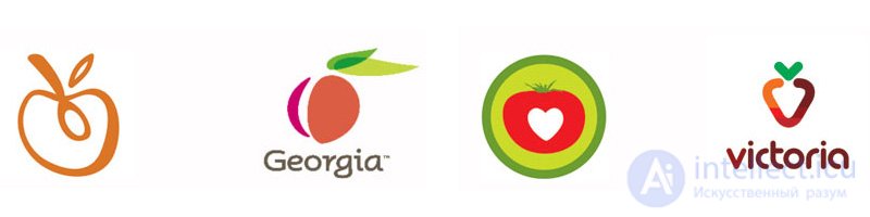
 15. Fruits
 When was Apple not an apple? When was the Blackberry not a blackberry? And these images from the world of fruits are symbols of leading brands in technology, innovation and communication.
The trend of depicting fruits as symbols is something other than showing a garden or an industrial technology of processing fruits, for example, in jelly.
Over the past year, these sweet perfections of nature have been consumed everywhere in the field of symbols, signs and identity. Each type of fruit can cause positive associations and memories for the consumer and help the producer to find a common language with the consumer. These are tactile and familiar representatives of nature. They are a symbol of purity and procreation where everything is in one. They are quite loved and understood to attract many fans and customers.
 Other trends and logo styles that have already emerged and are developing in 2011:
 1. Back Again - back to flat vector.
2. Isometry of pixels.
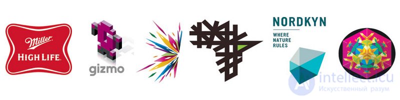
3. BlackHole - asymmetric flying elongated parts.
4. PickUpSticks - Silhouette of intersecting lines.
5. The movement of the form.
6. Medallions - these logos look more like round Aztec calendars than a logo, there is too much information.
1. Marker.
Application pointer Here used on maps.
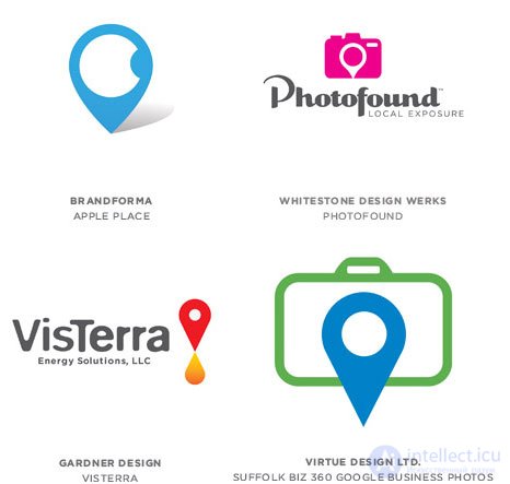
2. Crosshair.
Use intersecting items.
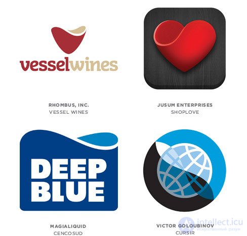
3. Infinity.
Using an element of a wave that looks like an infinity sign.
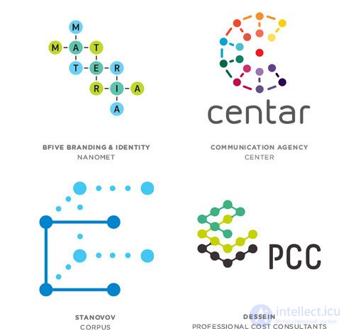
4. Molecules.
The use of elements of molecular structure.
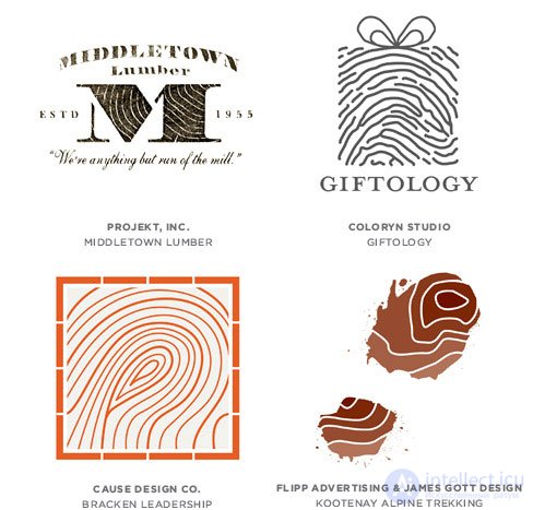
5. Texture of unique fingerprints.
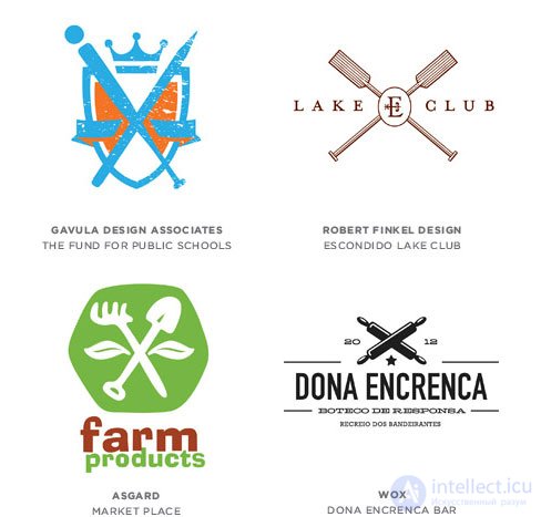
6. Asymmetrical compositions.
Masonry, randomly located bionic spots or cuts, camouflage nets, etc.
7. Ingredients.
We break the process into stages. This is no longer a logo, and the signs of visual communication are obtained).

Comments
To leave a comment
design software UI and Web design
Terms: design software UI and Web design