ELEMENTS AND DESIGN PRINCIPLES.
Many people will be able to distinguish good design from bad, but when they themselves begin to practice in the field of design, they usually do not do anything good, because they do not know the principles of design, they can not look at their work from the right point of view.
In these articles I will try to tell you about the basics. My articles are designed for a reader who has just encountered the design area. Of course, it is more correct to buy a smart book, where they will tell you more and more thoroughly, and it is best to go to courses, but they are usually biennial, if these are good courses, and not a waste of time.
You know, pl *** hto designer who does not know how to manage the attention of the viewer. Design principles are based on the perception of visual information by the human brain. Depending on the goal, you can use certain techniques to achieve the desired reaction from the viewer. It is not too difficult when you have in your service practical psychology and knowledge of how to manage the design elements, organize them into a single composition. You have modern advances in information technology (computer, graphics programs, tablets). And in the end, at your service are paper, brushes, pencils, paints, and many other tools. And also head and hands :)
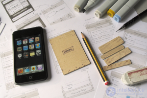
Pencil and paper vs design tools
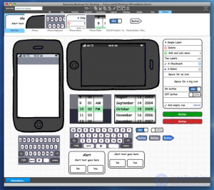
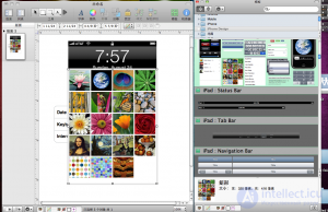
Over all these years, I was repeatedly asked why I, the designer of interaction and user interfaces, do not use any drawing tools or prototyping systems, and still prefer pencil and paper, despite the availability of all these really smart and convenient tools. Well, try to explain.
Usually I never get to make the first draft of a prototype software from one time, even though I carefully study the wishes of the customer and users. Understanding the new field is a time consuming process. Before I demonstrate the first draft of a prototype to a customer and users, I always learn a lot about a particular subject area. However, it always happens that the customer forgot to tell me something very important, or I myself could not understand the importance of something. These amendments, as a rule, require adjustments in the design. And here begins the complexity ...
I have noticed that it is much harder for me to force myself to make the necessary changes when I create a prototype using software, rather than on paper. I noticed the same thing about my colleagues. Why? The answer is simple and lies on the surface.
The fact is that one of the main thrusts to the use of frame representations before starting to write code was the fact that the developers reluctantly took to rework the design, because this meant massive code changes, a waste of time and money. To limit the amount of transcoding, frame models appeared (among other things), because to sketch a model frame on paper takes less time than writing code, and therefore it is easier to change if necessary.

But with the increasing popularity of frame drawings in the development process, tools such as Axure, Omnigraffle and Balsamiq began to appear. I noticed that it takes me a lot more time to sketch a framework in any of these programs than on paper by hand. So, if the first time I did not work out, you will need to redo the prototype. In order to remake the prototype in the program, I will have to spend a lot of time again and the very thought of it discourages any desire to start working.
It is noticed that the more time and effort we spent on some task (programming or drawing is not important), the less we want to change something and the sooner we begin to resist reasonable arguments in favor of the need to change something. It is for this reason that I returned to drawing prototypes by hand. This method requires a minimum of time, even in the case when you need to completely redraw the model.
So take a pencil, a sheet of paper, an eraser and a ruler and start working in the old fashioned way!
DESIGN ELEMENTS.
If a design is some kind of whole composition or structure, subject to a specific goal and idea, then the design element is this part of the composition or structure. The following design elements can be called: line, shape, chiaroscuro, color, volume and space (illusion of depth), texture and texture.
Line.
Line.
Science geometry describes a line as the shortest distance between two points. Perhaps this is true, but for us the line is more significant, we, of course, can consider it as a geometric object, but we are more interested in the meaning that the line can carry. When you enter another line into your composition, it is able to set a completely different mood and meaning to your work. The line can, on the contrary, support your construction. As with all other design elements, the line must be taken seriously and thoughtfully.
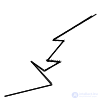
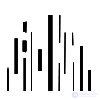
The direction of the line and the location of the line can create a certain mood: for example, horizontal lines create a sense of calm, static. Vertical lines suggest the possibility of movement, dynamics. Polyline - energetic, perhaps even aggressive.
Not only the direction of the line, but also how it is executed, how thick this bar affects our perception of the line.
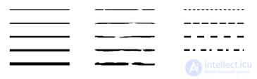
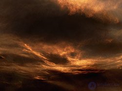
Look at the lines in the pictures. What feelings arise? Surely, straight straight lines make you feel something artificial, adamant, hard. And uneven, interrupted lines (in the second figure), evoke the sensation of something natural, natural, pacifying (especially if we recall the previous picture with the sunset, if it did not precede our drawing, then perhaps we would perceive it differently). The dotted lines in the third figure can cause a feeling of something nervous, intermittent.
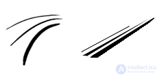
And in these figures we see movement, but not only movement in the same plane, but also in space. It seems that our lines rushed somewhere on the way to the horizon. This effect occurs due to the difference in the thickness of the lines, so thin lines appear to us further in space, and more dense (fat) lines are closer to us, they are visually standing in the foreground - this is one of the features of our perception that we can use in our work.
Circuit.
A line or combination of lines can form a contour. Roughly speaking, the contour is the border, the stroke of the object.
Hatching.
Using lines, we can shade the outline drawn by us.
We do this either with a linear stroke, when we put all the lines side by side, parallel to each other, or intersecting hatching. Thus, we can set a different tone: from very light to very dark, creating the illusion of three-dimensional object due to light and shadow.
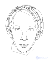
Of course, we will not need in our work to use painted objects every day, but, nevertheless, they may be useful to us. Not necessarily, but it is desirable that the designer was able to draw. If you can draw, then this is a big plus: you can easily put many of your ideas into life. You will be able to draw illustrations yourself, create original images, which, if necessary, can then be processed in a graphic editor on a computer.
DESIGN ELEMENTS.
The form.
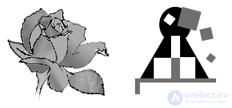
Under the form means a two-dimensional object that can be created with the help of lines, color, light and shade. I ask you not to confuse: in the picture, on a piece of paper, we create only the illusion of depth or volume, but the objects themselves are still two-dimensional. We deal with three-dimensional objects, for example, in sculpture, where we have the concepts of mass and volume.
Forms can be divided into geometric and organic. Organic - these are natural forms, you can meet them in the animal and plant world, for example, sea waves, stripes of zebra, web, snowflake, etc. Organic forms are usually complex, it is best to draw them by hand. Geometrical forms — artificial, created by man (a line, a triangle, a square, etc. — these are the simplest geometrical forms, more complex ones can be created on the basis of them).
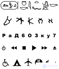
In addition to organic and inorganic forms, you can still distinguish abstract forms. These include early forms of visual written communication: cave paintings, symbols that have a ritual meaning, for example, symbols of the sun or the moon. Figures and symbols gradually moved into pictograms (for example, Egyptian images - a type of writing in which objects, actions, concepts of their connection are transmitted using generalized and simplified images, figures, diagrams), ideograms (stylized, simplified images, denoting words or concepts) , and soundtracks (sounds represented by pictures, for example, a note, or part of a name). Hieroglyphs, runes, and, in the end, quite familiar to you letters - these are all abstract forms. In addition to letters, there are other modern abstract forms - these are road signs, symbols on the buttons of your player, “places for disabled people” in transport, etc.
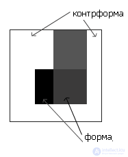
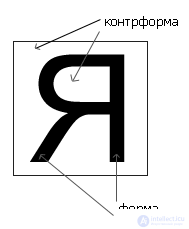
If there is a form, then there is a counterform (place, space around the form). When working, we should always consider how it works (interacts) inside our working space, both.
 | |  |
We will talk about the letter, not only as a form, about written information and its organization, separately, since Typography is quite an independent subject.
DESIGN ELEMENTS.
Chiaroscuro.
Combining light and shadow, we can achieve a lot: set the volume of our image, create the illusion of depth, focus our viewer's attention on an object in our work, or vice versa remove some elements of our composition to the background (make it less significant).
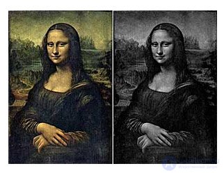
The relationship between light and shade, shades is best seen when we look at work in black and white. If you want to check how well these relationships are balanced, you can make your work in a graphical editor black and white and test yourself. Sometimes preliminary sketches are made in black and white, for example, this is true for sketches that will be used when painting a picture or when creating an illustration for a book, or when developing logos, taking for example something closer to advertising design.
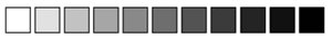
By combining black and white, we can create different shades of gray, this is called gradation.
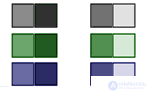
Similar in tone and brightness shades of color in combination are called nuance:

Accordingly, the hues of color that are very different in tone and brightness are called contrast:
The greater the difference in tone and brightness - the greater the contrast. The maximum contrast is, for example, a combination of black and white.

Operating with light and shadow, shades of colors, we can set a certain mood for our work. So, for example, the predominance of the dark will make our work grim, and the predominance of light will be more positive in mood. If mainly contrasting colors are used in our work, then it will seem coarser, heavier, more pressing. If we turn to the nuance, then our work will be easier, weightless, perhaps soft, soothing.
DESIGN ELEMENTS.
Volume and space (illusion of depth).
As I have already said, we are dealing with a two-dimensional space. However, we can create in it the illusion of volume and depth, using the following means: in terms of the size of objects, the imposition of objects on each other, the introduction of light and shade and tone, perspective.
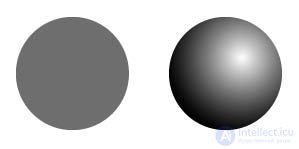
Volume
We create volume by light and shade. Compare the pictures: in the first case we are dealing with a flat circle, in the second - we already had a ball, adding light and shade, we created the illusion that our ball is voluminous.
Space.
The size.
One of the features of our perception: we perceive distant objects as smaller in size than those objects that are closer to us. Those. By drawing some objects larger in size than others, we can create the illusion that they are closer or further to us. I mentioned this when we talked about the line.

Overlay
Placing one object on another, we can also create the impression that they are further-closer to each other. Look at the picture: we put all the objects in a row, however, it seems that, for example, buckets are closer to us than pink boots, and farther from us than brown ones.

Light and shadow.
We can also organize the space with the help of chiaroscuro. Let's go back to our ball:
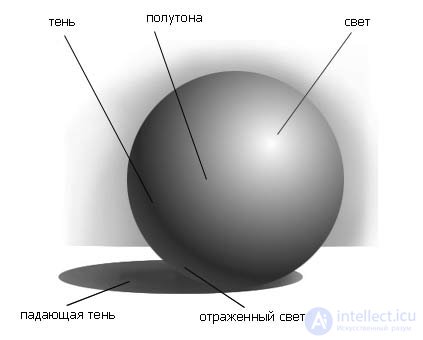
We positioned our three-dimensional object in space with the help of light and shadow. In addition to the volume of the ball and the falling shadow, this illusion is supported by the fact that we introduced two planes: the one on which the ball lies, and which is closer to us, we left bright, and the one farther from us and in front of which the ball lies, we made darker to create the illusion that it is further.
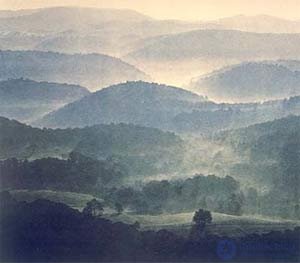
You can do the opposite: a closer space is dark, and a distant light one is called an air (atmospheric) perspective . In ordinary life, when we look at, say, the landscape, we see objects that are distant from us, as it were, through the air, so that objects that are far from us have less contrasting and more neutral colors. Accordingly, brighter and more saturated colors are inherent in objects that are closer to us. Those. as a result, not only light and shadow, but also color saturation, its shades affect our perception of depth.
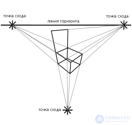
Perspective.
The best, but not the safest way to understand what a perspective is is to get on the railway track, then it will be noticeable that the rails converge somewhere on the horizon at one point, this point is called the vanishing point.
As a rule, linear perspective is used to correctly position geometric objects in space, for example, when depicting urban, industrial landscapes.
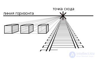
In theory, the horizon line is the line on which the viewer's eye is located. As a rule, natural objects, like mountains, or objects like houses and trees are located in whole or in part above the horizon line.
Of course, when we depict, for example, the interior of an apartment, the horizon line is not visible to us, but we believe that it is, and is located at the level of the observer’s eyes.
Take a cube to draw it in perspective, we draw one of its sides, all faces of which are parallel / perpendicular and equal to each other. To find the remaining faces, we take an arbitrary vanishing point on the horizon line and draw from the corners of the cube side of the line to the vanishing point. Now it remains for us to draw the second side of the cube (by eye), in which all sides are also parallel or perpendicular.
Objects parallel to each other have one vanishing point.
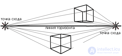
However, objects located at different angles to each other have different vanishing points.
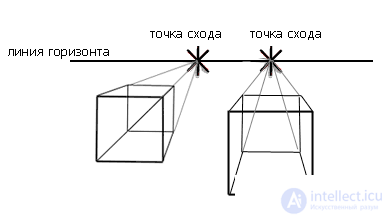
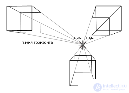
By the way, we have so far spoken to you about the prospect, when only one point of the lines drawn from the object to the horizon is taken. As a rule, this is not often used, because if we take a single vanishing point, this means that we look at the object "head-on." If we look at the object a little at an angle, from the side, then we use two vanishing points, because in this case we see the object more distorted.
Also, there are situations when we use three vanishing points, one of which lies not on the horizon line. Usually, we enter the third vanishing point when we look at the object from above or below (and the angle of the object "creeps out" to the foreground).
***
So, as we have seen, in order to position objects in space and relative to each other, you have many ways. As a rule, they are used together, not one by one.
A designer is not an artist, but even when creating simplified objects and images, you will need the knowledge that learners in art universities. A general idea of the obvious laws will make your life much easier, and your work better.
Цвет.
Наука о цвете - колористика - возникла не так давно. Наука вполне серьезная, и основывается на вполне серьезных научных открытиях. По теории цвета написано много книг, и я была бы слишком самонадеянной, если бы решила вам рассказать вкратце все о цвете в одной статье. Поэтому я очень надеюсь, что вы последуете моему совету и скачаете книгу Иоханеса Иттена "Основы цвета", не смотря на то, что весит она чуть больше мегабайта, более того, я надеюсь, что вы ее даже прочитаете, и я также надеюсь, что вы еще пройдетесь и по ссылкам в правой колонке.
Цвет самый сильный по воздействию из наших элементов и самый сложный, именно поэтому к его изучению надо подходить серьезно. Как правило, в художественно-дизайнерских Вузах с цветом начинают работать лишь на втором году обучения.
Каждый цвет, или сочетание цветов мы воспринимаем по-разному:
- Оптически и физически (например, предметы, окрашенные в красный цвет, кажутся нам ближе, именно поэтому его часто можно встретить на дорожных знаках, глаз заметит и воспримет такие знаки быстрее, чем, допустим зеленые, красный цвет для нас сигнал опасности, тревоги).
- Эмоционально, психологически (определенные цвета и гаммы вызывают у нас определенные эмоции и чувства, так природные синий и зеленый вызывают в нас ощущение спокойствия и умиротворенности, ведь синий – это цвет ясного неба, или спокойного моря, а зеленый напоминает о лесе, о луге, о теплом времени года, когда трава и деревья были зелеными).
Конечно, я не могу отрицать того, что каждый художник и дизайнер, работая с цветом руководствуется и своими субъективными чувствами, однако, я хочу заметить, что даже великие мира сего подходили к работе с цветом серьезно, так, например, такие мастера, как Роден, Матисс и многие другие логически продумывали и рассчитывали цветовую композицию, которую процессе работы либо осуществляли, либо отбрасывали, как ненужную, но тем не менее, если художник подходит к цвету в своей работе не только субъективно, но и логически, то дизайнеру уж сам бог велел относиться к цвету с умом.
Если вы будете работать в области рекламного дизайна, то столкнетесь с тем, что за определенными направлениями и родами деятельности закрепились уже какие-то определенные цвета и цветовые гаммы. Вы можете следовать им, чтобы обеспечить узнаваемость, а можете нарушать их, так, например, в рекламе женских гигиенических средств был поставлен крест на ярких цветах, в частности на красном цвете, видимо, из боязни вызвать неприятные ассоциации. Однако, создатели бренда Kotex перешагнули через такое предубеждение, они нагло использовали красный цвет и в оформлении упаковки своей продукции, и в рекламе, только красный (с черным и белым), и в итоге они только выиграли от этого, они выделили себя из массы. Прошу прощения за пример, надеюсь, тонкие и чувствительные натуры, на дух не переносящие слов «женские гигиенические средства» меня простят.
Those. я хочу сказать, что правила знать необходимо, чтобы не изобретать колесо, когда оно уже есть, и чтобы не совершить разных глупых ошибок. Однако, любое правило может быть нарушено, но с умом, ведь может так случится, что нарушив правило, как герой одной из наших первых статей Петрович, вы только напортачите, и не добьетесь никакого положительного результата.
ЭЛЕМЕНТЫ ДИЗАЙНА. Текстура и фактура. Многие предметы и вещества, окружающие нас имеют текстуру и фактуру: если вы прикоснетесь к отколотому от скалы камню, то ощутите на его шершавую в трещинках поверхность. Позже, если вы увидите поверхность камня, отображенную в двухмерном рисунке, она вызовет у вас определенные ассоциации и ощущения.
Итак, фактура – это свойства материала, предмета, которые мы ощущаем при прикосновении к нему. Фактурами в своей работе пользуются художники-декораторы, дизайнеры по интерьеру. Грубо говоря, фактура – это то, к чему мы можем прикоснуться, и ощутить, что оно действительно шершавое или гладкое, или колючее.
Художник или дизайнер использует в своей работе текстуры – двухмерные картинки, на которых при помощи цвета, света и тени, он создает иллюзию, что эта поверхность каменная, шершавая, холодная, мокрая и т.д.

Как правило, создать текстуру с нуля в графическом редакторе очень сложно, если там не предусмотрены специальные фильтры и функции для этого. Как правило, у дизайнера в запасе есть коллекция с текстурами, которые он достает в нужное время, как фокусник карту из рукава.
Иногда дизайнеру приходится самому создавать текстуры, это не сложно, нужно лишь иметь некоторые представления о свойствах материалов и поверхностей. Так, если вы захотите создать текстуру камня, вы можете найти характерную стену, где наиболее очевидна фактура, приложить к ней тонкий лист бумаги, и выявить текстуру на поверхности бумаги при помощи мягкого карандаша или кусочка угля (он продается в художественных магазинах и салонах, не надо сжигать соседей и конкурентов ради того, чтобы создать текстуру самому:)
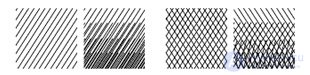
Текстуру можно использовать не только для того, чтобы сделать стену в вашем рисунке стеной (со всеми необходимыми трещинками и шершавинками), вот посмотрите, например, как на наша текстура на рисунке практически перешла в рекламный плакат.

Не смотря на то, что мы не применяем эту текстуру к какому-то определенному объекту на нашем рисунке, а используем ее саму по себе, она все же сохраняет свои свойства, и вызывает определенные ощущения и ассоциации: она агрессивна, современна, хаотична и т.д. Так, например, эта наша текстура могла бы перейти в рекламу какой-нибудь молодежной обуви 21-го века, или какого-нибудь молодежного клуба, группы.
Для интересующихся: текстура создана при помощи туши, и двух листов бумаги, на один мы наносили текстуру, другой мы смяли, обильно испачкали тушью и использовали, как штамп (печать), в итоге получили достаточно интересный результат.
ПРИНЦИПЫ ДИЗАЙНА.
Элементы никогда не бывают сами по себе, они всегда связаны в некую композицию, подчиненную некой идее. Говоря о принципах дизайна, мы имеем в виду целесообразность, единство, равновесие, доминанты, соподчинение, динамизм, гармонию.
Целесообразность.
Что такое принцип целесообразности? О нем я уже упоминала в первых статьях курса: любой авторский замысел и весь строй произведения должны быть подчинены какой-то цели, идее, художественной задаче.
Если речь идет о художественном произведении, то его тема должна задевать, быть близкой определенной группе людей. Тему, идеологию – в этом случае диктуют чувства автора, его взгляды на жизнь, политику, его страну, мир в целом.
Если же речь идет о работе дизайнера, то цели и задачи ставятся перед дизайнером заказчиком, состоянием рынка, и многими другими факторами. В отличие от художника – дизайнер не хозяин сам себе, его работы не имеют художественной ценности, он подчинен коммерции и рекламе.
Единство.
Все элементы в композиции должны быть взаимосвязаны, они должны так взаимодействовать друг с другом, чтобы композиция смотрелась единым гармоничным целым. Самая большая ошибка начинающих дизайнеров (в том числе и веб), что их творение буквально разваливается на куски, разнородные и невзаимосвязанные, этого ни в коем случае нельзя допускать.
Какие же приемы вы можете использовать для достижения единства в вашей композиции: наложение объектов друг на друга, тем самым, показывая их близость, ваши элементы могут быть выполнены в одной манере, стиле. Какие-то элементы композиции могут повторяться и перекликаться друг с другом в цвете, текстуре, по форме и т.д.
Все части композиции должны быть соподчинены друг другу. Если вы не можете изъять из вашей готовой композиции ни одну ее часть, ни один ее элемент без ущерба для целого, если части композиции нельзя поменять местами, добавить какой-то новый элемент, то это говорит о том, что вы справились со своей задачей, что вы имеете на руках вполне завершенную и хорошую работу.
PRINCIPLES OF DESIGN.
Equilibrium.
Speaking of equilibrium, we do not mean not only a well-built symmetrical composition, no, equilibrium is a condition for the stability of a visual composition, it is a state when all elements are balanced with each other.
Symmetry
This is only the most obvious and easiest way to achieve balance in composition. Symmetry implies a certain order, a mathematical pattern of the arrangement of elements relative to each other and in space.
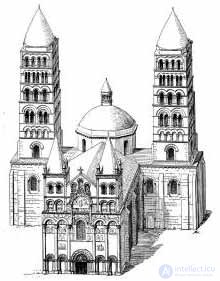
Symmetry is found not only in objects created by man, we very often meet symmetry in nature, it was from there that the person initially took the example, creating objects or objects, which is why the ancients considered symmetry a condition of beauty and harmony.
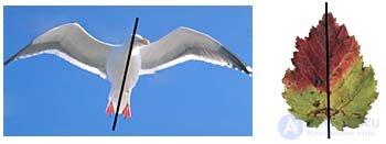
Look at the illustrations, as you can see, in nature there is no exact symmetry. Yes, the leaf and the bird are symmetrical in general, but they are different in details (feathers on the wings of the bird, eyes on its head, streaks on the leaf). This kind of symmetry, when only a general form is symmetrical, but there is no exact similarity in trifles, is the basis of many works of art and artistic works. “One of” means that there are different types of symmetry. Mirror, inverted, axial, radial, etc.

Symmetry can be built around a point (radial), around one axis, around several axes.
Asymmetry.
Asymmetry is a complete violation of symmetry, this is when the repeating elements are absent or arranged so that they cannot be combined by shifting or turning.
However, asymmetry does not mean a lack of balance. In asymmetric compositions, we use color, shape, saturation of tone, texture, direction of movement, the location of objects relative to the center of the plane to make our composition balanced.
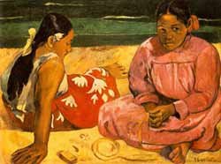
Look at the picture. A small red element makes the whole picture more vivid, it would not exist, the picture would die from an abundance of neutral tones, it would be quite boring and uninteresting. However, this bright element would be very distracting from the overall composition and could spoil the picture if it were not balanced by a neutral pink-tone tone.

Or take a look at this drawing. A broken white line gathers all the elements of the composition together, and sets them the direction of movement. As a result, the picture is very dynamic, solid, balanced.
PRINCIPLES OF DESIGN.
Dominant.
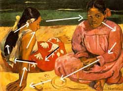
Every composition has a semantic center, where the main action is tied up, and basic connections arise. In addition to the semantic center, there is also a visual center, it begins with the perception of our work by the audience, it was he who first draws the eye. Sometimes the semantic and visual centers may coincide.
The word “center” should not be taken literally; this word does not mean the center of a sheet or screen at all. Placement of the semantic or visual center within our working space (screen, sheet) can be any.
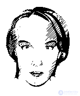
Let's return to this illustration. The red skirt of the girl is the center of the composition, with which our view begins with the contemplation of the picture. Those. the red skirt is a visual center, but it is not, in this case, a semantic one. It is not the red skirt that plunges us into thoughtfulness, but the girl’s face in pink, it’s she who is the semantic center of the picture.
Very often in his work a designer or artist uses several semantic centers, in the event that he depicts complex events, several ideas of equal importance. In this case, in order to separate these semantic groups from each other, the designer must actively use the free space so that the composition does not turn into a mess, heap-little. However, it is necessary to ensure that the composition does not fall apart into several parts.
Subordination.
So, we said that all elements of our work should be interconnected with each other, and this means that within the composition there is a subordination of its separate parts to each other. Something is important, something is less important.
The task of the designer and the artist is to make these connections obvious to his viewer (end user), i.e. Your task is to manage the attention of your viewer. It is necessary for the parts of your composition to be perceived by the viewer in a certain sequence, in a certain way.
How to provide it? The individual elements of the composition are combined into groups. Accordingly, there should be signs of a connection between these groups (for example, we unite them with a common axis of symmetry, however, there should be no symmetry within the group of elements). Groups can overlap with each other among themselves with their elements (let's say on the website: icons, colors of headings, size of illustrations, etc.).
Naturally, with all this, our composition should be perceived as a whole.
Those. thanks to the grouping of elements and details, a consistent perception of parts of the whole takes place, and at the same time we perceive all the elements of our composition as something whole, not fractional.
PRINCIPLES OF DESIGN.
Dynamism.
Dynamism is not an image of movement in your work literally, even if your composition is static, calm, then there is still some kind of life (movement) in it, because all the same there is an interaction between the details and the elements of your work. Those. By controlling the look and attention of your viewer, you somehow create movement in your work.
Let's return to our illustrations. The first is a bit chaotic, all in motion. The second is static, calm. However, in both, there is dynamism, a certain rhythm.
In the first illustration, our gaze follows the white line. In the second illustration, the direction of movement is not specified in the same way definitely, but still it is:
The direction of the girls' views, their postures (how they sit, how their hands are lying, how their heads are turned) - all this controls our view.
Your composition will be static or dynamic, depending on what goals and objectives you are facing. For example, for a bank site, some static stability is preferable, and for a stadium site, a racetrack, it is better to create a mood of tension and activity.
The static state in the work is supported by a symmetric composition, not too much free space, the absence of diagonal lines and directions.

To express the dynamics, you can use an asymmetric composition, elements with sharp corners, a large amount of free space, and diagonal directions.

Remember, the movement in the composition must be organized, otherwise it may turn out that the dynamics will turn into chaos, a jumble, and static will be boring, uninteresting view.
Harmony.
Symmetry, proportions, rhythm, contrast, wholeness, balance - all these categories form harmony. Harmony connects all the elements of your work, reconciles form and content, object and space, bringing everything together.
Harmony is an aesthetic category and it cannot be reduced only to the concepts of proportion, symmetry and others. Harmony includes the personal, your attitude to their work. If what you create is unpleasant for you, it will somehow reflect in what you create.
Your audience does not understand the principles of design, does not know its fundamentals, but he will easily catch disharmony in your work, you do not need to be a designer or an artist to intuitively feel that the work of a designer or artist leaves much to be desired.
That is why you should strive to achieve harmony in your work, because any person is able to feel imbalance and imbalance. If you are not confident in yourself, then you can show the work to an ordinary consumer and find out his attitude towards it. His opinion may be very valuable to you.
Harmony and unity play an important enough role, the designer should be able to balance visual information in his composition. All the diversity of our elements must be brought to a certain unity. You, as a designer, are solely responsible for what is happening within your sheet (workspace), you must not allow your composition to collapse. Different colors, sizes of shapes, their relative positions - everything is subject to your control, even if you create something abstract
Basic principles of graphic design
12 Apr 2010, 6:00, wrote Maxim Shaikhalov in the section "This is interesting!"
Many of us often depart from the basics of design. Well, if a professor at the university firmly rooted these bases in your skull. But a self-taught person with several books on the table is unlikely to find all the basic principles of graphic design. However, more and more people are addicted to design, but they need to learn the basics before trying to create a cool gradient in Photoshop. Although it is fun and interesting at the moment, but the time will come and this skill will become unnecessary, and the principles will last forever.
Design principles are the glue that keeps the mind from disintegrating and keeps (at least, should) the industry up to par.
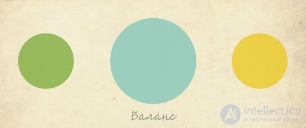
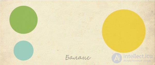
Balance
Organization of parts of the composition to achieve balance.
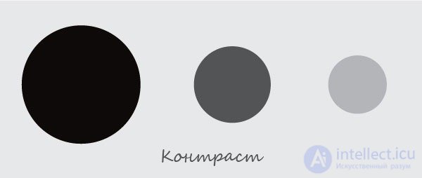
Contrast
The interaction of conflicting elements and the distinctiveness of the object from its surrounding background.
Accent and subordination
Creating an emphasis on which you can focus the viewer. If all elements are relatively equal weight, attention is scattered. 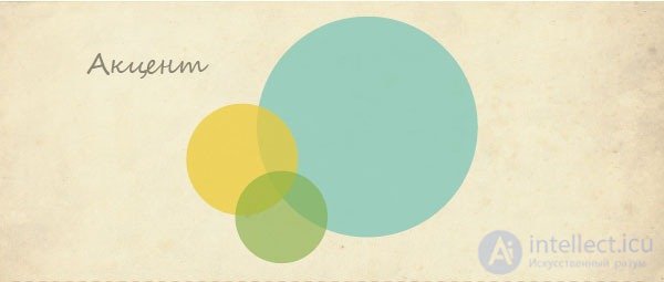
Direction
The direction helps to direct the eyes and thoughts of the viewer on the right. It can also link work into one. 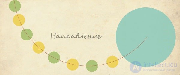
Proportions
The size of the parts in relation to the entire work, and to other parts separately. Very often, this principle is associated with figures of art. For example, the "Golden Section". 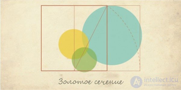
Scale
The real, visible size of an object in relation to other objects, people, the environment, or the proportion of composition. 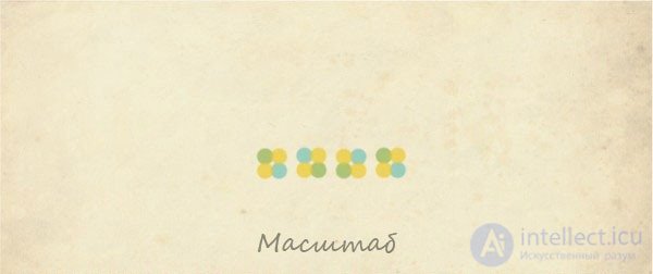
Repetition and Rhythm
Repeating a design element for any purpose. Provides perception continuity, direction, etc. 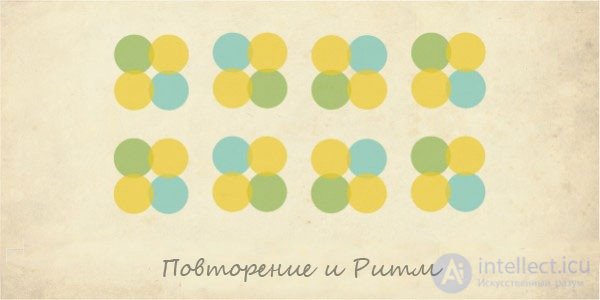
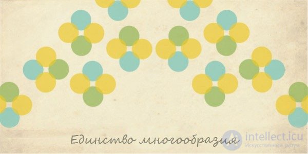
Unity of diversity
The principle acting in works of art, which can give the composition a single look. Helps to fit the concept. He must be constantly remembered when developing corporate identity.
With the combination of these principles of work become very successful and memorable. Be guided by these principles. They grab the attention of the viewer, help to understand the idea and will not let it go until he understands everything to the end.


Comments
To leave a comment
design software UI and Web design
Terms: design software UI and Web design