Picture. Icon. Hieroglyph. Fetish. Sign. Symbol. Logo. Ways to create a trademark


 1. Logo. Short and succinctly. Concepts
The logo is a stylish graphic image that is maximally and universally abstracted to the symbol and adapted to the application environment in accordance with the “principles of reasonable design”.
1. Logo. Short and succinctly. Concepts
The logo is a stylish graphic image that is maximally and universally abstracted to the symbol and adapted to the application environment in accordance with the “principles of reasonable design”.
(I will explain that the “reasonable design principle” of a logo is:
1. designing a form on a modular grid
2. the choice of the form, which is not "greased" when scaling
3. The right choice of colors
4. create black and white version and reverse image
and much more, which undoubtedly (!) knows and is able to put into practice a real professional and what will be discussed in more detail below.
(Klyuev M.)
Trademark, logo - a designation placed on a product (or package) by industrial and trade enterprises for the individualization of a product and its manufacturer (seller). A trademark is one of the objects of industrial property. Performs the function of quality assurance of the product and its advertising
(Great Soviet Encyclopedia)
2. Logo. Theory in detail. We read and learn.
Image (image):
Information presentation form intended for visual perception. The image is a very visual and capacious form of presenting information. This is connected not only with the nature of its perception by the human brain, but also with the capabilities of its organ of vision. The person easily operates with visual images. Characteristically, on average, color accounts for about 80% of the information contained in the image. The quality of the image and the resulting shadows also greatly affect the image quality. The image can be one-, two- and "three-dimensional" 3D. The graphics use two tones: black and white. At the same time, in most cases, a gray scale is needed - a set of fields with shades of gray tone. Due to this, the photos display smoothly changing shades of a halftone image. They are performed by selecting various raster elements. Special images are pictograms and trademarks.
The logo, trademark is the "face" and the hallmark of the manufacturer and its products.
Trademarks have much in common with proper names: the thoroughness with which they are chosen and presented; the paternal care of the company acting as the owner; their spelling with a capital letter, their magical ability to cause associations, their almost consecrated religion origin; their registration, their exclusivity and legal protection. (Casper D. Verkman)
In any ad, the first thing that catches your eye is a trademark, and it is least forgotten. A trademark is called a silent seller, a shop window, but in reality its loud voice resounds everywhere. (Casper D. Verkman.)
The art of creating a character sign.
Where did the symbol go, however? :)
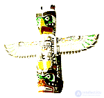
It is clear that it was not invented yesterday ... Even at the dawn of the birth of mankind, cave paintings-symbols existed when artists conveyed the essence of the depicted object as expressively as possible using a minimum of means. There were hieroglyphs, fetishes, and totems, and pictography ...
The history of symbolic symbolism is directly related to the development of civilization, the emergence of a written pictorial language, its genesis in time and space. Therefore, it is rather difficult with a certain degree of probability, operating with scattered bits of facts a thousand years ago, to give an unconditional definition of a particular symbol. In addition, the same images can be observed in different nations in different parts of the world. This applies, first of all, to simple geometric shapes - a circle, square, triangle, star, cross.
Totemism:
The complex of beliefs and rituals of primitive society associated with totems (in its Ojibwe language is its kind) - animal and plant species, less often natural phenomena and inanimate objects.
 Fetishism:
Fetishism (from the French fetiche - idol, talisman), the cult of inanimate objects - fetishes endowed, according to the ideas of believers, with supernatural properties. It was common to all primitive peoples. Preserved features - faith in amulets, amulets, talismans.
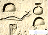
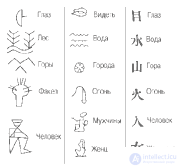
 Hieroglyphs:
Hieroglyphs (from the Greek. Hieros - the sacred and glyphe - that which is carved), ancient picturesque signs of Egyptian writing.
 Ideograms:
Ideographic writing (from the Greek. Idea - idea, image and grapho - I write), the principle of writing, using ideograms. The Egyptian, Sumerian and other oldest writing systems were largely ideographic in nature. The greatest development reached in the Chinese hieroglyphics.
 Cuneiform:
Cuneiform, writing, the signs of which consist of groups of wedge-shaped dashes (signs were extruded on raw clay). Occurred approx. 3000 BC er in Sumer and later was adapted for Akkadian, Elam, Hittite, Urartian and other languages. By origin, cuneiform writing is ideographic-rebus, later - a word-syllable letter.

 What are artistic characters?
1. Geometric symbols - pictures, logos, signs of communication, etc.
2. Informative symbols - signs of communication, road pictograms ...
3. Symbols with exceptional content - icons ...
4. Index characters - numbers, letters ...
Trademark.
TradeMark (TM): TM is a designation registered in the established manner that serves to distinguish a company or its product. TM is an original decorated image, special designation, emblem, combination of letters, numbers, words, etc. However, the trademark does not contain heraldic designations, geographical names, because they can not be the object of exclusive ownership of a legal entity. A special trademark is a trademark, which is also called a brand name. A trademark is a designation that can be recognized by the buyer, but cannot be described verbally. This sign indicates the manufacturer of the product, and not the type of product. For example, IBM (IBM Corporation), Novell (Novell Corporation). The trademark holder has the exclusive right to use it. The mark is protected by law and may be assigned to other legal entities. Often, in order to emphasize the fact of registration of a trademark, the symbol R is enclosed in its end, surrounded by a circle. Examples of trademarks are: ARCNET, Windows, Sony.
Sign:
compliance marks, monetary, packaging, environmental, technological, warning


 Pictogram:
Pictograms have been used since ancient times, as evidenced by the cave paintings of figurines found in different countries. The most widely known road signs are in the form of pictograms, which are necessary to regulate traffic on the streets. In computer science, icons are widely used in multiscreen technology, they correspond to the minimized state of windows.
signs of communication of the subway, train stations, competitions, transport, firms, cities


 Character (character):
That which serves as a symbol of some concept, phenomenon, process. A symbol or sign is a numeral, letter, punctuation mark or hieroglyph of a natural language, punctuation mark, space character, special sign, operation symbol.
astranomic, zodiac, technical, sports, household, meteorological


 Method of designing a logo.
More precisely - one of the many well-known principles, schemes. Which, in my opinion, is more effective. Without further thinking, I called this technique "Solo" :) But first, the general principles and standards ... I’ll just say that the logo is not created for ages. And subsequently, for a number of reasons, it may require its redesign.
Over the course of several decades, many signs have successfully performed their functions in a particular area. Their image has become traditional. But over time, they gradually became obsolete and ceased to meet the latest technical requirements of marketing and trade in a broad sense. They have an old-fashioned look, no longer reflecting the spirit of the enterprise they represent, and they do not correspond well to modern advertising methods. (F. Wills)
A trademark can only be changed if its owner concludes that at one time he made the wrong choice, if the tastes of society changed, if numerous imitations lowered the power of a mark or, on the contrary, this mark encroaches on the rights of already existing marks, and also if political and economic changes in public life require changes in the sign. (X. Riffs)
Limitations.
The law of the Russian Federation does not accept images on signs of state emblems, flags, emblems, seals, awards, etc., as well as individual letters and numbers, dates in the standard version. They may be included in the framing of the trademark as unprotected items. It is unacceptable that the trademark directly talked about the quality and purpose of the product, the method of its manufacture, its value, quantity, properties, indicated the place and time of production or marketing. These are generally accepted concepts that any person has the right to use to characterize their goods.
Not accepted under the protection of generally accepted symbols and terms. You cannot register the words fish or vodka as a trademark.
The law requires specificity from a trademark, the impossibility of confusing a new trademark with a declared for registration or already registered mark for similar goods. Let, when looking at it, the imagination and memory of the buyer come into play. It is great if a trademark is a collective image, perceived by each person in its own way. Similar images are easily remembered.
Necessary information about the future sign (discussed with the customer).
1. Description of the current state of affairs and activities of the organization in the future
2. Types of surfaces, objects and materials on which the mark will be applied
3. The use of a trademark in various advertising media and the expected change in its size
4. Territorial framework for the use of the trademark
5. The similarity of the projected mark on the already used by the company or related organizations;
6. The timing of the design and the number of submitted draft versions of the sign.
After the design assignment has been received, the stage of pre-project research of analogues begins. As a rule, this is a collection of information on the project's theme, on the current state of the graphic mode. The sources of information are primarily publications in magazines, books, catalogs of industrial firms and exhibitions, patent materials and, of course, everyday creative practice. The analyzed material is graphically fixed in the form of sketches, photocopies, clippings ...
Design can be significantly simplified if the designer accurately selects one of the characteristics of the product or service produced by the organization, and graphically beats this property to create the necessary association in the perception of the trademark.
1. Source of Origin
a) Manufacturer.
aa Manufacturer's designation.
a.b. The designation of the enterprise.
av The designation of the industry.
b. Geographical, political, ethnic sources.
b.a. Location of the enterprise.
bb Country of origin.
bv National producer culture.
c) Additional sources.
VA. The origin of raw materials and materials.
d) Used production technology.
d) The method of delivery to the place of sale.
2. Product Functions
a) Application.
b) Purpose.
3. The composition of the product and its packaging
a) Raw materials.
b) Composition.
c) Ingredients.
d) Packaging.
4. Physical properties
a) Form.
b) Color.
c) Weight.
d) Structure.
e) Taste.
e) Elasticity
g) Strength.
h) Appearance.
and) temperature.
k) Accuracy.
l) Texture.
5. Operational and consumer properties
a) Quality.
b) Safety and reliability.
c) Speed.
d) Comfort.
e) Method of preparation.
e) Durability.
g) Method of consumption.
h) Healing properties.
6. Psychological properties
a) Prestige.
b) Value as a luxury item.
c) Sensual perception.
d) Sexual associations.
e) Attractiveness.
f) Mystery.
7. Economic factors
What about the price.
b) Availability.
c) Kinship with similar products.
8. Results of use.
a) Results.
b) Utility.
Leitmotifs used in the trademark image.
Use as a motive in designing a trademark of well-known images inspires confidence, is easily perceived, but, as a result, often does not differ in originality. On the contrary, unusual images do not like because of their novelty, are perceived with difficulty, but have a high degree of originality. Determine the boundaries of the reasonable when using the traditional or new form of the sign - a task that the designer solves to the best of his abilities
For the designer, awareness of modern style in advertising is an important factor dictating the need to ensure the progressive look of a trademark. It does not follow from this that fashionable and original design always means success and unconditional recognition, but good images usually indicate a strong sense of fashion and delicate taste. Unfortunately, these properties of a trademark can be assessed mainly only by professionals at traditionally organized exhibitions and contests.
Real objects and symbols:
1. Astral symbols
but. Sun moon.
b. Land.
at. Stars.
Constellation.
D. Zodiac signs.
2. Images of a person
but. Female, male figures.
b. Body parts.
at. Bodies. a heart. lungs.
Skeleton and its constituent parts.
3. Animal World
but. Mammals.
b. Birds.
at. Fish.
Insects.
4. Plants
but. Fruit.
b. Roots.
at. Leaves.
5. Objects of culture and their fragments
but. Architecture.
b. Art.
6. Technique
but. Machines and mechanisms.
b. Technological processes.
7. Subject environment
8. Abstract motifs
a. Symbolism.
b. Font and number signs, calligraphy.
c. Arbitrary forms.
Requirements.
Requirements to be met by the logo:
1. professionalism of execution
2. memorability
3. originality, associativity
4. versatility when resizing (decrease, increase without loss of quality of perception of details)
5. universality of the coloristic decision (adaptation to various color environments)
Basic styles for the logo
The structure of the logo.
Despite all the countless diversity of ideas, forms, colors, compositions and styles, the structure of the logo is reduced to three basic schemes of construction.
The first scheme (1):
Corporate font, word mark - a word mark, the name of the company, made a specially designed font or by adapting an existing font for this particular company-customer.


It is possible:
1. simple (normal) font style
2. introduction to the font, as an element of the composition, of the element of signality by artistic change / deformation of a part of the font, one letter of the font or part of a letter
3. adaptation of the font to the sign level
Scheme two (2):
A logo
, a graphic symbol - a logo - a symbol specially selected and designed for this client company in order to achieve uniqueness, recognizability, attractiveness, memorability. Sometimes a corporate font can be used as a sign, artistically altered to make the graphemes have character marks.


It is possible:
1. abstracting a specific image of an object / thing
2. the font grapheme is modified or font composition is created
3. apply composition font + object 4. an associative abstraction is created
The third scheme (3):
Corporate block, combination - a combination of a corporate font and brand name. At the same time, it is not at all necessary that the sign and the font should always be used together. When designing a proprietary unit, it is necessary to determine which of the two components of the composition will be dominant.


It is possible:
1. use of corporate block (composition of parts: logo + font)
2. use, at its discretion, a corporate logo mark separately from the corporate font and vice versa
All logos in terms of color schemes need to be designed taking into account the changing habitat in which they (logos) will have to be found by occupation :) For this reason, it is desirable to provide both polychrome and monochrome options for the brand name. Or try to choose the most versatile color / shade of color scheme.
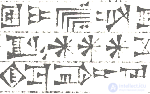
Examples of extremely unsuccessful! logos:


 Gross mistakes:
1. glut of information
2. low level of abstraction
3. ill-conceived arrangement of the compositional center
4. ill-considered direction of dynamics
5. non-universality in terms of use in different promotional situations
6. ill-conceived composition
And no matter what logo scheme you choose, you need to design it correctly :) Logo-induced associations should not carry negative or unwanted emotions. To do this, use ...
3. Logo. The practical part. Method "Solo",
developed by me to speed up and improve the logo design process.
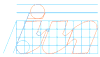
Human thought is like the excitement of the water surface, so changeable and unstable. But you need to learn to fix the state of your creative thought, so that those ideas and images that constantly arise in our imagination do not disappear without a trace, do not dissolve, do not get lost, like drops of water in the environment of their own kind ... For this there is a simple solution! We fix our ideas in pencil on paper. Or with a voice, we slander into a dictaphone in order to subsequently transfer the idea to paper, embody our thoughts in a drawing and see what comes of it. We have a pencil and paper - well. Many will disagree, they will say, they say, and why not use the computer right away, i.e. those technical capabilities that he offers us. Well, the amateur will do that. And in my humble opinion, there is no substitute for the vitality of a pencil sketch, made by hand, when the sketch comes out “alive” and each line “breathes”.
I design the InternetInform logo. First you need to understand that, in fact, yes, and why it is necessary to abstract? The company is engaged in On-Line activities, in particular, the provision of pricing information on the Internet. Fine! We have two whole objects (defining the specifics of the company) for reflection:
1. Internet
2. information
We quickly find the symbol for each object. But you can go on a simpler way and try to abstract the graphemes of the first letters of the company name "AND + AND". In this case, you can skip the first three points and start with "impersonation".
1. Deification - trace
2. Personification - the image of the image, the nature of the subject
3. Typology - geometrization ... gee, beauty
4. Impersonation - schematization
Ordinary graphemes of the letter "I", and nothing needs to be done here.
 5. Fetishization - association
Here it is supposed to shudder the association on the theme of "a beautiful combination of two letters"
 6. Symbol - universalization
But this is already a serious and tedious final stage of work. You must follow all the rules for building a logo and use
"The principle of reasonable design". But the result, as a rule, depends largely on it!

Hooray! We came up with the icon, but this is not enough, we still need to think about some of the problems with which he (our icon) will face in his "life" ... Arbitrary (not everything! And not structured :) elements of corporate identity: 1. structural modular grid
2. iconic trademark logo direct image

2-a. logo tone option

2-b. logo negative image

3. branded unit

4. variations on the topic ...

5. corporate color, branded color range
6. Rapport field, ornamental structure
 7. note:
The company's corporate identity should be considered as a way to improve the quality and effectiveness of advertising, as a tool to enhance the prestige of the company and as an important commercial factor. It should be determined by the minimum of color graphic elements with the proposed principles for their use in business documentation, in advertising printed materials, in the press, outdoor advertising and other identification elements.
The set principles should not constrain the creative initiative of designers in the development of specific objects - carriers of corporate identity. It is necessary to firmly remember that the distortion of a trademark, corporate color, the neglect of modular page layout in advertising and the replacement of the font by others lead to the destruction of a single company image!
The mark is evaluated:
1. The content of the mark
2. The possibility of use in advertising media
3. Distinctness
4. Stylistic features
5. Persuasiveness
6. Reliability (sustainability)
7. Consumption (relevance)
8. Regional features
9. Individuality
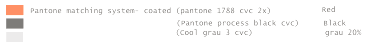
4. Color in the logo
Use 2, maximum 3 colors (counting black, gray, white tones)
See also:
Color
Interior color
Color in heraldry
Safe and system colors

This part of the spectrum can illustrate food products, because all plant products known to us are related to this part of the spectrum color. All other colors will be for food unnatural color.


Blue-black colors + gray tone and all monochrome stretch marks with an admixture of gray are characteristic of the metal and are more suited to the engineering industry, as well as to all industries related to metal or other similar "technical style" industries.

Red is a warning color. He, like orange, always attracts attention.

Violet is the color of anxiety, anxiety, insecurity, melancholy, "female loneliness." Interestingly, the combination of red and purple without separating color or tone, always causes irritation to the observer.
If you use several colors in the logo .
In such a logo, as a rule, the base color is black. As a second color can be any. The third color should be achromatically or chromatically contrasting to the second:
An example of achromatic contrast. Colors are located in the same region of the spectrum, but have different brightness / saturation.

An example of chromatic contrast. Colors are located in different areas of the spectrum, but have the same brightness / saturation.

White and black tones are neutral in themselves. They never (!) Conflict with other colors, but complement or share them. Similarly neutral are all grayscale.

As an option to fill the logo (or part of it), the spectrum of the rainbow or a similarly complex gradient can be used. In this case, this shading must be done inside a certain contour in order to prevent the logo from merging with the background in those places where their colors match and “assemble” this “vinigret” into one whole.
5. Instead of a conclusion. Copyright. Trademark protection.
Copyright (copyright) the right of the author to the exclusive use of the work performed by him. Copyright establishes the priority of discoveries and inventions. Along with this, it defines intellectual property, i.e. the fact that literary, musical and artistic works are the property of the groups of persons who created them.Only with the permission of the authors can these works be published, republished and translated into other languages. Later, copyright was extended to programs, radio and television programs, film and video films, software (software). Copyright is reserved for its owner all his life and for, as a rule, 50 years after his death. Dissemination or reproduction of a work without the consent of the author is considered a criminal offense. Among the branches of law emphasize inventive law. Copyright infringement is referred to as piracy. It is concluded, for example, that a copy is made from the program and sold without the permission of the authors. Piracy is stopped by an injunction. Deliberate attribution of authorship to someone else's work is called plagiarism.In accordance with the copyright, the victim may claim compensation for damages incurred by him. The authors are recorded on the title page of their work next to the symbol C, circled.

Comments
To leave a comment
design software UI and Web design
Terms: design software UI and Web design