Lecture
Flexbox can rightly be called a successful attempt to solve a huge range of problems when building layouts in css. But before proceeding to its description, let's find out what is wrong with the layout methods that we use now?
Any typesetter knows several ways to align something vertically or make a 3-column layout with a rubber center column. But let's admit that all these methods are rather strange, similar to a hack, are not suitable in all cases, are difficult for perception and do not work if certain magic conditions that have developed historically are not observed.
It happened so because html and css evolved. At the beginning of the web page, they were similar to single-text text documents, a little later the page splitting into blocks was done with tables, then it became fashionable to type out floats, and after the official death, ie6 they added methods with inline-block. As a result, we inherited an explosive mixture of all these techniques, used to build layouts 99.9% of all existing web pages.
Specification CSS Flexible Box Layout Module (popularly Flexbox) is designed to radically change the situation for the better when solving a huge number of tasks. Flexbox allows you to control the size, order and alignment of elements along several axes, the distribution of free space between elements and much more.
Browser support is incomplete (2014). The main reason for this is Internet Explorer, which supports the 2011 specification only starting from version 10,. In spite of this, I would recommend to pay attention to the extensive support of all other mobile and desktop browsers! Everything is beautiful here. If you need a mobile version of the site or a web-based application, then you can (and perhaps you should) do it using all the advantages of flexbox!
We will consider all the examples based on the new specification. If you need support for old Сhrome, FF and IE10, it is better to use autoprefixer, which will automatically add css rules and vendor prefixes for outdated specifications.
Flexbox defines a set of CSS properties for a container (flex-container) and its child elements (flex-blocks). The first thing to do is to specify the display: flex or display: inline-flex container.
HTML
 <div class = "my-flex-container">
 <div class = "my-flex-block"> item1 </ div>
 <div class = "my-flex-block"> item2 </ div>
 <div class = "my-flex-block"> item3 </ div>
 </ div>
CSS
 .my-flex-container {
 display: flex;
 }
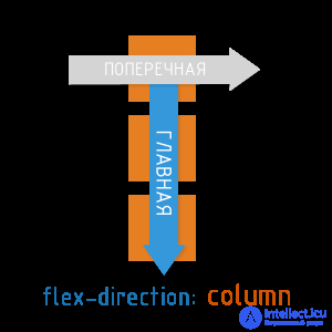
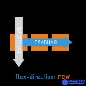
One of the basic concepts in flexbox are axes.
The main axis in the ltr locale by default is located from left to right. Transverse - from top to bottom. The direction of the main axis of the flex container can be set using the basic css property of the flex-direction.
Available flex-direction values:
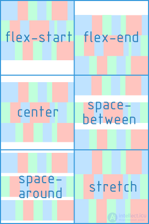
The css property justify-content determines how elements are aligned along the main axis.
Available values justify-content:

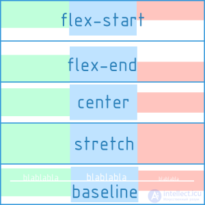
The Css align-items property determines how items align along the transverse axis.
Available align-items values:
The CSS properties of flex-direction, justify-content, align-items should be applied directly to the flex container, and not to its children.
The axes and alignments are the basics of flex. Relax, click on the demo and use it if you need to refresh your memory.
All the examples that we cited above were constructed taking into account the single-line (single-column) arrangement of blocks. I must say that by default the flex-container will always place the blocks inside itself in one line. However, the specification also supports multi-line mode. For the multi-line inside the flex-container, the CSS property flex-wrap is responsible.
Available flex-wrap values:
In fact, flex-flow provides the ability to describe the direction of the main and multi-lines of the transverse axis in one property. The default is flex-flow: row nowrap.
flex-flow: <'flex-direction'> || <'flex-wrap'>
CSS
 / * i.e.  ... * /
 .my-flex-block {
 flex-direcrion: column;
 flex-wrap: wrap;
 }
 / * this is the same as ... * /
 .my-flex-block {
 flex-flow: column wrap;
 }
There is also the align-content property, which determines how the resulting rows of blocks will be aligned vertically and how they will divide the entire space of the flex container among themselves.
Important: align-content works only in multi-line mode (i.e. in the case of flex-wrap: wrap; or flex-wrap: wrap-reverse;)
Available values are align-content:
CSS, the flex-wrap and align-content properties should be applied directly to the flex container, not to its child elements.
Sets the initial size along the main axis for a flex block before transformations based on other flex factors are applied to it. It can be set in any units of length (px, em,%, ...) or auto (by default). If set as auto, the block dimensions (width, height) are taken as a basis, which, in turn, may depend on the size of the content, if not specified explicitly.
Determines how much a separate flex block can be larger than neighboring elements, if necessary. flex-grow takes a dimensionless value (default is 0)
Example 1:
Example 2:
That is, the absolute value of flex-grow does not determine the exact width. It determines its degree of “greed” in relation to other flex-blocks of the same level.
Determines how much the flex block will decrease relative to neighboring elements inside the flex container in case of insufficient free space. The default is 1.
flex: none | [<'flex-grow'> <'flex-shrink'>? || <'flex-basis'>]
CSS
 / * i.e.  ... * /
 .my-flex-block {
 flex-grow: 12;
 flex-shrink: 3;
 flex basis: 30em;
 }
 / * this is the same as ... * /
 .my-flex-block {
 flex: 12 3 30em;
 }
Makes it possible to redefine the align-items flex-container property for an individual flex-block.
Available align-self values (same 5 options as for align-items)
By default, all blocks will follow each other in the order specified in html. However, this order can be changed using the order property. It is an integer and defaults to 0.
The order value does not specify the absolute position of the element in the sequence. It determines the weight of the position of the element.
HTML
 <div class = "my-flex-container">
 <div class = "my-flex-block" style = "order: 5"> item1 </ div>
 <div class = "my-flex-block" style = "order: 10"> item2 </ div>
 <div class = "my-flex-block" style = "order: 5"> item3 </ div>
 <div class = "my-flex-block" style = "order: 5"> item4 </ div>
 <div class = "my-flex-block" style = "order: 0"> item5 </ div>
 </ div>
In this case, the blocks will follow one after another along the main axis in the following order: item5, item1, item3, item4, item2
Flexbox can be loved at least for the fact that the horizontal alignment familiar to everyone through the margin: auto here also works for the vertical!
 .my-flex-container {
 display: flex;
 height: 300px;  / * Or whatever * /
 }
 .my-flex-block {
 width: 100px;  / * Or whatever * /
 height: 100px;  / * Or whatever * /
 margin: auto;  / * Magic!  The unit is centered vertically and horizontally!  * /
 }

Comments
To leave a comment
Cascading CSS / CSS3 Style Sheets
Terms: Cascading CSS / CSS3 Style Sheets