Lecture
After becoming familiar with HTML, site developers are divided into two main categories. One part believes that using HTML on the site you can create everything or almost everything, while the other understands that, in general, the markup is not enough to design web documents. Indeed, HTML is only the first stage in the process of learning to create websites. The next step is to learn styles or CSS (Cascading Style Sheets, cascading style sheets).
Styles are a set of parameters that control the appearance and position of web page elements. To make it clear what we are talking about, let's look at fig. 1.1.
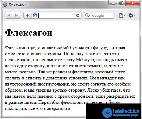
Fig. 1.1. HTML based webpage
This is a regular web page, designed without any frills. The same document, but with the addition of styles, takes on a completely different look (Fig. 1.2).
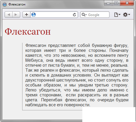
Fig. 1.2. HTML and CSS webpage
The change is dramatic, so let's look at the code in order to understand what the difference is (Example 1.1).
Example 1.1. Document source
HTML5CSS 2.1IECrOpSaFx
<!DOCTYPE HTML> <html> <head> <title>Флексагон</title> <meta charset="utf-8"> <link rel="stylesheet" href="style.css"> </head> <body> <h1>Флексагон</h1> <p>Флексагон представляет собой бумажную фигуру, которая имеет три и более стороны. Поначалу кажется, что это невозможно, но вспомните ленту Мёбиуса, она ведь имеет всего одну сторону, в отличие от листа бумаги, и, тем не менее, реальна. Так же реален и флексагон, который легко сделать и склеить в домашних условиях. Он выглядит как двухсторонний шестиугольник, но стоит согнуть его особым образом, и мы увидим третью сторону. Легко убедиться, что мы имеем дело именно с тремя сторонами, если раскрасить их в разные цвета. Перегибая флексагон, по очереди будем наблюдать все его поверхности.</p> </body> </html> Example 1.2. The contents of the style.css style file
body { font-family: Arial, Verdana, sans-serif; /* Семейство шрифтов */ font-size: 11pt; /* Размер основного шрифта в пунктах */ background-color: #f0f0f0; /* Цвет фона веб-страницы */ color: #333; /* Цвет основного текста */ } h1 { color: #a52a2a; /* Цвет заголовка */ font-size: 24pt; /* Размер шрифта в пунктах */ font-family: Georgia, Times, serif; /* Семейство шрифтов */ font-weight: normal; /* Нормальное начертание текста */ } p { text-align: justify; /* Выравнивание по ширине */ margin-left: 60px; /* Отступ слева в пикселах */ margin-right: 10px; /* Отступ справа в пикселах */ border-left: 1px solid #999; /* Параметры линии слева */ border-bottom: 1px solid #999; /* Параметры линии снизу */ padding-left: 10px; /* Отступ от линии слева до текста */ padding-bottom: 10px; /* Отступ от линии снизу до текста */ } In the style.css file, all the design parameters of tags such as <body>, <h1> and <p> are described. Notice that the tags themselves in the HTML code are written as usual.
Since a style file can be referenced from any web document, this results in a reduction in the amount of duplicate data. And thanks to the separation of code and design, the flexibility of managing the look of the document and the speed of work on the site is increased.
CSS is its own language that matches only certain values with HTML, for example, a way to determine color.
There are several types of styles that can be applied together to a single document. This is a browser style, author style and user style.
The default design that is applied to the elements of a web page by the browser. This design can be seen in the case of “bare” HTML, when no styles are added to the document. For example, the page title, formed by the <H1> tag, is displayed in most browsers in a serif font of 24 points.
The style that the developer adds to the document. Example 1.2 shows one of the possible ways to connect the author's style.
This is a style that a site user can turn on through browser settings. This style has a higher priority and overrides the original design of the document. In Internet Explorer, the user's style connection is made through the Tools> Internet Options> Appearance button, as shown in Figure. 1.3.
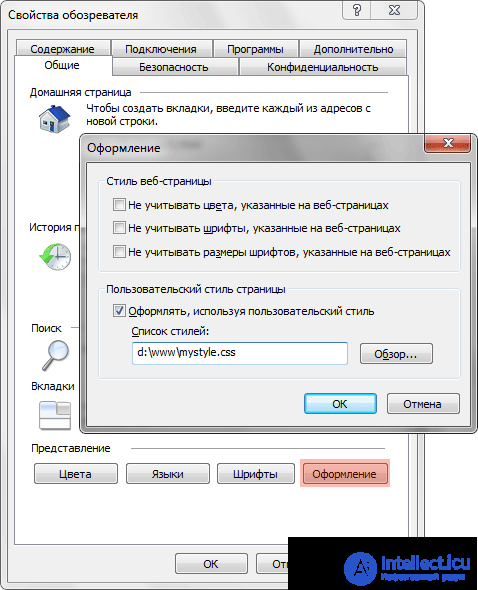
Fig. 1.3. Connecting a user's style in Internet Explorer
In Opera, a similar action takes place through the command Tools> General Settings> Advanced tab> Content> The Style Settings button (Fig. 1.4).
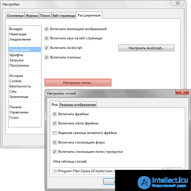
Fig. 1.4. Connecting the user's style in Opera browser
These types of styles can easily exist with each other, if they are not trying to change the look of a single element. In the event of a conflict, the user's style first takes precedence, then the author’s style and the browser’s last style.
1. Required to set the header color to green. What style property is suitable for this purpose?
2. What is style?
3. What is the CSS abbreviation?
1. color
2. A set of rules for formatting elements of a web page.
3. Cascading Style Sheets
CSS (English Cascading Style Sheets - Cascading Style Sheets ) is a formal language for describing the appearance of a document written using markup language.
It is mainly used as a means of describing, shaping the appearance of web pages written using HTML and XHTML markup languages, but can also be applied to any XML documents, for example, SVG or XUL.
CSS is used by the creators of web pages to specify colors, fonts, the location of individual blocks and other aspects of the presentation of the appearance of these web pages. The main purpose of developing CSS was to separate the description of the logical structure of a web page (which is produced using HTML or other markup languages) from the description of the appearance of this web page (which is now produced using the formal CSS language). This separation can increase the availability of a document, provide greater flexibility and control over its presentation, as well as reduce complexity and repeatability in structured content. In addition, CSS allows you to present the same document in different styles or output methods, such as screen presentation, print presentation, voice reading (with a special voice browser or screen reader), or when outputted by devices using Braille.
CSS rules are written in the formal CSS language and are located in style sheets, that is, style sheets contain CSS rules. These style sheets can be located both in the web document itself, the appearance of which they describe, and in separate files that have a CSS format. (Essentially, the CSS format is a regular text file. The .css file contains nothing but a list of CSS rules and comments for them.)
That is, these style sheets can be connected, embedded in the web document they describe in four different ways:
  <! DOCTYPE html>
 <html>
    <head>
       .....
       <link rel = "stylesheet" href = "Style.css">
    </ head>
    <body>
       .....
    </ body>
 </ html>
  <! DOCTYPE html>
 <html>
    <head>
       .....
       <style media = "all">
@import url (style.css);
  </ style>
    </ head>
 </ html>
  <! DOCTYPE html>
 <html>
    <head>
       .....
       <style>
  body {
             color: red;
          }
  </ style>
    </ head>
    <body>
       .....
    </ body>
 </ html>
  <! DOCTYPE>
 <html>
    <head>
       .....
    </ head>
    <body>
       <p style = "font-size: 20px; color: green; font-family: arial, helvetica, sans-serif">
          .....
       </ p>
    </ body>
 </ html>
In the first two cases, it is said that external style sheets are applied to the document, and in the second two cases internal style sheets are applied.
To add CSS to an XML document, the latter must contain a special reference to the style sheet. For example:
<? xml-stylesheet type = "text / css" href = "style.css"?>
As you know, HTML documents are built on the basis of a hierarchy of elements, which can be clearly represented in a tree form. The HTML elements for each other can be parents, children, ancestor elements, descendants, sister elements .
An element is the parent of another element if it is immediately in the hierarchical structure of the document, directly above this element. An element is an ancestor of another element if it is somewhere above this element in the hierarchical structure of a document.
Let, for example, in the document there are two paragraphs p , which include a bold-face font b . Then elements b will be children of their parent elements p , and descendants of their ancestors body . In turn, for p elements the body element will be only the parent . And besides, these two elements of p will be sister elements , as having the same parent - body .
In CSS, with the help of selectors, not only single elements, but also elements that are descendants, children, or sister elements of other elements (see the subsection “types of selectors”) can be specified.
In the first three cases of connecting the CSS table to the document (see above), each CSS rule from the style sheet has two main parts - a selector and a block of declarations . The selector located on the left side of the rule determines which parts of the document the rule applies to. The ad block is located on the right side of the rule. It is placed in braces, and, in turn, consists of one or more declarations separated by the “;” sign. Each ad is a combination of CSS properties and values separated by a ":". Selectors can be grouped in one line separated by commas. In this case, the property is applied to each of them.
  selector, selector {
   property: value;
   property: value;
   property: value;
 }
In the fourth case of connecting a CSS table to a document (see list), the CSS rule (which is the value of the style attribute of the tag on which it operates) is a list of declarations (“ CSS property : value ”) separated by “;”.
  * {
    margin: 0;
    padding: 0;
 }
  p {
    font-family: arial, helvetica, sans-serif;
 }
  .note {
    color: red;
    background-color: yellow;
    font-weight: bold;
 }
  # paragraph1 {
     margin: 0px;
 }
 a [href = "http://www.somesite.com"] {
    font-weight: bold;
 }
  div # paragraph1 p.note {
    color: red;
 }
  p.note> b {
    color: green
 }
  h1 + p {
    font-size: 24pt;
 }
  a: active {
    color: blue;
 }
  p: first-letter {
    font-size: 32px;
 }
A class or identifier can be assigned to some element (tag) of HTML by means of class attributes or id of this element (tag):
  <! DOCTYPE html>
 <html>
    <head>
       <meta http-equiv = "Content-Type" content = "text / html; charset = utf-8">
       <title>
          Class selectors and ids
       </ title>
       <style>
  p.Big {
             font-family: arial, helvetica, sans-serif;
             color: maroon;
          }
          div # First {
             background-color: silver;
          }
  </ style>
    </ head>
    <body>
        .....
        <div id = "First">
           .....
        </ div>
        <p class = "Big">
           .....
        </ p>
    </ body>
 </ html>
The main difference between element classes and element identifiers is that in a document a class can be assigned to several elements at once, and an identifier can be assigned to only one element. It also differs in the fact that there can be multiple classes (when an element class consists of several words, separated by spaces). For identifiers this is not possible.
It is important to note the following difference between an identifier and a class: identifiers are widely used in JavaScript to find a unique element in a document.
The names of classes and identifiers, in contrast to the names of tags and their attributes, are case-sensitive.
The properties of classes and identifiers are set using the appropriate selectors. And it can be set as a property of the class as a whole (in this case, the selector starts with “.”), Or the property of the identifier itself (in this case, the selector starts with “#”), or the property of some element of this class or this id.
In CSS, in addition to the classes specified by the author of the page, there is also a limited set of so-called pseudo - classes that describe the type of hyperlinks with a certain state in the document, the type of element that has input focus, and the type of elements that are the first children of other elements. Also in CSS there are four so-called pseudo - elements : the first letter, the first line, the use of special styles before and after the element.
Applying CSS to HTML documents is based on inheritance and cascading . The principle of inheritance is that CSS properties declared for ancestor elements are inherited by descendant elements. But, naturally, not all CSS properties are inherited — for example, if a frame is set for a paragraph tag p using CSS, then it will not be inherited by any tag contained in this tag p. This is done under the assumption that framing all-all attachments to a tag is a less trivial task than setting a single frame. But if for paragraph p, the font color is set by CSS means (for example, color:green; ), then this property will be inherited by each tag element in the paragraph, until its own font color is assigned to this tag. Which, in turn, will now be inherited by all the subelements nested in it, not extending to the elements-neighbors of the tag.
The principle of cascading is used when some HTML element is simultaneously assigned to more than one CSS rule, that is, when the values of these rules conflict. To resolve such conflicts, priority rules are introduced.
#id ) in the selector - ((1,0,0) for each declared identifier in the CSS rule selector); .class ), attributes ( [attr], [attr="value"] ) and pseudo-classes ( :pseudo-class ) in the selector - ((0,1,0) for each declared class, attribute and pseudo-class in the selector CSS rules); , input ) and pseudo-elements (:: pseudo-element) in the selector - ((0,0,1) for each declared element and pseudo-element in the CSS rule selector). !important word, have the highest priority. If there are several such properties, the preference is given primarily to the styles specified by the user , and for the remaining properties (which will be specified by the author of the page), it will be necessary to determine their specificity according to the principles described above and apply these properties in descending order of their specificity. An example of a style sheet (in this form, it can either be placed in a separate .css file, or framed with <style> tags and placed in the “header” of the same web page on which it acts):
  p {
    font-family: arial, helvetica, sans-serif;
 }
 h2 {
    font-size: 20pt;
    color: red;
    background: white;
 }
 .note {
    color: red;
    background-color: yellow;
    font-weight: bold;
 }
 p # paragraph1 {
    padding-left: 10px;
 }
 a: hover {
    text-decoration: none;
 }
 #news p {
    color: blue;
 }
 [type = "button"] {
    background-color: green;
 }
Here are seven CSS rules with p , h2 , .note , p#paragraph1 , a:hover , #news p and [type="button"] selectors.
p (paragraph) - the style is assigned. Paragraphs will be displayed in Arial, or, if such a font is not available, then Helvetica or Sans-serif otherwise the font of this family. h2 html element (second level header). The title of the second level will be displayed in red on a white background with an increased size. class attribute is “note”. For example, to a paragraph: <p class="note">Этот абзац будет выведен полужирным шрифтом красного цвета на желтом фоне. </p> <p class="note">Этот абзац будет выведен полужирным шрифтом красного цвета на желтом фоне. </p> p element, whose id attribute is equal to paragraph1 . Such an element will have an internal padding of 10 pixels. a - hyperlinks. By default, in most browsers the text of elements a underlined. This rule removes the underscore when the mouse pointer is over these elements. p , которые находятся внутри какого-либо элемента с атрибутом id , равным « news » (#news p — это типичный случай селектора потомков, см. 5-й пункт списка выше). type равен button . Например, это правило будет применено к элементу <input type="button"> (обычная кнопка), изменив его цвет фона на зеленый. До появления CSS оформление веб-страниц осуществлялось исключительно средствами HTML, непосредственно внутри содержимого документа. Однако с появлением CSS стало возможным принципиальное разделение содержания и представления документа. За счёт этого нововведения стало возможным лёгкое применение единого стиля оформления для массы схожих документов, а также быстрое изменение этого оформления.
Benefits:
Disadvantages:
CSS — одна из широкого спектра технологий, одобренных консорциумом W3C и получивших общее название «стандарты Web» [2] . В 1990-х годах стала ясна необходимость стандартизировать Web, создать какие-то единые правила, по которым программисты и веб-дизайнеры проектировали бы сайты. Так появились языки HTML 4.01 и XHTML, и стандарт CSS.
В начале 1990-х различные браузеры имели свои стили для отображения веб страниц. HTML развивался очень быстро и был способен удовлетворить все существовавшие на тот момент потребности по оформлению информации, поэтому CSS не получил тогда широкого признания.
Термин «каскадные таблицы стилей» был предложен Хокон Виум Ли в 1994 году. Совместно с Бертом Босом он стал развивать CSS.
В отличие от многих существовавших на тот момент языков стиля, CSS использует наследование от родителя к потомку, поэтому разработчик может определить разные стили, основываясь на уже определенных ранее стилях.
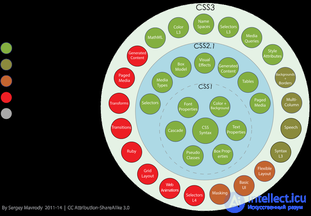
В середине 1990-х Консорциум Всемирной паутины (W3C) стал проявлять интерес к CSS, и в декабре 1996 года была издана рекомендация CSS1.
Рекомендация W3C, принята 17 декабря 1996 года, откорректирована 11 января 1999 года [3] . Среди возможностей, предоставляемых этой рекомендацией:
Рекомендация W3C, принята 12 мая 1998 года [4] . Основана на CSS1 с сохранением обратной совместимости за несколькими исключениями. Добавление к функциональности:
В настоящее время W3C больше не поддерживает CSS2 и рекомендует использовать CSS2.1
Рекомендация W3C, принята 7 июня 2011 года.
CSS2.1 основана на CSS2. Кроме исправления ошибок, в новой ревизии изменены некоторые части спецификации, а некоторые и вовсе удалены. Удаленные части могут быть в будущем добавлены в CSS3.
CSS3 (англ. Cascading Style Sheets 3 — каскадные таблицы стилей третьего поколения ) — активно разрабатываемая спецификация CSS. Представляет собой формальный язык, реализованный с помощью языка разметки. Самая масштабная редакция по сравнению с CSS1, CSS2 и CSS2.1. Главной особенностью CSS3 является возможность создавать анимированные элементы без использования JS, поддержка линейных и радиальных градиентов, теней, сглаживания и многое другое.
Преимущественно используется как средство описания и оформления внешнего вида веб-страниц, написанных с помощью языков разметки HTML и XHTML, но может также применяться к любым XML-документам, например, к SVGили XUL.
Разрабатываемая версия (список всех модулей) [5] .
В отличие от предыдущих версий спецификация разбита на модули, разработка и развитие которых идёт независимо.
CSS3 основан на CSS2.1, дополняет существующие свойства и значения и добавляет новые.
Нововведения, начиная с малых, вроде закругленных углов блоков, заканчивая трансформацией (анимацией) и, возможно, введением переменных [6] [7] .
Разрабатывается W3C с 29 сентября 2011 года. [8] [9]
Модули CSS4 построены на основе CSS3 и дополняют их новыми свойствами и значениями. Все они существуют пока в виде черновиков (working draft).
For example:
Наиболее полно поддерживающими стандарт CSS являются браузеры, работающие на движках Gecko (Mozilla Firefox и др.), WebKit (Safari, Arora, Google Chrome) и Presto (Opera) [10] .
Бывший когда-то самым распространённым браузером [11] Internet Explorer 6 поддерживает CSS далеко не полностью [12] .
Вышедший спустя 7 лет после своего предшественника Internet Explorer 7 хотя и значительно улучшил уровень поддержки CSS [13] [14] , но всё ещё содержит значительное количество ошибок [15] .
В Internet Explorer 8 используется новый движок, который полностью поддерживает CSS 2.1 и частично — CSS 3 [16] .
Для проверки поддержки браузером веб-стандартов (в том числе и различных частей стандарта CSS) был разработан тест Acid. Его вторая версия называется Acid2, а третья, соответственно, Acid3.
Многие веб-мастера для кросс-браузерности стилей не используют нововведения в CSS3, заменяя их изображениями. Например, вместо закругления углов используют фоновое изображение, на котором изображен этот блок без содержания (текста) с закругленными углами.
В стандартах CSS от Консорциума W3C используется модель, в которой свойство width определяет ширину содержимого блока, не включая в нее отступы и рамки. Ранние версии Internet Explorer (4 и 5), реализовали собственную модель, в которой width определяет расстояние между рамками блока, включая отступы ( padding ) и рамки ( border ). Кроме Internet Explorer 5 эту модель так же понимают браузеры Netscape 4 и Opera 7. Поддержка стандартной модели W3C появилась в IE только в шестой версии.
В разрабатываемом стандарте CSS3 для решения этой проблемы введено свойство box-sizing , со значениями content-box для указания на использование стандартной модели W3C и border-box для использования модели IE 5.
В браузере Mozilla, при поддержке этого свойства, под собственным «рабочим» названием -moz-box-sizing , ввели еще одно значение — padding-box , таким образом создав третью блочную модель, в которой width это размер содержимого и отступов блока, не включая рамки.
Различия в реализации CSS различными браузерами заставляют веб-разработчиков искать решения, как заставить все браузеры отображать страницу одинаково. CSS-фильтры (также часто называемые CSS-хаками) позволяют выборочно применять (или не применять) стили к различным элементам. Например, известно, что Internet Explorer 6 применяет правила, использующие селекторы вида * html селектор (фильтр, известный как «star html bug»). Тогда, чтобы заставить и браузеры, использующие блоковую модель W3C и IE, работающего в Quirks mode со своей блоковой моделью, отображать блок #someblock шириной в 100 пикселей и внутренними отступами в 10 пикселей, можно написать такой код:
 /* Модель W3C - 80px ширина содержимого и 10px отступы с каждой стороны */
#someblock { width: 80px;  padding: 10px;  }
 /* Следующее правило применит только IE6.  * /
* html #someblock { width: 100px;  padding: 10px;  }
Ещё одним способом выборочного применения правил для Internet Explorer являются условные комментарии.
Все поддерживаемые на конец 2010 года версии Internet Explorer были уязвимы: при обработке браузером каскадных таблиц стилей (CSS) может возникнуть неинициализированная память, используемая затем для удалённого запуска на компьютере пользователя вредоносного кода [17] .
CSS Framework (также Web design framework ) — это заранее подготовленная css-библиотека, созданная для упрощения работы верстальщика, быстроты разработки и исключения максимально возможного числа ошибок вёрстки (проблемы совместимости различных версий браузеров и т. д.). Так же как и библиотеки скриптовых языков программирования, CSS-фреймворки, обычно имеющие вид внешнего .css-файла, «подключаются» к проекту (добавляются в заголовок веб-страницы), позволяя неискушённому в тонкостях вёрстки программисту или дизайнеру правильно создать xhtml-макет.
Часто при вёрстке страниц нужно использовать одно и то же значение много раз: один и тот же цвет, один и тот же шрифт. И если это значение нужно будет изменить, то придётся менять во многих местах. В стандартном CSS нет возможностей наследования стилей, вычисляемых значений и прочих зависимостей.
Для решения этих вопросов и ускорения разработки существует несколько расширений языка CSS. Расширений в том смысле, что код CSS является валидным кодом для расширения, но не наоборот. Чтобы из кода «расширенного CSS» получился обычный CSS-файл, воспринимаемый браузером, необходимо выполнить компиляцию. Компиляция может быть нескольких типов:
Примеры расширений CSS:

Comments
To leave a comment
Cascading CSS / CSS3 Style Sheets
Terms: Cascading CSS / CSS3 Style Sheets