Lecture
Bootstrap (also known as Twitter Bootstrap ) is a free set of tools for creating websites and web applications. Includes HTML and CSS design templates for typography, web forms, buttons, tags, navigation blocks, and other web interface components, including JavaScript extensions.
Bootstrap uses modern developments in the field of CSS and HTML, so you need to be careful with the support of older browsers [5].
Virtually any web page contains many similar components that are found on other sites. This menu, navigation, form elements, titles, etc. Not to mention the multi-column layout, without which it is generally difficult to turn the layout image into a finished web page. In order to write less code and use ready-made solutions to the maximum, specialized libraries are used, they are often called frameworks. One of these frameworks for layout is Bootstrap.
Bootstrap was developed by Mark Otto and Jacob Thornton, Twitter employees, which is why the name of the company appears in the title. Their goal is clear to any developer - to create a single standard set of tools for company employees, accelerating their work.
Today, Bootstrap has long gone beyond the framework of a single company; it is an open product used by web developers for website layout all over the world.
What are the advantages of using the library.
High development speed
In fact, Bootstrap is a constructor, fragments of which you include in your project if necessary. This reduces development time, because you do not need to invent and write them yourself.
Adaptive design
Bootstrap aims to create a layout for different devices - laptops, tablets, smartphones. In this case, the code is written alone, and scaling depending on the width of the device takes the framework.
Open program
You are free to study the source code of the library, change and expand it for your own needs.
Browser Compatibility
The components of the library are written and tested taking into account the work of different browsers. This ensures that the layout will look the same regardless of the browser selected.
Low threshold of entry
To use the library in your work, you need to have minimal knowledge of HTML, CSS and JavaScript. This allows you to create spectacular sites, even novice developers.
Single work component
Bootstrap not only inserts any elements on the page, but immediately sets their design and user interaction through JavaScript. You get a fully working set of components, which is enough to add and customize.
The drawbacks, of course, also exist, and they stem mainly from the universality of the system.
First, library files, even compressed, take up quite a lot of space and increase server load. With increasing experience, you need to download and install only the required components of Bootstrap, thereby reducing the amount of files.
Secondly, the styles offered in the library may not fit the design of the developed site and will have to be redone a lot. In such cases, as you know, it is easier to write everything yourself from scratch.
In general, Bootstrap is suitable for standard sites, the design of which is focused on the library. And sites that offer themes and templates, including free ones, have recently been born quite a lot. Just search for the keywords "Bootstrap Theme."
This framework has been developed as a Twitter internal library called Twitter Blueprint . After several months of development, it was opened under the name Bootstrap on August 19, 2011 [6].
The main innovations of the second version, which appeared on January 31, 2012, were a 12-column grid and support for adaptability [7].
The third version was released on August 19, 2013. In it, adaptability was further developed, the transition to the concept of mobile first was made, optimization primarily for mobile devices. The default design was flat [8].
Work on the fourth version was started on October 29, 2014 [9]. The alpha version was released on August 19, 2015 [10].
The disadvantages include poor color gamut of a standard set of icons. [11]. Benefits - a good implementation of the grid for scaling a web page, creating a responsive design. [12]
Basic tools Bootstrap:
 \
\
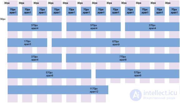
Figure 1. Aaron K. White's Bootstrap grid system template
First you need to download Bootstrap from the developer's website at the following address:
http://getbootstrap.com/getting-started/#download
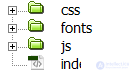
This is a full version containing all the necessary scripts and styles. Inside there are three folders: css, fonts and js.
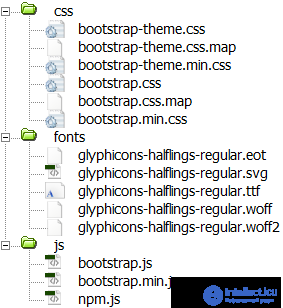
Bootstrap file structure
In folders with styles and scripts, two versions of the files are attached - the source and the compact (the name contains min). Compact differs only in file size and reduced readability of the code. It is best to add this version to the working site, so we will speed up the loading of web pages.
Copy all the folders in our project and create index.html in the root. As a result, the structure of our project will look like this.
Files and folders of our project
The content of index.html includes a link to the style file bootstrap.css and at the bottom of the page we call bootstrap.js. More is not yet needed.
Bootstrap title> <link href="css%20/%20bootstrap.css" rel="stylesheet"> head> Hello world! h1>
If during the work you need to redefine the styles of some elements, then you can include one more own style file and set the necessary properties in it. Bootstrap also offers you to immediately set the desired parameters directly on their site, select the required components and download a personalized version of the working files. This is done via the following link:
http://getbootstrap.com/customize/
Also, in the future, we will need the jQuery library, we need to download it and add a call before bootstrap.js.
Bootstrap is characterized by its well-designed and flexible system of modular grids, which is based on a 12-column layout.
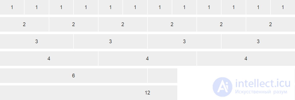
Columns of the same width
The columns themselves do not have to have the same width; you can combine any number of columns, as long as they add up to 12 in total.
Columns of different widths
So, to create a layout of three columns use
Example 1. Layout with three columns
    Three-Column Layout  title>
   <link href="css%20/%20bootstrap.min.css" rel="stylesheet">
   <style>
    [class * = "col-"] {
     background-color: #eee;
     border-right: 2px solid #fff;
     text-align: center;
     padding-top: 15px;
     padding-bottom: 15px;
     font-size: 2rem;
    }
   </ style>
  </ head>
  <body>
   <div class = "container">
    <div class = "row">
     <div class = "col-xs-3"> 3 columns </ div>
     <div class = "col-xs-7"> 7 columns </ div>
     <div class = "col-xs-2"> 2 columns </ div>
    </ div>
   </ div>
   <script src = "js / jquery.min.js"> </ script>
   <script src = "js / bootstrap.min.js"> </ script>
  </ body>
 </ html> </style>
The style is added only for visual selection of columns.
The container class creates a fixed-width layout, the value of which depends on the size of the device. For monitors, the maximum width is 1170 pixels, for smartphones the layout will occupy the entire available width. If you do not need to limit the width of the layout, then instead of the class of container should use container-fluid (example 2).
Example 2. Rubber layout
4 columns div>6 columns div>2 columns div> div> div>Indents between speakers
The columns initially fit snugly together, which is not always useful for the layout. To add white space between columns, use the class col-xs-offset-N, where N varies from 0 to 12. Indent is added to the left of the current column (Example 3).
Example 3. Adding indents
3 columns div>5 columns div>2 columns div> div> div>The result of this example in the browser is shown in Fig. 3
Fig. 3. Columns with indents between them.
Remember that indents are added to the total number of columns, the sum of which should not exceed 12, otherwise the columns will start moving to another line.
Column shift
Each column can be shifted left or right by a specified number of columns. Again this is done using classes. col-xs-pull-N shifts the column to the left by the specified number, and col-xs-push-N shifts to the right (example 4). Here N can vary from 0 to 12.
Example 4. Right column shift
3 columns div>5 columns div>2 columns div> div> div>Note that the shift is not an additional column as when using offset, so you do not need to summarize all the values. You also need to ensure that the speakers do not overlap each other.
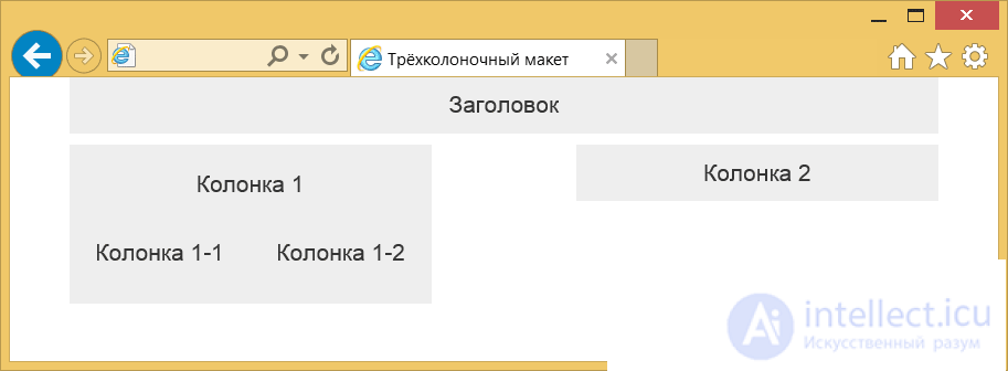
Nested columns
With the layout of the complex layouts of twelve columns may not be enough, moreover, in one column there may be additional ones. So we will need some column attachments to others. This is done in a similar way (Example 5).
Example 5. Nested columns
Title div>Column 1 div>Column 1-1 div>Column 1-2 div> div> div>Column 2 div> div> div>To create nested columns again add a
with the class row, which contains the desired structure of nested columns. Thus you can create any complex layouts.Notice that the header fills the entire width of the layout, because it occupies all 12 columns. An additional container row for such things is not necessary to enter, the transfer of the remaining columns to another row will occur automatically (Fig. 4).
Fig. 4. Nested columns
Adaptive design is called the way of layout, when the width of the layout of the web page adapts to the width of the device. The simplest option is proportional zooming, but in fact it is better to change the location of elements and their sizes. So we get the most optimal view for smartphones, tablets and monitors.
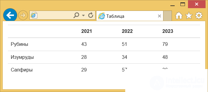
In Bootstrap already incorporated the possibility of responsive design. If you make a simple multi-column layout, and then begin to reduce the width of the browser window, you will notice that the layout itself changes. But this is not all limited, it is much more interesting to change the layout itself a little so that it best suits the device. For this purpose, keywords are entered that are found in class names, they are presented in Table. one.
Tab. 1. Keywords Device Name Layout width Smartphone xs Less than 768px The tablet sm 768px and more Monitor md 992px and more High resolution monitor lg 1200px and more To set the width of the speakers for smartphones, it is enough to include the class col-xs-N in the code, for monitors it will already be called col-md-N. Any classes can be combined with each other, if the class for the selected device is not specified, then it is inherited from the bottom up. This means that the layout for the smartphone will look the same as the layout for the monitor. But not the other way around. That is why the layout always begins with the layout for the smartphone, then the tablet and monitor are already coming.
Since we are now focusing on mobile devices, we need to add the following line inside the
.Now our design will scale to the width of the device and look optimal, especially on devices with a small screen.
Taking into account this line and new classes we will make a simple layout with two columns (example 1).
Example 1. Adaptive layout
Responsive Layout title> <meta name="viewport" content="width = device-width, initial-scale = 1.0"> <link href="css%20/%20bootstrap.min.css" rel="stylesheet"> <style> [class * = "col-"] { background-color: #eee; text-align: center; padding-top: 10px; padding-bottom: 10px; margin-bottom: 10px; font-size: 2rem; } </ style> </ head> <body> <div class = "container"> <div class = "row"> <div class = "col-xs-12"> Title </ div> <div class = "col-xs-12 col-sm-8 col-md-8"> Column 1 </ div> <div class = "col-xs-12 col-sm-4 col-md-3 col-md-offset-1"> Column 2 </ div> </ div> </ div> <script src = "js / jquery.min.js"> </ script> <script src = "js / bootstrap.min.js"> </ script> </ body> </ html> </style> To test the layout, it is not necessary to watch it on any given device, it is enough to reduce the width of the browser window and we will immediately see the changes. In fig. 1-3 shows the result of this example with different window widths.
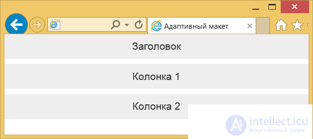
Fig. 1. View on smartphone
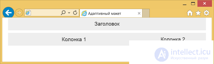
Fig. 2. View on the tablet
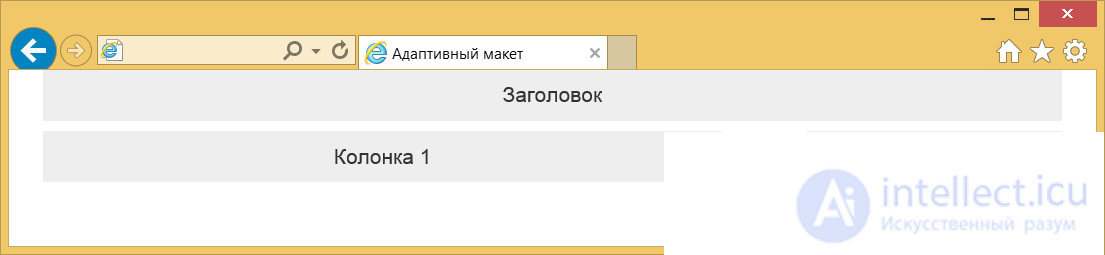
Fig. 3. View on the monitor
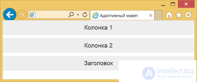
We have considered the simplest case when the arrangement of elements practically does not change relative to each other. What if you need to rearrange the elements in places or something to remove for small screens? Directly, this will not work, so let's go for a little trick - add two identical elements in different places and hide one and display the other. Bootstrap offers two sets of classes for hiding and showing elements depending on the window width - hidden-xs and visible-xs-block. The principle is the same as when working with columns; instead of xs, we substitute the desired keyword. Example 2 shows how to “move” the title.
Example 2. Changing the position of the header
продолжение следует...
Часть 1 Bootstrap - HTML and CSS design templates and JavaScript extensions. basics of use
Часть 2 Sketches - Bootstrap - HTML and CSS design templates and


 div>
div>


Comments
To leave a comment
Cascading CSS / CSS3 Style Sheets
Terms: Cascading CSS / CSS3 Style Sheets