Lecture
All visual components of the Swing library are inherited from the JComponent class. This class itself is abstract and not directly used, but all visual components inherit its methods. Consider the most useful ones.
setEnabled(boolean enabled) used to control the activity of a component. When this method is called with the false parameter, the component enters the inactive state. For each successor of JComponent this “inactivity” can be redefined in different ways. For example, the inactive button is not pressed, does not respond to the mouse being targeted, and is displayed in monochrome gray. The isEnabled() method returns true if the element is active and false otherwise.
setVisible(boolean visible) controls the visibility of the component. We have already used it to display the JFrame window. Most of the controls, unlike the window, are visible by default (so we did not call this method after creating buttons in the examples in the previous chapter). The isVisible() method returns false if the element is invisible and true otherwise.
Using the setBackground(Color color) method, you can change the background color of a component. However, the effect will take place only if the component is opaque (some components, for example, the JLabel label is transparent by default). Opacity is set by the setOpaque(boolean opaque) method setOpaque(boolean opaque) with the true parameter. The getBackground() and isOpaque() methods return the current background color and component opacity.
In most visual libraries, a label is one of the simplest components. It is a plain text that is displayed at a specified location in the window and is used to display supporting textual information: signatures to other elements, instructions and warnings for the user. In Swing, the label allows you to achieve more interesting effects. First, in addition to text, you can use the icon. Secondly, it can be used to display formatted text.
Text and label icon can be set in its constructor. She has several constructors with different parameters, in particular:
JLabel(String text) - creates a label with the text
JLabel(Icon image) - creates a label with an image icon
JLabel(String text, Icon image, int align) - creates a label with the text and image icon. The third parameter sets the alignment of the text along with the icon. One of the constants described in the SwingConstants: interface can be used as it SwingConstants: LEFT , RIGHT , CENTER .
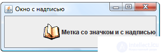 For example, create a window with a label created using the third constructor. As in the last lesson, we will use two classes, one of which we will call
 SimpleWindow and inherit it from the JFrame window JFrame . In its constructor, all window elements will be created and placed. The second class will create this window and display it on the screen (the code will be the same as in the examples in the previous chapter).
Let's write the following code in the constructor of the SimpleWindow class:
SimpleWindow(){ super("Окно с надписью"); setDefaultCloseOperation(EXIT_ON_CLOSE); JLabel label = new JLabel("Метка со значком и с надписью", new ImageIcon("1.png"), SwingConstants.RIGHT); getContentPane().add(label); pack(); } To make sure that the right-justified alignment works, you need to slightly stretch the window so that the width of the label becomes more optimal.
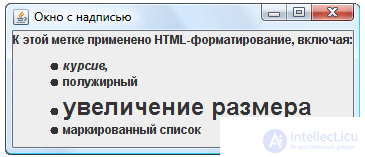
In the Swing library, a label (and not only it) can be configured to display formatted text in HTML format. This requires that the string set as a label label starts with the <html> tag. After that, you can use any HTML version 3.2 language tags in the string, and they will be converted to the corresponding formatting attributes. This is easily seen by changing in the previous example the line calling the constructor to:
JLabel label = new JLabel("<html>К этой метке применено " + "HTML-форматирование, включая: <ul><li> <i>курсив</i>," + JLabel label = new JLabel("<html>К этой метке применено " + "HTML-форматирование, включая: <ul><li> <i>курсив</i>," + "<li><b>полужирный</b> <li><font size = +2> увеличение размера </font>" + "<li>маркированный список </ul>"); Since the text of our inscription is rather long, the line is divided into parts for convenience of perception and the + operator is used.
 We list the main methods of the
 JLabel class:
getText() - returns the current label text
setText(String text) - sets a new caption text
getIcon() - returns the label icon
setIcon(Icon image) - sets a new icon. As an icon, an object of the simple ImageIcon class already familiar to us is ImageIcon (as in the example above).
getVerticalAlignment() , setVerticalAlignment(int align) , getHorizontalAlignment() , setHorizontalAlignment(int align) - these four methods allow you to get the current or set a new alignment (horizontally and vertically) of the label relative to its borders. Possible positions are described in the SwingConstants interface.
getVerticalTextPosition() , setVerticalTextPosition(int align) , getHorizontalTextPosition() , setHorizontalTextPosition(int align) - these four methods allow you to get the current or set a new text alignment relative to the icon. Possible positions are described in the SwingConstants interface.
getIconTextGap() , setIconTextGap(int gap) - allows you to get or set the distance between the text and the label icon in pixels.
We constantly used the buttons in the previous chapter, although we didn’t touch on their customization options. A button is a rectangle with text (and / or an icon) that the user clicks on when he wants to perform an action (or to signal something).
The button is created by one of five constructors, in particular, JButton() , JButton(String text) , JButton(Icon icon) , JButton(String text, Icon icon) , the parameters of which speak for themselves. The fifth constructor will be discussed in the next chapter.
In addition to the usual icon, you can assign a few more buttons to different states. The setRolloverIcon(Icon icon) method setRolloverIcon(Icon icon) allows you to set an icon that will appear when you hover over a button, setPressedIcon(Icon icon) is an icon for a button in a setDisableIcon(Icon icon) state, and setDisableIcon(Icon icon) is an icon for an inactive button. Each of these methods has a get method.
The setMargin(Insets margin) method allows you to set the amount of indents from the text of the label on the button to its margins. An object of class Insets , which is passed to this method, can be created by a constructor with four integer parameters that specify the amount of indents: Insets(int top, int left, int bottom, int right) . The getMargin() method returns the value of the current indents as an object of the same class.
All the JLabel class methods described in the previous section are also present in the JButton class. Using these methods, you can change the icon and text of the inscription on the button, as well as manage their relative position relative to each other and relative to the edge of the button (taking into account the indents).
 Through the
 setBorderPainted(boolean borderPainted) , setFocusPainted(boolean focusPainted) , setContentAreaFilled(boolean contentAreaFilled) you can turn off (with the false parameter) and turn back (with the true parameter) frame drawing, focus drawing (the button on which the focus is highlighted by a dotted rectangle) and fill the button in the down state.
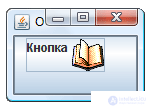
For example, create a button with an icon and with an inscription, change its indents and the text position relative to the icon (the text will be aligned left and up relative to the icon).
SimpleWindow(){ super("Окно с кнопкой"); setDefaultCloseOperation(EXIT_ON_CLOSE); JButton button = new JButton("Кнопка", new ImageIcon("1.png")); button.setMargin(new Insets(0, 10, 20, 30)); button.setVerticalTextPosition(SwingConstants.TOP); button.setHorizontalTextPosition(SwingConstants.LEFT); getContentPane().add(button); pack(); } The JToggleButton component is a button that can be in two states: pressed and released. When the user clicks on such a button, it changes its state. This is how the formatting buttons on the text editor toolbar behave. The [I] button not only sets or removes italics in the selected text, but also signals its presence or absence.
The main constructor - JToggleButton(String text, Icon icon, boolean selected) creates a button with the specified label, icon and current status. The button can be translated to the desired state programmatically by calling the setSelected(boolean selected) method setSelected(boolean selected) . The isSelected() method returns true if the button is selected (that is, it is in the depressed state) and false otherwise.
From the JToggleButton class, the JToggleButton class JToggleButton inherited. This class has exactly the same set of constructors and methods, i.e. does not extend the functionality of the ancestor. The only difference between them is in appearance: JCheckBox does not look like a button, but as a small box in which you can tick or uncheck.
The JRadioButton class behaves in a similar way - a switch or a radio button that looks like an empty circle when it is not selected and a circle with a dot in the selected state.
Although the JCheckBox and JRadioButton behave in exactly the same way (and, similarly to their common ancestor JToggleButton ), they are commonly used in different situations. In particular, JRadioButton assumes the choice of a single alternative from several possible: several such objects are combined into one group (most often this group is visually indicated by a frame) and when one of the group elements is selected, the previous selected element changes to the “not selected” state.
In order to get this behavior, a special container ButtonGroup is ButtonGroup - a mutually exclusive group (created by the constructor without parameters). If you add several JRadioButton elements to one such container, then only one of them will always be selected.
In principle, not only switches, but also checkboxes and selection buttons (and even regular buttons) can be added to a ButtonGroup . But when developing an interface, you should follow the well-established approach, according to which JRadioButton objects (and, in some cases, JToggleButton ), but not JCheckBox should be merged into a mutually exclusive group.
The add(AbstractButton button) * method adds an item to a group. The getElements() method returns all its elements as an Enumeration collection. You can iterate through the collection to find the selected item.
Consider an example in which two select buttons, two checkboxes and two radio buttons are created. Selection buttons and switches are grouped into ButtonGroup groups. In order to circle each pair of elements with a frame, it is necessary to arrange each pair of elements on a separate panel.
SimpleWindow(){ super("Пример с кнопками выбора, флажками и переключателями"); setDefaultCloseOperation(EXIT_ON_CLOSE); ImageIcon icon = new ImageIcon("1.png"); // будем использовать один значок на все случаи ImageIcon icon = new ImageIcon("1.png"); // будем использовать один значок на все случаи Box mainBox = Box.createVerticalBox(); Box box1 = Box.createVerticalBox(); JToggleButton tButton1 = new JToggleButton("Кнопка выбора 1"); JToggleButton tButton2 = new JToggleButton("Кнопка выбора 2", icon); ButtonGroup bg = new ButtonGroup(); // создаем группу взаимного исключения ButtonGroup bg = new ButtonGroup(); // создаем группу взаимного исключения bg.add(tButton1); bg.add(tButton2); // сделали кнопки tButton1 и tButton2 взаимоисключающими bg.add(tButton2); // сделали кнопки tButton1 и tButton2 взаимоисключающими box1.add(tButton1); box1.add(tButton2); // добавили кнопки tButton1 и tButton2 на панель box1 box1.add(tButton2); // добавили кнопки tButton1 и tButton2 на панель box1 box1.setBorder(new TitledBorder("Кнопки выбора")); Box box2 = Box.createVerticalBox(); JCheckBox check1 = new JCheckBox("Флажок 1"); JCheckBox check2 = new JCheckBox("Флажок 2", icon); box2.add(check1); box2.add(check2); // добавили флажки на панель box2 box2.add(check2); // добавили флажки на панель box2 box2.setBorder(new TitledBorder("Флажки")); box2.add(check2); // добавили флажки на панель box2 box2.setBorder(new TitledBorder("Флажки")); Box box3 = Box.createVerticalBox(); JRadioButton rButton1 = new JRadioButton("Переключатель 1"); JRadioButton rButton2 = new JRadioButton("Переключатель 2", icon); bg = new ButtonGroup(); // создаем группу взаимного исключения 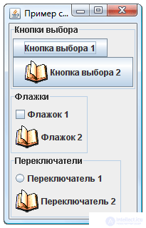
bg.add(rButton1); bg.add(rButton2); // сделали радиокнопки взаимоисключающими bg.add(rButton2); // сделали радиокнопки взаимоисключающими box3.add(rButton1); box3.add(rButton2); // добавили радиокнопки на панель box3 box3.add(rButton2); // добавили радиокнопки на панель box3 box3.setBorder(new TitledBorder("Переключатели")); mainBox.add(box1); mainBox.add(box2); mainBox.add(box3); setContentPane(mainBox); pack(); } By running the example, we can observe the features of the selection buttons, checkboxes and radio buttons. In particular, we see that for checkboxes or radio buttons the pattern replaces the selection element. But the picture does not indicate whether this object is selected, which can confuse the user. You need to set a separate drawing for the selected state, which is achieved by the setSelectedIcon(Icon icon) method setSelectedIcon(Icon icon) . Add to the right place command:
check2.setSelectedIcon(new ImageIcon("2.png")); and
rButton2.setSelectedIcon(new ImageIcon("2.png")); Observe the effect produced. Do not forget that the 2.gif file, as well as the 1.gif file, must be located in a place accessible to the program: in the directory of your project.
In the above example, the frames have different widths. Modify the example so that all frames are identical in width. Hint: Use a different location manager for the main panel (instead of BoxLayout ).
A text field is a simple and frequently used component designed for entering small-sized (written in one line) text data. To create a text box, constructors are most often used:
JTextField(int columns) - creates an empty text field, which is wide enough to accommodate columns characters. In this case, the user can enter a string of any length into the text field: it will simply scroll.
JTextField(String text) - creates a text field with the initial text text .
JTextField(String text, int columns) - sets both the width and the initial text.
You can enter text into the field using the setText(String text) method. The getText() method returns the contents of the text field entirely, and getText(int offset, int length) - a fragment of the length content, starting with the character offset .
Part of the text in the field can be allocated (both programmatically and as a result of user actions). The getSelectedText() method allows you to get the selected part of the text. You can replace the selected text with another using the replaceSelection(String content) method. The getSelectionStart() and getSelectionEnd() methods return the bounds of the selected area, and the setSelectionStart(int start) and setSelectionEnd(int end) methods change them.
The getCaretPosition() method returns the position of the cursor (caret) in the text field, and the setCaretPosition(int position) method allows you to set it programmatically. Method setCaretColor(Color color) you can change the color of the cursor.
By default, the text in the field is pressed to the left. This can be setHorizontalAlignment(int align) using the setHorizontalAlignment(int align) method setHorizontalAlignment(int align) ; one of the alignment constants defined in the same JTextField: class is passed as a parameter JTextField: LEFT , CENTER , RIGHT .
JPasswordField is a direct descendant of JTextField , so all of the above is true for it. The difference lies in the fact that all the text entered into it is hidden from prying eyes: it is replaced with asterisks or another symbol that can be set using the setEchoChar(char echo) method and getEchoChar() .
Most often, JPasswordField is used to enter a password. The getText() method allows you to get this password, but is not recommended to use it (an attacker can analyze the contents of RAM and intercept this password). Instead, use the getPassword() method, which returns an array of char[] characters. After the entered password is processed (for example, compared to a real password), it is recommended to fill this array with zeros so that there are no traces in the RAM.
JTextArea is also a descendant of JTextField and inherits all of its methods. In contrast to the text field, the text entry area allows you to enter not one line, but several. In this regard, JTextArea offers several additional functions. First, it is the ability to setWrapStyleWord(boolean wrapStyle) words onto an adjacent string entirely, which is controlled by the setWrapStyleWord(boolean wrapStyle) method setWrapStyleWord(boolean wrapStyle) . If you call this method with the true parameter, then the words will not break in the place where they “stumble” on the component border, but will be completely transferred to a new line. Secondly, it is the ability to transfer text (that is, long lines will fit into several lines instead of one component that goes beyond the boundaries. This ability is controlled by the setLineWrap(boolean lineWrap) method setLineWrap(boolean lineWrap) . The isWrapStyleWord() and isLineWrap() methods return the current state of these abilities ( true - activated and false - deactivated).
When creating a JTextArea most often use the JTextArea(int rows, int columns) constructor, which sets the height (number of lines) and the width (number of characters) of the component.
JTextArea additionally offers two convenient methods for working with its contents. The append(String text) method adds the text string to the end of the existing text, and the insert(String text, int position) method insert(String text, int position) inserts it into the position position .
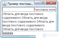 We will observe these three components in an illustrative example. Create a simple window in which we place them with the help of the
 BorderLayout manager.
SimpleWindow(){ super("Пример текстовых компонентов"); setDefaultCloseOperation(EXIT_ON_CLOSE); JTextField textField = new JTextField("Текстовое поле", 20); textField.setCaretColor(Color.RED); textField.setHorizontalAlignment(JTextField.RIGHT); JPasswordField passwordField = new JPasswordField(20); passwordField.setEchoChar('$'); passwordField.setText("пароль"); JTextArea textArea = new JTextArea(5, 20); textArea.setLineWrap(true); textArea.setWrapStyleWord(true); for (int i = 0; i <= 20; i++) textArea.append("Область для ввода текстового содержимого "); getContentPane().add(textField, BorderLayout.NORTH); getContentPane().add(textArea); getContentPane().add(passwordField, BorderLayout.SOUTH); pack(); } In order to better understand the features of the text area, replace true by false with false in the calls to the setLineWrap() and setWrapStyleWord() methods. Observe the change in component operation. Resize the window to see how the text is rearranged to the available space.
Arrange the same three components in the window, but with the help of the FlowLayout , which always sets the preferred sizes for the components. Observe how the JTextArea area JTextArea when you add new text to it.
Observing the behavior of the JTextArea component in the previous example, it is easy to detect the problems that arise when the text becomes “cramped” within the allotted space. Depending on the layout manager used, the text is either cut off, going beyond the component's borders, or it expands these boundaries (but in any case it remains limited by the window size). In such cases, the use of scroll bars is typical, but in Swing the scroll bars themselves do not appear.
Fortunately, adding a scrollbar to a component is actually very simple. For this is the component JScrollPane- the scroll bar. Most often, it is simply “worn” on the required object by means of its own constructor, which takes this object as a parameter. For example, in order for the text area textAreafrom the previous example to acquire scroll bars, you need to replace the command
getContentPane().add(textArea); on command
getContentPane().add(new JScrollPane(textArea)); In this command, a panel with scroll bars is created, an object is placed into it textArea, and the panel itself is added to the window's content panel. Now the text scrolls freely. And in the case of a manager FlowLayoutor BoxLayoutcomponent, JTextAreait will not adjust to its content (it will have the preferred size corresponding to the parameters of the designer) and, if necessary, display scroll bars.
Useful methods of JScrollPane are:
setHorizontalScrollBarPolicy(int policy)- allows you to set a strategy for working with a horizontal scroll bar. Possible values are represented by constants HORIZONTAL_SCROLLBAR_ALWAYS(display always), HORIZONTAL_SCROLLBAR_AS_NEEDED(display if necessary) and HORIZONTAL_SCROLLBAR_NEVER(never display). These constants are defined in the interface ScrollPaneConstants.
In the interface ScrollPaneConstants, not a single method is described, but only constants are contained. By the way, the exact same “constant compilation” is a class SwingConstantsused to indicate alignment in the last chapter. If a class (in our examples this SimpleWindow) often uses constants defined in such an interface (for example, to align multiple components), the technique is used to reduce the amount of code. A class can implement the desired interface and use all its constants as its own. For example, we could rewrite the class definition SimpleWindowas follows:
class SimpleWindow extends JFrame implements ScrollPaneConstants { ... } and instead ScrollPaneConstants.HORIZONTAL_SCROLLBAR_NEVERwrite just HORIZONTAL_SCROLLBAR_NEVERwhere it is needed.
setVerticalScrollBarPolicy(int policy)allows you to set a strategy for working with a vertical scroll bar by means of constants VERTICAL_SCROLLBAR_ALWAYS, VERTICAL_SCROLLBAR_AS_NEEDEDand VERTICAL_SCROLLBAR_NEVER. *
 Большинство программных продуктов предоставляют удобные инструментальные панели, расположенные вдоль границ окна программы и содержащие кнопки, выпадающие списки и другие элементы управления, обычно соответствующие командам меню. В Swing для инструментальных панелей разработан визуальный компонент
 JToolBar , в котором заложена просто потрясающая функциональность.
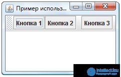
На этот раз начнем сразу с примера. Создадим окно с менеджером расположения BorderLayout , разместим по центру область для ввода текста JTextArea , а к верхней границе прикрепим инструментальную панель с тремя кнопками и одним разделителем:
SimpleWindow(){ super("Пример использования JToolBar"); setDefaultCloseOperation(EXIT_ON_CLOSE); JTextArea textArea = new JTextArea(5, 20); getContentPane().add(textArea); JToolBar toolBar = new JToolBar("Инструментальная панель"); toolBar.add(new JButton("Кнопка 1")); toolBar.add(new JButton("Кнопка 2")); toolBar.addSeparator(); toolBar.add(new JButton("Кнопка 3")); getContentPane().add(toolBar, BorderLayout.NORTH); pack(); } 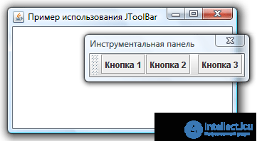 Run the example and experiment with the dashboard. Try to detach it from the top border of the window and attach it to some other one. Detach it from the window borders so that the panel becomes an independent window. In this case, the panel is always displayed above the parent window, even if it is it, and not the panel is active. If you close an independent panel with the button with a cross, it will return to its window, to the place where it was fixed last time.
So, a very simple example demonstrated the very impressive capabilities of a dashboard. To summarize, listing the most useful methods JToolBar:
The constructor JToolBar(String title)creates a horizontal panel with the specified title. The horizontal panel is designed to attach to the upper or lower border of the parent panel (having a location BorderLayout). To create a vertical panel, a constructor is used JToolBar(String title, int orientation), where the parameter orientationis specified by a constant VERTICALfrom the interface SwingConstants. Also available are constructors JToolBar()and JToolBar(int orientation), creating a panel without a title.
setFloatable(boolean floatable)- allows or denies (by default, allows) the user to unfasten the panel from the place of its initial location. It corresponds to the method isFloatable()returns true, if you unpin the panel is allowed.
add(Component component) — добавляет на инструментальную панель новый элемент управления. Взаимосвязанные группы элементов управления принято разделять с помощью линии или пустого пространства. Метод addSeparator() добавляет такой разделитель.
Выпадающий список — весьма распространенный элемент управления. Он содержит множество вариантов, из которых пользователь может выбрать один и только один, либо (если выпадающий список это позволяет) ввести свой собственный.
Создать выпадающий список можно конструктором по умолчанию JComboBox() , после чего добавлять в него элементы методом addItem(Object item) , добавляющим новый элемент в конец списка, или методом insertItemAt(Object item, int index) , позволяющим уточнить позицию, в которую требуется вставить элемент. Однако проще использовать конструктор, в котором сразу указываются все элементы выпадающего списка. Таких конструкторов два: JComboBox(Object[] elements) и JComboBox(Vector elements) . Работают они одинаково, так что это вопрос удобства разработчика: использовать массив или вектор.
Чаще всего в выпадающий список добавляют строки, однако, как это следует из сигнатур описанных выше методов, он может содержать вообще любые объекты. Любой объект преобразуется к строке методом toString() , именно эта строка и будет представлять его в выпадающем списке.
Метод getItemAt(int index) позволяет обратиться к произвольному элементу.
 Метод
Метод removeAllItems() удаляет из JComboBox все элементы, а метод removeItem(Object item) — конкретный элемент (при условии, что он содержался в списке).
Метод getSelectedIndex() позволяет получить индекс выбранного пользователем элемента (элементы нумеруются начиная с нуля), а метод getSelectedItem() возвращает сам выбранный объект. Сделать конкретный элемент выбранным можно и программно, воспользовавшись методом setSelectedIndex(int index) или setSelectedItem(Object item) .
Чтобы пользователь мог ввести свой вариант, который не присутствует в списке, должен быть вызван метод setEditable(boolean editable) с параметром true. Ему соответствует метод isEditable() .
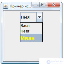
Рассмотрим пример, в котором создается выпадающий список из 3 элементов и выбирается 2-й. Строка, представляющая третий элемент, использует HTML-теги. Как показывает результат, они работают не только в метках*.
SimpleWindow(){ super("Пример использования JComboBox"); setDefaultCloseOperation(EXIT_ON_CLOSE); String[] elements = new String[] {"Вася", "Петя", "<html><font size = +1 color = yellow>Иван</font>"}; JComboBox combo = new JComboBox(elements); combo.setSelectedIndex(1); JPanel panel = new JPanel(); panel.add(combo); setContentPane(panel); setSize(200,200); } 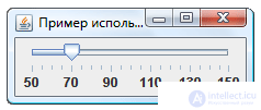 Ползунок позволяет пользователю выбрать некоторое число из диапазона доступных значений, наглядно представив этот диапазон. Против наглядности у ползунка есть один недостаток: он занимает достаточно много места.
Основной конструктор ползунка: JSlider(int orientation, int min, int max, int value) . Первый параметр — ориентация ползунка ( HORIZONTAL или VERTICAL ). Остальные параметры указывают соответственно минимальное, максимальное и текущее значение. Изменить эти значения позволяют методы setOrientation(int) , setMinimum(int min) , setMaximum(int max) , setValue(int value) , а получить текущие — соответствующие им методы get. Чаще всего, конечно, используется метод getValue() — чтобы определить, какое значение выбрал при помощи ползунка пользователь.
Шкала ползунка может быть украшена делениями. Метод setMajorTickSpacing(int spacing) позволяет задать расстояние, через которое будут выводиться большие деления, а метод setMinorTickSpacing(int spacing) — расстояние, через которые будут выводиться маленькие деления. Метод setPaintTicks(boolean paint) включает или отключает прорисовку этих делений. Метод setSnapToTicks(boolean snap) включает или отключает «прилипание» ползунка к делениям: если вызвать этот метод с параметром true, пользователь сможет выбрать при помощи ползунка только значения, соответствующие делениям. Наконец, метод setPaintLabels(boolean paint) включает или отключает прорисовку меток под большими делениями.
Пример использования перечисленных методов:
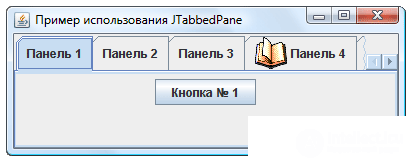
SimpleWindow(){ super("Пример использования JSlider"); setDefaultCloseOperation(EXIT_ON_CLOSE); JSlider slider = new JSlider(JSlider.HORIZONTAL, 50, 150, 70); slider.setMajorTickSpacing(20); slider.setMinorTickSpacing(5); slider.setPaintTicks(true); slider.setPaintLabels(true); slider.setSnapToTicks(true); JPanel panel = new JPanel(); panel.add(slider); setContentPane(panel); pack(); } Многим программам бывает необходимо разместить в одном окне большое количество элементов управления, некоторые из которых (такие как списки, деревья, текстовые области и т.д.) могут к тому же занимать приличное пространство. Чаще всего такая необходимость возникает, когда для работы программе необходимо множество входных данных. Для того, чтобы не вводить дополнительных окон и не перегружать интерфейс, часто используется панель с закладками. Ее можно воспринимать как множество страниц (вкладок), каждая из которых занимает все доступное пространство, за исключением полосы с краю (это может быть любой край), где отображаются ярлычки с названиями страниц. Когда пользователь щелкает по ярлычку, открывается соответствующая ему страница. На каждой странице размещено несколько элементов управления (как правило, они группируются по смыслу).
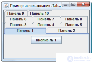 Создать панель со вкладками можно простым конструктором, в котором определяется только месторасположение ярлычков (
 LEFT , RIGHT , TOP или BOTTOM ). Но иногда бывает полезен конструктор JTabbedPane(int orientation, int layout) , где второй параметр принимает значения, соответствующие константам SCROLL_TAB_LAYOUT (если все ярлычки не помещаются, появляется полоса прокрутки) или WRAP_TAB_LAYOUT (ярлычки могут располагаться в несколько рядов).
После этого можно добавлять вкладки методом addTab() , имеющим несколько вариантов. В частности, метод addTab(String title, Component tab) добавляет закладку с указанием текста ярлычка, а метод addTab(String title, Icon icon, Component tab) позволяет задать также и значок к ярлычку. В качестве вкладки обычно служит панель с размещенными на ней элементами управления.
Создадим панель с десятью вкладками, на каждой из которых поместим по кнопке. Все эти вкладки создадим в цикле for, чтобы не писать много кода.
SimpleWindow(){ super("Пример использования JTabbedPane"); setDefaultCloseOperation(EXIT_ON_CLOSE); JTabbedPane tabbedPane = new JTabbedPane(JTabbedPane.TOP, JTabbedPane.WRAP_TAB_LAYOUT); for (int i = 1; i <= 10; i++) { JPanel panel = new JPanel(); panel.add(new JButton("Кнопка № " + i)); tabbedPane.add("Панель " + i, panel); } getContentPane().add(tabbedPane); setSize(300,200); } Измените пример, чтобы вкладки располагались не в несколько рядов, а прокручивались и, кроме того, добавьте к ярлыку четвертой вкладки значок. Результат должен выглядеть так, как изображено на рисунке.
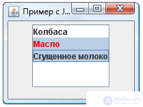 Список
 JList — это один из сложных компонентов, для эффективной работы с которыми необходимо понимание основ библиотеки Swing, в частности, концепции «Модель-Вид». Компоненты JTree (дерево) и JTable (таблица) еще сложнее и в данном пособии не рассматриваются. Что касается списка, то некоторая часть его возможностей может быть использована без углубления в детали.
Список содержит группу элементов, аналогично выпадающему списку JComboBox , но обладает двумя отличительными особенностями. Во-первых, на экране видны одновременно несколько элементов списка. Во-вторых, пользователь может выбрать в списке не один элемент, а несколько (если установлен соответствующий режим выделения).
Создать список можно с помощью конструктора, работающего на основе массива Object[] или вектора Vector (аналогично JComboBox ). Метод setVisibleRowCount(int count) устанавливает количество видимых элементов списка. Остальные элементы будут уходить за его пределы или прокручиваться, если поместить список в JScrollPane (что рекомендуется).
По умолчанию пользователь может выбрать в списке любое число элементов, держа нажатой клавишу Ctrl . Это можно изменить, вызвав метод setSelectionMode(int mode) , где параметр задается одной из констант класса ListSelectionModel :
SINGLE_SELECTION — может быть выделен только один элемент,
SINGLE_INTERVAL_SELECTION — может быть выделено несколько элементов, но составляющих непрерывный интервал,
MULTIPLE_INTERVAL_SELECTION — может быть выделено произвольное количество смежных и несмежных элементов.
Выделенный элемент списка (если он один) можно получить методом getSelectedValue() . Если таких несколько, метод вернет первый из них. Метод getSelectedValues() возвращает все выделенные элементы списка в виде массива Object[] . Аналогично работают методы getSelectedIndex() и getSelectedIndices() , только возвращают они не сами выделенные элементы, а их индексы. Всем этим методам соответствуют методы set, так что выделить элементы списка можно и программно.
Следующий пример иллюстрирует некоторые из этих возможностей JList :
SimpleWindow(){ super("Пример с JList"); setDefaultCloseOperation(EXIT_ON_CLOSE); Object[] elements = new Object[] {"Колбаса", "<html><font color = red>Масло", "Сгущенное молоко"}; JList list = new JList(elements); list.setVisibleRowCount(5); list.setSelectionMode(ListSelectionModel.SINGLE_INTERVAL_SELECTION); list.setSelectedIndices(new int[] {1,2}); getContentPane().setLayout(new FlowLayout()); getContentPane().add(new JScrollPane(list)); setSize(200,150); } Для того, чтобы эффективно добавлять и удалять элементы из списка, управлять их отображением, добавлять и удалять выделенные элементы поодиночке, необходимо познакомиться с моделью данных списка, что выходит за рамки настоящего пособия.
В качестве реального примера законченного окна, иллюстрирующего положения этой и предыдущей глав, рассмотрим окно для входа в систему (которое является необходимой частью каждого из итоговых заданий). Это окно содержит два текстовых поля для ввода логина и пароля, подписи к этим полям и кнопки «OK» и «Отмена».
В первую очередь необходимо сделать на бумаге (или с помощью специализированного программного средства рисования интерфейсов, такого как Microsoft Visio) эскиз будущего окна, чтобы определиться, где должны быть расположены элементы управления и какой менеджер расположения должен быть выбран.
В нашем окне нет элементов, которые имеет смысл растягивать на все доступное пространство, поэтому будем использовать один из менеджеров, сохраняющих предпочтительные размеры компонентов, а именно — BoxLayout . Проще всего представить наше окно как три горизонтальные панели, объединенные в одной вертикальной. В первой из них будет надпись «Логин:» и текстовое поле. Во второй — надпись «Пароль:» и поле для ввода пароля. В третьей будут размещены две кнопки. При этом необходимо учесть следующее:
setResizable(false) . Итоговый код окна приведен ниже. Рекомендуется не только набрать и протестировать, но и внимательно разобрать его.
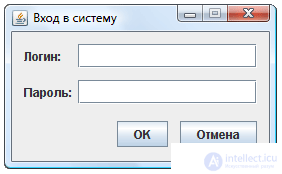
public class LoginWindow extends JFrame { /* Для того, чтобы впоследствии обращаться к содержимому текстовых полей, рекомендуется сделать их членами класса окна */ JTextField loginField; JPasswordField passwordField; LoginWindow(){ super("Вход в систему"); setDefaultCloseOperation(EXIT_ON_CLOSE); // Настраиваем первую горизонтальную панель (для ввода логина) Box box1 = Box.createHorizontalBox(); JLabel loginLabel = new JLabel("Логин:"); loginField = new JTextField(15); box1.add(loginLabel); box1.add(Box.createHorizontalStrut(6)); box1.add(loginField); // Настраиваем вторую горизонтальную панель (для ввода пароля) Box box2 = Box.createHorizontalBox(); JLabel passwordLabel = new JLabel("Пароль:"); passwordField = new JPasswordField(15); box2.add(passwordLabel); box2.add(Box.createHorizontalStrut(6)); box2.add(passwordField); // Настраиваем третью горизонтальную панель (с кнопками) Box box3 = Box.createHorizontalBox(); JButton ok = new JButton("OK"); JButton cancel = new JButton("Отмена"); box3.add(Box.createHorizontalGlue()); box3.add(ok); box3.add(Box.createHorizontalStrut(12)); box3.add(cancel); // Уточняем размеры компонентов loginLabel.setPreferredSize(passwordLabel.getPreferredSize()); // Размещаем три горизонтальные панели на одной вертикальной Box mainBox = Box.createVerticalBox(); mainBox.setBorder(new EmptyBorder(12,12,12,12)); mainBox.add(box1); mainBox.add(Box.createVerticalStrut(12)); mainBox.add(box2); mainBox.add(Box.createVerticalStrut(17)); mainBox.add(box3); setContentPane(mainBox); pack(); setResizable(false); } } Мы сделали лишь краткий обзор компонентов Swing. Нами не были упомянуты некоторые полезные компоненты, такие как индикатор состояния процесса JProgressBar, счетчик JSpinner, панель с разделительной полосой JSplitPane, а также ряд мощных текстовых компонентов. Многие из рассмотренных в этой главе компонентов внушительными возможностями, оставшимися за рамками нашего обзора. И хотя на основе материала этой и следующей, а также предыдущей глав можно разработать полноценный графический интерфейс, необходимый для выполнения основного задания, для профессиональной работы с библиотекой Swing необходимо обратиться к полноценным учебникам и справочникам.
1. Хабибуллин И.Ш. Самоучитель Java 2. (главы 11 - 14)
2. И.Портянкин. Swing. Эффективные пользовательские интерфейсы.
Pay special attention to the so-called models that are not covered in this manual. Model notion is key to controls such as the JList list, JTree tree, and JTable table. Many of the above components also have their own models, through which you can seriously improve the efficiency of their work.

Comments
To leave a comment
OOP and Practical JAVA
Terms: OOP and Practical JAVA