Lecture
Modern programs need a graphical user interface (GUI). Users have lost the ability to work through the console: they control the program and enter input data through so-called controls (in programming they are also called visual components), which include buttons, text fields, drop-down lists, etc.
Each of the modern programming languages provides many libraries for working with a standard set of controls. Recall that under the library in programming a set of ready-made classes and interfaces designed to solve a specific range of tasks.
Java has three visual component libraries for creating a graphical user interface. The earliest of them is called AWT. It is believed that when designing it, a number of shortcomings were made, due to which it is rather difficult to work with it. The Swing library is developed on the basis of AWT and replaces most of its components with its own, designed more carefully and conveniently. The third, the newest library, is called SWT.
Each library provides a set of classes for working with buttons, lists, windows, menus, etc., but these classes are designed differently: they have a different set of methods with different parameters, therefore, “translate” a program from one library to another (for example , in order to increase speed) is not so easy. It’s almost like going from one programming language to another: all languages can do the same thing, but each of them has its own syntax, its own program structure and its many tricks.
For this reason, instead of reviewing all three libraries, we will try to better understand one of them - the Swing library. A full-fledged graphical user interface can be developed with its help.
Each GUI program runs in a window and may open several additional windows as you work.
The Swing library describes the JFrame class, which is a window with a frame and a title bar (with the “Minimize”, “Full screen” and “Close” buttons). It can resize and move around the screen.
Swing has a few more classes of windows. For example, JWindow is a simple window, without a frame and without a title bar. Usually, it is used to make a splash screen for a program that, before launching, must perform several lengthy actions (for example, download information from the database).
The JFrame() constructor without parameters creates an empty window. The JFrame(String title) constructor creates an empty window with the title title .
To write a simple program that displays a blank window, we need three more methods:
setSize(int width, int height) - sets the size of the window. If you do not specify the dimensions, the window will have a zero height, regardless of what it is in and after the launch, the user will have to stretch the window manually. Window sizes include not only the “work area”, but also the borders and the title bar.
setDefaultCloseOperation(int operation) - allows you to specify the action that must be performed when the user closes the window by clicking on the cross. Usually the program has one or several windows when closing which the program stops working. In order to program this behavior, you should pass the EXIT_ON_CLOSE constant described in the JFrame class as the operation parameter.
setVisible(boolean visible) - when a window is created, it is invisible by default. To display a window on the screen, this method is called with the parameter true. If you call it with the parameter false, the window will again become invisible.
Now we can write a program that creates a window, displays it on the screen and quits after the user closes the window.
import javax.swing.*; public class MyClass { public static void main (String [] args) { JFrame myWindow = new JFrame("Пробное окно"); myWindow.setDefaultCloseOperation(JFrame.EXIT_ON_CLOSE); myWindow.setSize(400, 300); myWindow.setVisible(true); } } Note that to work with most Swing library classes, you will need to import the java.swing package. *
As a rule, before displaying a window, you need to take a lot more steps than in this simple program. You need to create many controls, customize their appearance, place in the right places window. In addition, the program can have many windows and configure them all in the main() method is inconvenient and wrong, because it violates the principle of encapsulation: keep together the data and commands that process them. It would be more logical for each window to deal with its size and contents independently. Therefore, the classical structure of the program with windows is as follows:
In the SimpleWindow.java file:
public class SimpleWindow extends JFrame { SimpleWindow(){ super("Пробное окно"); setDefaultCloseOperation(EXIT_ON_CLOSE); setSize(250, 100); } } In Program.java:
public class Program { public static void main (String [] args) { JFrame myWindow = new SimpleWindow(); myWindow.setVisible(true); } } From the example it can be seen that the window is described in a separate class, which is the heir of the JFrame and adjusts its appearance and behavior in the constructor (the constructor of the superclass is called with the first command). The main() method is contained in another class responsible for managing the program flow. Each of these classes is very simple, everyone does his own business, so they are easy to understand and easy to follow (that is, improved if necessary).
Note that the setVisible() method is not called in the SimpleWindow class, which is quite logical: where the button is located and what dimensions it should have is monitored by the window itself, but to decide which window is displayed at what point screen - the prerogative of the control class of the program.
Directly in the window controls are not placed. To do this, use the content panel that occupies the entire space of the window * You can access this panel using the getContentPane() method of the JFrame class. Using the add(Component component) method, you can add any control to it.
In the examples of this lesson we will use only one control - a button (without going into the details of its device). The button is described by the JButton class and is created by the constructor with a parameter of type String - an inscription.
 Add a button to the content pane of our window with the commands:
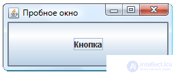
JButton newButton = new JButton(); getContentPane().add(newButton); As a result, we get a window with a button. The button takes up the entire available area of the window. This effect is not useful in all programs, so it is necessary to explore various ways of arranging elements on the panel.
Elements that contain other elements are called containers. All of them are descendants of the Container class and inherit from it a number of useful methods:
add(Component component) - adds a component element to the container;
remove(Component component) - removes the component element from the container;
removeAll() - removes all elements of the container;
getComponentCount() - returns the number of elements in the container.
In addition to those listed in the Container class, about two dozen methods have been defined for managing the set of components contained in the container. As you can see, they are similar to the methods of the collection class. This is not surprising, because in fact the container is a collection, but a collection of a special kind - visual. In addition to storing items, the container deals with their spatial arrangement and drawing. In particular, it has a getComponentAt(int x, int y) method that returns a component that has a point with given coordinates (coordinates are counted from the upper left corner of the component) and a number of others. We will not consider in detail the abstract container, but immediately move on to its most frequently used descendant - the class JPanel .
The JPanel panel is a control that represents a rectangular space on which other elements can be placed. Elements are added and removed by methods inherited from the Container class.
In the example with the button, we watched how the button added to the content panel took up all its space. This is not always the case. In fact, each panel has a so-called placement manager , which defines the strategy for the relative position of the elements added to the panel. It can be changed using the setLayout(LayoutManager manager) method setLayout(LayoutManager manager) . But in order to pass the required parameter to this method, you need to know what managers are like.
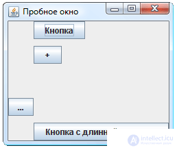
The easiest placement manager is FlowLayout . It places the components to be added to the panel strictly in turn, line by line, depending on the size of the panel. As soon as the next element does not fit in the current line, it is transferred to the next. It is best to observe this with an example. Change the constructor for the SimpleWindow class as follows:
SimpleWindow(){ super("Пробное окно"); setDefaultCloseOperation(EXIT_ON_CLOSE); JPanel panel = new JPanel(); panel.setLayout(new FlowLayout()); panel.add(new JButton("Кнопка")); panel.add(new JButton("+")); panel.add(new JButton("-")); panel.add(new JButton("Кнопка с длинной надписью")); setContentPane(panel); setSize(250, 100); } 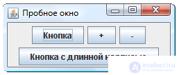 Location managers are described in the java.awt package. Do not forget to import the necessary classes.
Observe the behavior of the window that appears after starting the program. Four buttons in it are arranged as words in a text editor (when centered). The effect will be better noticeable if the window is resized while the program is running.
Let's analyze the text of the example. A new FlowLayout manager is created by the parameterless designer. Please note that the program does not use an intermediate variable. That is, instead of two commands:
FlowLayout newLayout = new FlowLayout(); panel.setLayout(newLayout); We use one:
panel.setLayout(new FlowLayout()); This is quite acceptable in cases where in the future we do not need to refer to the object being created (which is true for this example). We create a location manager, we immediately tie it to the panel - that's all. Now the panel and the manager will find a common language with each other.
The panel stores a link to its manager and itself accesses it whenever it is necessary to calculate the coordinates of the elements (this happens when they are added, deleted, resized, and also when the window is resized). In principle, we can even get this manager with the getLayout() method of the JPanel class, but, as a rule, this is not necessary at all.
By the way, the JPanel class, in addition to the constructor without parameters, has a constructor in which the location manager is set as a parameter. Therefore, instead of commands
JPanel panel = new JPanel(); panel.setLayout(new FlowLayout()); can write:
JPanel panel = new JPanel(new FlowLayout()); Moreover, by default the newly created panel has exactly FlowLayout . Therefore, in the example above, we install the manager rather for clarity, in general, it is not necessary to do this.
Similarly, we add new buttons to the panel. Nowhere else are we trying to access these buttons in the program, so there is no point in setting variables for them.
The setContentPane(JPanel panel) method setContentPane(JPanel panel) allows you to replace the window's content pane.
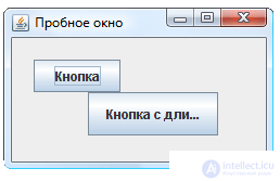
The BorderLayout layout manager divides the panel into five areas: central, upper, lower, right, and left. In each of these areas, you can add exactly one component, and the component will occupy the entire area reserved for it. Components added to the upper and lower regions will be stretched in width, added to the right and left in height, and the component added to the center will be stretched to completely fill the remaining space of the panel.
When adding an element to the panel with the BorderLayout layout manager, it is necessary to additionally indicate in the add() method which area is meant. To do this, use the line with the names of the sides of the world: "North", "South", "East", "West" and "Center". But instead, it is recommended to use the constants defined in the BorderLayout class: NORTH , SOUTH , EAST , WEST and CENTER (since you can make an error in the line and not notice it, and when you try to write the wrong constant name, the compiler will give a warning) If you use the add() method as usual, with one parameter, the element will be added to the center.
The content pane has exactly this location, which is why the button occupied the entire window (it was added to the central area). To see the BorderLayout effect, add buttons to all five areas:
SimpleWindow(){ super("Пробное окно"); setDefaultCloseOperation(EXIT_ON_CLOSE); getContentPane().add(new JButton("Кнопка"), BorderLayout.NORTH); getContentPane().add(new JButton("+"), BorderLayout.EAST); getContentPane().add(new JButton("-"), BorderLayout.WEST); getContentPane().add(new JButton("Кнопка с длинной надписью"), BorderLayout.SOUTH); getContentPane().add(new JButton("В ЦЕНТР!")); setSize(250, 100); } 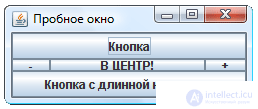 The effect will be well observed if the window is resized.
This placement is not accidentally used in the default content panel. Most programs use areas around the edges of the window to place toolbars, status bars, and so on. And the restriction on one component in the central area is absolutely unimportant, because this component can be another panel with multiple elements and any layout manager.
GridLayout splits the panel into cells of the same width and height (thus the window becomes like a table). Each element added to the panel with this location, entirely takes up one cell. Cells are filled with elements in turn, starting with the top left.
This manager, unlike the ones discussed earlier, is created by a constructor with parameters (four integers). You must specify the number of columns, rows and the distance between cells horizontally and vertically. Perform the following example and observe the effect.

SimpleWindow(){ super("Пробное окно"); setDefaultCloseOperation(EXIT_ON_CLOSE); JPanel panel = new JPanel(); panel.setLayout(new GridLayout(2,3,5,10)); panel.add(new JButton("Кнопка")); panel.add(new JButton("+")); panel.add(new JButton("-")); panel.add(new JButton("Кнопка с длинной надписью")); panel.add(new JButton("еще кнопка")); setContentPane(panel); setSize(250, 100); } BoxLayout Manager places items on the panel in a row or column.
Usually, to work with this manager, the auxiliary class Box , which is a panel for which block placement is already configured. Such a panel is created not by a constructor, but by one of two static methods defined in the Box class: createHorizontalBox() and createVerticalBox() .
Elements added to the block layout panel line up one after another. The distance between the elements is by default zero. However, instead of the component, you can add an invisible “spacer”, the only task of which is to push the adjacent elements apart, providing a specified distance between them. The horizontal strut is created by the createHorizontalStrut(int width) static method, and the vertical - by the createVerticalStrut(int height) method. Both methods are defined in the Box class, and the integer parameter in each of them determines the size of the spacer.
In addition, on this panel, you can add another special element - a kind of "spring". If the size of the panel is larger than necessary for optimal placement of all elements, those that are able to stretch will try to fill the extra space with them. If one or several “springs” are placed among the elements, the additional free space will be distributed even into these gaps between the elements. Horizontal and vertical springs are created by the createHorizontalGlue() and createVerticalGlue() methods, respectively.
Understand the features of the work of this manager better on a good example. We will position the four buttons vertically, placing between the two central "spring", and between the rest - spacers 10 pixels.
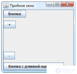
SimpleWindow(){ super("Пробное окно"); setDefaultCloseOperation(EXIT_ON_CLOSE); Box box = Box.createVerticalBox(); box.add(new JButton("Кнопка")); box.add(Box.createVerticalStrut(10)); box.add(new JButton("+")); box.add(Box.createVerticalGlue()); box.add(new JButton("-")); box.add(Box.createVerticalStrut(10)); box.add(new JButton("Кнопка с длинной надписью")); setContentPane(box); setSize(250, 100); } In the example with a vertical panel, all the buttons were aligned to the left. This horizontal alignment is the default.
However, when developing a program window, it may be necessary for some elements to be aligned differently, for example, along the right edge or center. In order to set the alignment of any visual component (for example, buttons or panels), the methods setAlignmentX(float alignment) - horizontal alignment and setAlignmentY(float alignment) - vertical alignment are used. As a parameter, it is easiest to use the constants defined in the JComponent class. For horizontal alignment, constants LEFT_ALIGNMENT (on the left), RIGHT_ALIGNMENT (on the right) and CENTER_ALIGNMENT (on the center) are used. For vertical alignment - BOTTOM_ALIGNMENT (on the bottom), TOP_ALIGNMENT (on the top) and CENTER_ALIGNMENT (on the center).
However, alignment works a little differently than expected. To detect this, change the previous example by aligning the third button on the right. To do this, replace the line:
box.add(new JButton("-")); On the other three:
JButton rightButton = new JButton("-"); rightButton.setAlignmentX(JComponent.RIGHT_ALIGNMENT); box.add(rightButton); We had to enter a variable to access this button, because now we need to perform with it not one, but two actions: setting the alignment to the right and adding to the panel. The previous method — creating a button at the same time and passing it as a parameter to a method — will not work here.
After launching the program, we will see a window in which the buttons are located not in the way that was probably expected. We are used to the fact that right alignment presses the object to the right edge of the container, but in this case all elements were rebuilt, and the button with right alignment turned out to be the leftmost one.
The explanation is simple. When aligned to the right, the object is not pressed against the right edge of the component. Instead, it presses the right edge to an invisible alignment line. All other components are pressed to this line with their left edges, so the observed effect is obtained.
The only difficulty for a novice developer may be that it is not always easy to understand exactly where this line will go. Its position depends on the size and alignment of all elements of the container. However, it is easy to remember a simple rule: if all the elements in the container are aligned the same way, we get the usual behavior (as it was in the previous example, when all the components were aligned to the left and the line was pressed to the left edge of the panel.
The alignment parameter is actually a real number in the range from 0 to 1. It shows which part of the component will be to the left of the alignment line, i.e. in what proportions the component will be “cut”. The constants LEFT_ALIGNMENT and TOP_ALIGNMENT are actually 0, RIGHT_ALIGNMENT and BOTTOM_ALIGNMENT are 1, and CENTER_ALIGHNMENT is 0.5. You can substitute these numbers directly (although the use of constants significantly increases visibility!), Or you can choose any other number from 0 to 1 and set up a completely arbitrary alignment.
Try experimenting with a vertical panel, specifying different alignment for its elements to intuitively understand the logic of the alignment line placement. Resize the window while the program is running to see how the position of this line changes.
If you set null as the layout manager, elements will not be automatically arranged. The coordinates of each element must be explicitly indicated in this case, and they do not depend on the size of the panel or on the coordinates of other elements. By default, the coordinates are zero (i.e. the element is located in the upper left corner of the panel). The element size must also be set explicitly (otherwise, its width and height will be zero and the element will not be displayed).
Element coordinates can be set using one of the following methods:
setLocation(int x, int y) ,
setLocation(Point point)
Эти методы работают аналогично, устанавливая левый верхний угол элемента в точку с заданными координатами. Разница в способе задания точки. Можно представить точку двумя целыми числами, а можно объектом класса Point . Класс Point по сути представляет собой ту же пару чисел, его конструктор имеет вид Point(int x, int y) . Получить доступ к отдельной координате можно методами getX() и getY() .
Можно задаться вопросом: зачем использовать класс Point , если можно просто передать пару чисел? Но дело в том, что многие полезные методы возвращают результат — координаты некоторой точки — в виде объекта этого класса. Например, метод getLocation() , возвращающий координаты элемента. Предположим, нам нужно поместить элемент b в точности в то место, которое занимает элемент a . Этого легко добиться одной строкой:
b.setLocation(a.getLocation()); Размер элемента задается одним из двух методов:
setSize(int width, int height) ,
setSize(Dimension size)
Эти методы работают одинаково — разница, как и в прошлый раз, в способе передачи параметра. Класс Dimension , аналогично классу Point , просто хранит два числа, имеет конструктор с двумя параметрами: Dimension(int width, int height) и позволяет получить доступ к своим составляющим — ширине и высоте — с помощью простых методов getWidth() и getHeigth() . Для того, чтобы получить текущий размер элемента, можно воспользоваться методом getSize() , возвращающего объект класса Dimension . Элемент b можно сделать точно такого же размера, как элемент a , выполнив команду:
b.setSize(a.getSize()); Создадим панель, с которой не будет связано никакого менеджера размещения и вручную разместим на ней две кнопки:
SimpleWindow(){ super("Пробное окно"); setDefaultCloseOperation(EXIT_ON_CLOSE); JPanel panel = new JPanel(); panel.setLayout(null); JButton button = new JButton("Кнопка"); button.setSize(80, 30); button.setLocation(20,20); panel.add(button); button = new JButton("Кнопка с длинной надписью"); button.setSize(120, 40); button.setLocation(70,50); panel.add(button); setContentPane(panel); setSize(250, 150); } Мы используем одну и ту же переменную button для обращения к обеим кнопкам (причем, второй раз ее описывать не нужно). В самом деле, осуществив все необходимые операции с первой кнопкой и зная, что обращаться к ней нам больше не понадобится, мы используем «освободившуюся» переменную для манипуляций со второй.
Если у панели есть любой менеджер размещения, она игнорирует явно заданные размеры и координаты всех своих элементов. В этом легко убедиться, заменив в предыдущем примере команду panel.setLayout(null) на panel.setLayout(new FlowLayout()) . Менеджер размещения сам определяет координаты и размеры всех элементов.
Способ определения координат элементов очевидным образом вытекает из алгоритмов работы каждого менеджера и, таким образом, детально рассмотрен нами выше.
Мы также отмечали, что в некоторых случаях компоненты стараются заполнить все доступное им пространство. Например, всю центральную область в случае менеджера BorderLayout или всю ячейку в менеджере GridLayout . А в панели с менеджером FlowLayout , напротив, элементы никогда не пытаются выйти за определенные границы. Рассмотрим, что это за границы.
Каждый визуальный компонент имеет три типа размеров: минимально допустимый, максимально допустимый и предпочтительный. Узнать, чему равны эти размеры для данного компонента можно с помощью соответствующих методов:
getMinimumSize() ,
getPreferredSize() ,
getMaximumSize() .
Методы возвращают результат типа Dimension . Они запрограммированы в соответствующем классе. Например, у кнопки минимальный размер — нулевой, максимальный размер не ограничен, а предпочтительный зависит от надписи на кнопке (вычисляется как размер текста надписи плюс размеры полей).
Менеджер FlowLayout всегда устанавливает предпочтительные размеры элементов. Менеджер BorderLayout устанавливает предпочтительную ширину правого и левого, а также предпочтительную высоту верхнего и нижнего. Остальные размеры подгоняются под доступное пространство панели. Менеджер GridLayout пытается подогнать размеры всех элементов под размер ячеек. Менеджер BoxLayout ориентируется на предпочтительные размеры.
Когда элемент старается занять все доступное ему пространство, он «учитывает» пожелания не делаться меньше своих минимальных или больше максимальных.
Всеми тремя размерами можно управлять с помощью соответствующим методов set:
setMinimumSize(Dimension size) ,
setPreferredSize(Dimension size) ,
setMaximumSize(Dimension size) .
Чаще всего используется простой прием, когда элементу «не рекомендуется» увеличиваться или уменьшаться относительно своих предпочтительных размеров. Это легко сделать командой:
element.setMinimumSize(element.getPreferredSize()); В рассмотренных выше примерах мы явно задавали размер окна методом setSize() . Но когда используется какой-либо менеджер расположения, расставляющий элементы и изменяющий их размеры по собственным правилам, трудно сказать заранее, какие размеры окна будут самыми подходящими.
Безусловно, наиболее подходящим будет вариант, при котором все элементы окна имеют предпочтительные размеры или близкие к ним*.
Если вместо явного указания размеров окна, вызвать метод pack() , они будут подобраны оптимальным образом с учетом предпочтений всех элементов, размещенных в этом окне.
Оцените работу этого метода, заменив в каждом из вышеприведенных примеров команду
setSize(250, 100); на команду
pack(); Заметьте, что когда панель не имеет метода размещения, эта команда не работает (поскольку панель не имеет алгоритма для вычисления своего предпочтительного размера).
Как уже отмечалось, элементом панели может быть другая панель. Создайте панель с тремя кнопками и менеджером размещения FlowLayout и панель с двумя кнопками и менеджером размещения BoxLayout (горизонтальным). Разместите обе панели в главном окне (не изменяя менеджера размещения у панели содержимого): одну в центр, а другую вдоль любой стороны окна.
Когда панели служат не просто для размещения элементов в соответствии с алгоритмом некоторого менеджера, а для визуального отделения их друг от друга, они оформляются с помощью рамок.
Рамка панели устанавливается методом setBorder(Border border) . Параметром метода выступает рамка — объект класса Border . Это абстрактный класс, поэтому для создания рамки используются его наследники:
EmptyBorder — пустая рамка, позволяет создать отступы вокруг панели. Размеры отступов задаются в конструкторе четырьмя целыми числами.
TitledBorder — рамка с заголовком. Простейший конструктор имеет один параметр типа String (текст заголовка). Заголовок может размещаться вдоль любой стороны рамки, иметь различные начертания.
EtchedBorder — рамка с тиснением. Может быть вогнутой или выпуклой.
BevelBorder — объемная рамка (выпуклая или вогнутая). Можно настроить цвета, требуемые для получения объемных эффектов.
SoftBevelBorder — то же самое, что BevelBorder, но позволяет дополнительно скруглить углы.
LineBorder — простая рамка, нарисованная сплошной линией. Можно выбирать цвет и толщину линии, скруглить углы.
MatteBorder — рамка из повторяющегося рисунка.
CompoundBorder — объединяет две рамки, передаваемые в качестве параметров конструктору в одну новую рамку.
Все перечисленные классы описаны в пакете javax.swing.border.
Consider an example. В этом примере мы создадим шесть панелей с различными рамками и разместим их в виде таблицы. Чтобы не описывать шесть раз процедуру создания новой панели, вынесем ее в отдельный метод:
private JPanel createPanel(Border border, String text) { JPanel panel = new JPanel(); panel.setLayout(new BorderLayout()); panel.add(new JButton(text)); panel.setBorder(new CompoundBorder(new EmptyBorder(12,12,12,12), border)); return panel; } Метод createPanel() создает панель с кнопкой во весь свой размер. В качестве параметра передается надпись на кнопке и рамка, которую необходимо добавить к панели. Рамка добавляется не напрямую, а путем композиции с пустой рамкой. Этот прием часто используется, чтобы рамка не прилипала к краю панели.
Теперь шесть раз воспользуемся этим методом в конструкторе окна программы.
SimpleWindow(){ super("Пробное окно"); setDefaultCloseOperation(EXIT_ON_CLOSE); JPanel panel = new JPanel(); panel.setLayout(new GridLayout(2,3,5,10)); panel.add(createPanel(new TitledBorder("Рамка с заголовком"), "TitledBorder")); panel.add(createPanel(new EtchedBorder(), "EtchedBorder")); panel.add(createPanel(new BevelBorder(BevelBorder.LOWERED), "BevelBorder")); panel.add(createPanel(new SoftBevelBorder(BevelBorder.RAISED), "SoftBevelBorder")); panel.add(createPanel(new LineBorder(Color.ORANGE, 4), "LineBorder")); panel.add(createPanel(new MatteBorder(new ImageIcon("1.png")), "MatteBorder")); setContentPane(panel); pack(); } 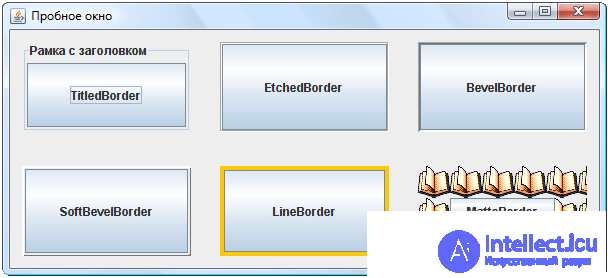
Этот пример показывает, с помощью каких конструкторов создаются различные рамки и как они выглядят. В нем использованы два новых класса: Color и ImageIcon .
Класс Color предназначен для работы с цветом. В нем есть несколько констант, описывающих наиболее распространенные цвета. В частности, к таковым относится Color.ORANGE .
The class ImageIcondescribes the graphic image. The parameter of its constructor is the path to the file from which the image can be loaded. The example uses the relative file name "1.png". In order for an object to ImageIconbe successfully created, a file with that name must be placed in the project folder.

Comments
To leave a comment
OOP and Practical JAVA
Terms: OOP and Practical JAVA