Meta tags in the HEAD mobile container

Lecture


I think everyone knows that mobile devices are currently actively taking over the world. A year ago, according to Stat Counter, the share of mobile Internet traffic in the world was 4%, at the moment this value is already equal to 8% with kopecks, and this is a two-fold increase, for a minute. Interestingly, the trend of 2 * x increase in mobile traffic has been observed since 2009, when its share was 0.7%.
And what is quite interesting - this growth will not only not stop, but will increase. For example, experts from Ericsson predict that mobile data traffic will increase tenfold by 2016. And one more experts from not less dear company Cisco predict growth in 18 times - proof.

  Meta tags in the HEAD mobile container

From all of the above, we can conclude that if some of the web developers have not yet plunged into the world of the mobile web, now is the time to do it.
In this article, I will look at those elements of the <head> container that desktop old school layout makers may not have encountered in their practice.

Let's start with the very first tag, in which we add a small upgrade:

one
2
<!--[if IEMobile 7 ]> <html class="iem7" lang="en"> <![endif]-->
<!--[if (gt IEMobile 7)|!(IEMobile)]><!--> < html lang = "en" > <!--<![endif]-->

In this simple way, using the conditional comments (conditional comments), the <html> tag is assigned the class .iem7 in the event that the page is opened in the IE Mobile browser. Sometimes it is useful, as it is known that Microsoft browsers are not perfect. And with the help of an additional class, we can, if anything happen, make a fork of styles.

Appcache

one
< html manifest = "default.appcache" >

Also, for the head, you can make an additional upgrade - add the manifest parameter and enable appcache support (Application Cache). This part of the HTML5 specification allows offline use of the web application. Yes, browsers have their own caching mechanism, but it is unreliable and does not always work as we expect from it. (Note: On the iPhone / iTouch, files no larger than 25 Kb are cached).
Using appcache provides the following benefits:

  • Offline viewing - the user can use the site, even if there is no online connection (meaning those pages that are already in the cache).
  • Speed ​​- resources are cached locally, pro allows the site to work faster.
  • Server load reduction - the browser downloads only those resources that have been changed from the server

In addition, AppCache allows developers to determine which specific files should be cached and made available to offline users.
You need to set these files in the manifest file approximately in this way

one
2
3
four
five
6
CACHE MANIFEST
img/splash.png
img/apple-touch-icon.png
css/style.css
js/libs/jquery-1.7.1.min.js
js/libs/modernizr-2.5.min.js

By the way, there is an official validator for this file.

Title

one
< title >Заголовок</ title >

Yes, the standard tag to set the page title. The function of this tag is similar to the desktop, but it is worth considering some features. On some devices, the page title is used as the title at the very top of the screen; in others, the title is used as default text for bookmarks and history. In addition, compared to the desktop browser, quite a small amount of space is allocated in the mobile under the title - an average of 15 to 40 characters (60 in horizontal position). Based on this, mobile headings should be made short and meaningful, and not as recommended by SEOs :).

Handheld friendly

one
< meta name = "HandheldFriendly" content = "True" >

The HandheldFriendly meta tag was originally supported by older Palm and Blackberry models, which used browsers such as AvantGo. There, the tag was used to define mobile-oriented markup. Today, this meta tag is also recognized by some mobile browsers and the “true” parameter indicates that the page has mobile-optimized markup. In addition, it serves as a guideline for the web document to be displayed without automatic scaling. (documentation)

MobileOptimized

one
< meta name = "MobileOptimized" content = "320" >

The MobileOptimized meta tag was introduced by Microsoft in order to control the width of the layout of web pages that are rendered in Internet Explorer Mobile. The content of a meta tag is specified as an integer in pixels. In IE Mobile, the presence of this meta tag forces the page to be displayed in one column with a given width, thereby getting rid of the browser's attempts to adjust the layout to fit the screen so that it fits on the screen. In addition, it allows you to get rid of the horizontal scroll bars.
Some non-MS mobile browsers may also use this meta tag for the same purpose. Moreover, search engine robots that index mobile websites also use this meta tag to define mobile-oriented HTML. read more

Viewport

one
< meta name = "viewport" content = "width=device-width" >

What is Viewport, how does it work and why is it needed at all? 13.03.2012

Create a simple page with minimal markup:

one
2
3
four
five
6
7
eight
9
<! doctype html>
< html >
< head >
     < title >Hello world!</ title >
</ head >
< body >
     < p >Hello world!</ p >
</ body >
</ html >

Now open this page on your mobile device. Having opened, we will see that our page will be displayed approximately as follows:

  Meta tags in the HEAD mobile container

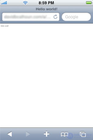
As you can see, the text is too small to read, there is a lot of empty space, and in order to read this text, we need to increase it by approximation.

Why is this happening?

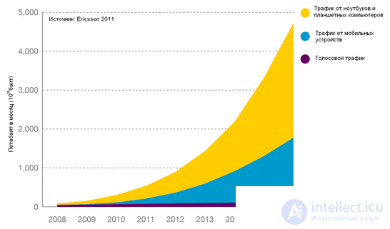
Mobile browser problem

When comparing mobile and desktop browsers, the most obvious difference is the size of the screen. Mobile browsers by default display sites created for ordinary desktop browsers much worse than they could: either by reducing the scale, making text and other content too small and unreadable (as in our version), or displaying only a small part of the site, which fits on screen.

If you think logically, then it makes sense: the mobile browser sees the page and assumes that it is designed for the desktop version of the browser, which is true for the vast majority of sites. Based on this, this browser sets the page to a width of 980px (Safari iPhone) and tries to fit it optimally on the screen of the smartphone, displaying it at the maximum scale. Typically, the width of sites is approximately the same, therefore, opening an average web page on a mobile device, it will stretch to its full width, but 2-3 times less than its original size.

Therefore, if we want to optimize the site for smartphones, this option does not roll. We need to somehow inform the browser that our page is designed to be displayed on mobile devices and set the rules for the correct behavior of the viewing area.

And just for this we will use the meta tag viewport, which was introduced by Apple and as usual copied by the others.

Add the following line to the <head> </ head> block:

one
< meta name = "viewport" content = "width=device-width" >

And that's what happens as a result:

  Meta tags in the HEAD mobile container

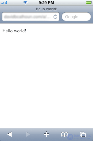
It is quite another matter. By setting the viewport meta tag to “device-width”, we tell the browser that the width of the viewport is equal to the width of this device, and not the standard width of 980px, as it may assume by default. On a large number of smartphones, the screen width is 320px (in portrait mode). You can set your own width to 320px, which will give the same result, but on some smartphones the screen width may be different, so the best option is to use device-width.

One of the most common options for determining the viewing area is the following:

one
< meta name = "viewport" content = "width=device-width, initial-scale=1.0" >

which determines the width of the page and sets the initial scale.

Also, you can often find this option:

one
< meta name = "viewport" content = "width=device-width, initial-scale=1.0, maximum-scale=1.0, user-scalable=no" >

In this case, the page is set to the width of the device on which it is open, and any scaling is prohibited - both initial when loading and user-defined after loading. In this mode, the mobile web page functions as a mobile application where only a vertical or horizontal scroll is available to the user. However, it is better not to use such a recording blindly, because it is impossible to prohibit the user to zoom out and scale at will, if the design idea does not require it. For example, too small a font impairs the readability of the text and in this case it is necessary to use the approximation.

The viewport meta tag is relatively new, which is why it is currently not supported by all browsers, especially for older smartphones. In such cases, it makes sense to use some old methods that allow the browser to identify the page as optimized for the mobile web. This can be done using the following meta tags:

one
2
< meta name = "MobileOptimized" content = "320" />
< meta name = "HandheldFriendly" content = "true" />

You can read more about these and other specific mobile tags here.

Possible options for the viewport meta tag

Attribute Possible meaning Description
width Integer non-negative value
(200px - 10,000px)
or device-width constant.
Specifies the width of the viewport.
If the width is not specified, the mobile Safari is set to 980px, in Opera - 850px, in Android WebKit - 800px, and in IE - 974px.
height Integer non-negative value
(from 223px to 10,000px)
or deviceheight constant
Specifies the height of the viewport. In most cases, this attribute can be ignored.
initial-scale Number with a dot (from 0.1 to 10).
Value 1.0 - do not scale
Defines the initial scale of the page. The larger the number, the higher the scale.
user-scalable no or yes Determines whether a user can zoom in a window.
The default is “yes” in mobile Safari.
minimum-scale Number with a dot (from 0.1 to 10).
1.0 - do not scale
Defines the minimum viewport scale. The default is “0.25” in mobile Safari.
maximum-scale Number with a dot (from 0.1 to 10).
1.0 - do not scale
Specifies the maximum viewport scale. The default is “1.6” in mobile Safari.

Viewport compatibility table.

<safari, webos = "" Yes = "" <= "" tr = "">
Browser / Platform Using
Android browser Yes, but before version 2.2, the initial scaling is 1.0.
Symbian / S60, Nokia Series 40, Motorola Internet Browser, NetFront, Openwave (Myriad), Opera Mobile, Opera Mini Not
Blackberry No up to version 4.2.1.
Yes, since version 4.2.1
Internet Explorer No to IE6

Actually, if you have no plans to go deeper into the nuances and specifics of the viewport tag, then this can be the end. However, if anyone wants to understand the principle of the viewport, and how the visual viewport and the page viewport differ, you can read more.
And the translation of the wonderful article by Peter-Paul Koch, supplemented by me, will help us in this. A tale of two viewports - part two   Meta tags in the HEAD mobile container

Two viewports

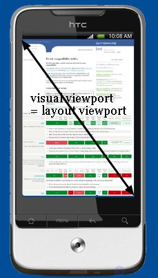
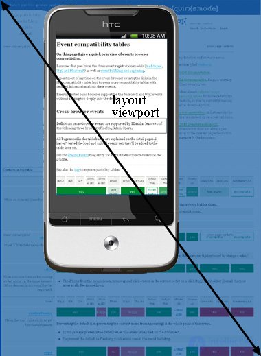
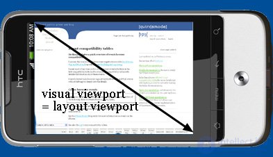
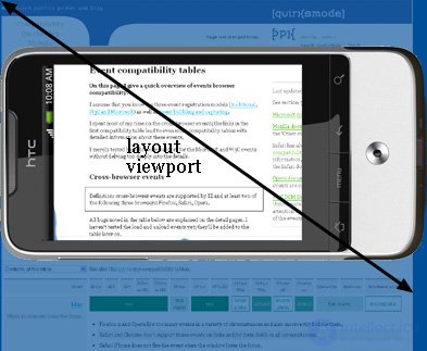
So, let's say that the viewport is too narrow for our CSS template. The obvious solution is to make the viewport wider. However, to begin with, we will divide the concept of a viewport into two parts: a visual viewport and a page viewport.

A very good viewport concept is explained by George Cummins at Stack Overflow:

Imagine the viewport of the page as a large image with the same size and shape. Now imagine a smaller frame through which you look at this large image. This frame is surrounded by an impenetrable material that prevents you from seeing the large image completely, with the exception of its individual parts. The part of the large image that is visible through the frame will be a visual viewport. If you move away from the frame with a large image (zoom out, i.e., zoom out), you can see the whole image at once, or move closer (zoom in, zoom out), then you can only view part of the image. Also, you can turn the frame to change its orientation (portrait or landscape), while the size and shape of a large image (page viewport) always remains the same.

The visual viewport is the part of the page that is currently visible on the screen. The user can scroll to change the visible part of the page, or use scaling to resize the visual viewport.

  Meta tags in the HEAD mobile container

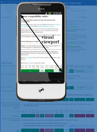
The page markup, especially if its width is specified as a percentage, is calculated relative to the page viewport, which is much wider than the visual viewport.

Thus, the element initially takes the width of the page viewport and further CSS behaves as if the screen were much wider than the screen of the phone. This provides the site with the same behavior as in the desktop browser.

What is the width of the visual viewport itself? It depends on the browser. Safari iPhone uses 980px, Opera - 850px, Android WebKit - 800px, and IE - 974px.

Some browsers behave differently:

Symbian WebKit tries to equate a page viewport with a visual viewport, and this means that elements with a percentage width can behave unpredictably. However, if the page does not fit in the visual viewport due to absolute values, the browser stretches the page viewport to a maximum of 850 pixels.

Samsung WebKit makes page view equal to the width of the widest element.

On a BlackBerry, at 100% scale, the page viewport will be equal to the visual viewport in any case.

Zooming

Both viewports are measured in CSS pixels. However, during scaling, the size of the visual viewport changes (as you zoom in, the smaller number of CSS pixels fit on the screen), while the size of the page viewport remains unchanged. (If this were not the case, the browser would continually reflow pages due to recalculation of the percentage width.)

Understanding the viewport page

To better understand the size of the page viewport, take a look at what happens at the smallest possible page scale. Most mobile browsers by default display any page at the smallest scale.

The fact is that the size of the browser's page viewport completely coincides with the screen at the maximum scale and therefore is equal to the visual viewport.

  Meta tags in the HEAD mobile container

Thus, the width and height of the page viewport is equal to all that is displayed on the screen at the smallest scale. As the user zooms in, these dimensions remain the same.

  Meta tags in the HEAD mobile container

The width of the page viewport is always the same. If you change the orientation of the smartphone screen, the visual viewport changes, but at the same time the mobile browser adapts to the new orientation, slightly zooming in so that the page viewport again becomes the same width as the visual viewport.

  Meta tags in the HEAD mobile container

This affected the height of the page viewport, which is now much smaller than in portrait orientation. But for developers, width is more important, not height.

  Meta tags in the HEAD mobile container

Android and target-densitydpi

The devices on the android platform have their own attribute for the viewport, which turns off scaling for displays with different resolutions.

one
< meta name = "viewport" content = "target-densitydpi=high-dpi" />

On devices with HDPI (240dpi) there will be no scaling.

one
< meta name = "viewport" content=" target-densitydpi = medium -dpi: />

On devices with MDPI (160dpi) there will be no scaling. This dpi value is set by default.

one
< meta name = "viewport" content=" target-densitydpi = low -dpi: />

On devices with LDPI (120dpi) there will be no scaling

one
< meta name = "viewport" content = "target-densitydpi=device-dpi" />

Such a record means that there will be no scaling on any of the devices on Android.

one
2
3
< link rel = "apple-touch-icon-precomposed" sizes = "114x114" href = "images/h/apple-touch-icon.png" >
< link rel = "apple-touch-icon-precomposed" sizes = "72x72" href = "images/m/apple-touch-icon.png" >
< link rel = "apple-touch-icon-precomposed" href = "images/l/apple-touch-icon-precomposed.png" >

Safari in iOS and the default browser in Android have the useful feature of saving bookmarks to websites and web applications on the desktop, along with icons for common applications. For these types of bookmarks, you can specify an icon by placing a 57x57px image called apple-touch-icon.png in the PNG site root. You can also specify an icon for a specific page or section of the site using the link tag with the value of apple-touch-icon in the rel attribute and the address of the picture.
With the advent of the iPhone 4 / 4s and iPad, the requirement for this icon has changed - now it should be 114 × 114 for iPhone or 72 × 72 for the iPad. In principle, the size of this icon can be larger, the mobile safari will independently compress it to the desired size, plus round the corners, add a small shadow and glassiness effect to the icon. It looks something like this:

  Meta tags in the HEAD mobile container

Also supported by translucency icons. In this case, the transparent areas will be filled with black:

  Meta tags in the HEAD mobile container

If desired, the glass effect can be discarded by setting the apple-touch-icon-precomposed instead of apple-touch-icon.
Many recommend always using precomposed-icons to always keep their design under their control.
However, even if you decide to use only apple-touch-icon-precomposed.png, it makes sense to also leave a note with apple-touch-icon.png for maximum compatibility — for example, iOS 1 and BlackBerry OS6 do not support precomposed.
By the way, if it is assumed that your site will be designed to work only with mobile devices from Apple, then you can refuse links to icons in HTML code altogether. It is enough to create versions of the image in the right sizes, give them the correct names and put them in the root of the project. Some documentation about this.

It should be said that Android at one time also learned to recognize these icons and use it in the same way as iOS devices - support for versions 2.1+ is announced. (Note: Android 2.1 only supports precomposed icons) - prow

one
< link rel = "shortcut icon" href = "images/l/apple-touch-icon.png" >

Allows you to set an icon for some other devices, for example, some models of Nokia smartphones.

one
< link rel = "apple-touch-startup-image" href = "images/l/splash.png" >

This line allows you to set a splash image when opening a bookmark from the desktop.
It looks something like this:

  Meta tags in the HEAD mobile container

Naturally, the splash image can be any, but it is desirable that its design is in harmony with the overall design of the site and contain its logo.
If such a picture is not set, then when opening a bookmark, a screenshot of the last state of the application will be shown.
The picture should be made in the following sizes (otherwise the device will not accept it):

  • 320 × 480 (iPhone <4, iPod Touch)
  • 640 × 960 (iPhone 4+, New iPod Touch)
  • 768 × 1004 (iPad portrait)
  • 1024 × 748 (iPad landscape)
one
< meta name = "apple-mobile-web-app-capable" content = "yes" />

By default, a bookmark from the desktop starts the website in standard safari mode - with the address bar.
This meta tag is required for the application to open in full screen mode, with no visible address bar. Unfortunately, this mode has some limitations - when you click on any link, the transition to the next page is carried out in the standard mode of mobile safari.

one
< meta name = "apple-mobile-web-app-status-bar-style" content = "default" >

We change the design of the status bar - a thin bar at the very top of the screen, where the time and battery icon are displayed.

  Meta tags in the HEAD mobile container

In order to change it, the apple-mobile-web-app-status-bar-style meta tag is used.

There can be one of three options - default, black or black-translucent.
Default - leave it in the standard blue design, black - make the background change to black. black-translucent - will also make the status bar black, but add translucency to it - this will slightly expand the visible content area, which may require additional edits to css. (documentation)

Some additional meta tags that can be included if needed:

one
< meta http-equiv = "cleartype" content = "on" >

Mobile Internet Explorer allows you to forcibly activate ClearType technology to smooth fonts. What many people use :).

one
2
< meta name = "format-detection" content = "telephone=no" >
< meta name = "format-detection" content = "address=no" >

These lines allow you to disable automatic format recognition. Simply put, if you anywhere on the page indicated a phone number in the html-code and did not indicate in the header, the smartphone recognizes it as a phone number and tries to dial it by clicking. Same with the address.

created: 2016-10-24
updated: 2021-03-13
132490


Rating 9 of 10. count vote: 2
Are you satisfied?:


Comments


To leave a comment
If you have any suggestion, idea, thanks or comment, feel free to write. We really value feedback and are glad to hear your opinion.
To reply

XML, HTML, DHTML, HTML 5

Terms: XML, HTML, DHTML, HTML 5